
Brand
ProjectBrand Identity
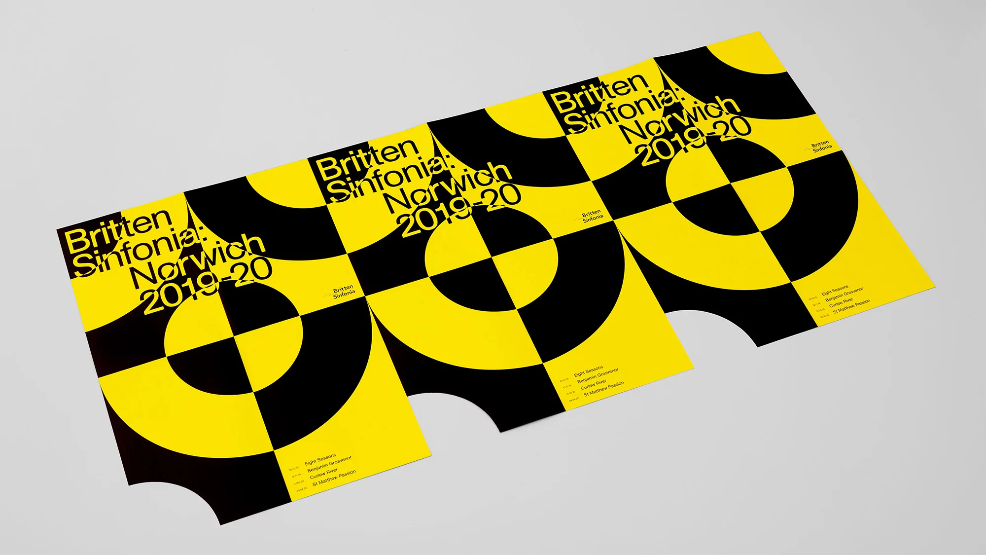
Britten Sinfonia Brand Identity 2019
Associated creatives

Tags
Description
Graphic design brand identity project for Britten Sinfonia created by The District. Three identical posters are displayed diagonally on a neutral white surface, showcasing a high-contrast geometric pattern in vivid yellow and black. Bold sans-serif typography reads Britten Sinfonia Norwich 2019-20 alongside additional event details. The studio lighting creates soft shadows beneath the printed paper edges, highlighting the clean graphic composition.