
Brand
ProjectBrand Identity
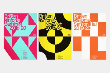
Britten Sinfonia Brand Identity 2019
Associated creatives

Tags
Description
This graphic design project by The District showcases three vibrant promotional posters for Britten Sinfonia. Each poster employs bold typography paired with distinct geometric patterns and striking color combinations including pink and turquoise, yellow and black, and orange and white. The layouts integrate event details and dates cleanly within the structured abstract forms against a neutral background. The visual style relies on strong graphic shapes and crisp typography to establish a cohesive brand identity.