
unknown: Brand Identity
Feb 2019
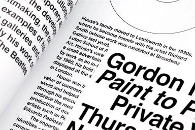
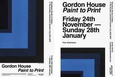
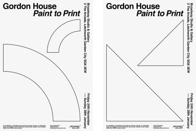
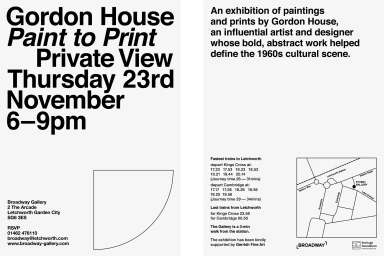
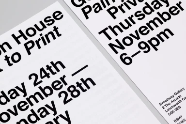
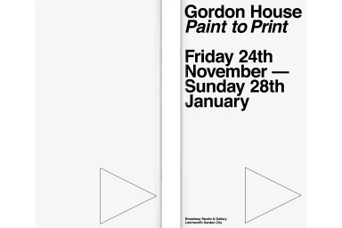
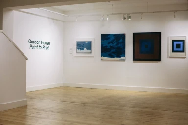
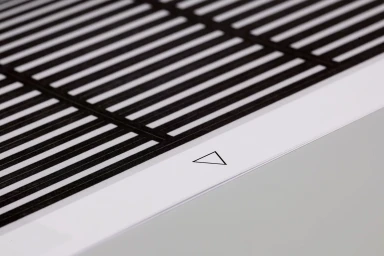
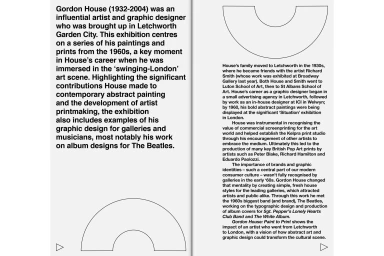
The brand identity for the Gordon House Paint to Print exhibition represents a masterclass in minimalist design, seamlessly bridging the gap between artistic integrity and commercial functionality. Executed by The District, the project navigates the complex intersection of digital media and contemporary art through a series of cohesive collateral pieces. By utilizing a high-contrast black and white palette, the team leans into a modernist aesthetic that prioritizes readability and structural precision. The use of typography is central to the visual language, employing bold sans-serif typefaces that anchor the layouts against expansive negative space. The integration of vector graphic elements—specifically geometric arches and triangles—creates a rhythmic consistency across exhibition posters, invitations, and brochures. This visual program functions as a cohesive system, where clean, grid-based layouts ensure that essential information remains accessible while maintaining a sophisticated, gallery-ready presentation. The design choices evoke the clarity of mid-century modern principles, ensuring the work feels both timeless and professional within the media and entertainment landscape. By emphasizing tactile qualities, such as the natural light-and-shadow effects on physical paper, The District has crafted a brand identity that translates the artist's abstract sensibilities into a highly effective, functional communication tool. The result is a sharp, disciplined exercise in editorial layout that commands attention without relying on superfluous ornamentation.
Horizontal, Clean, Minimalist
Typography
White Seamless
