
The District: Brand Identity
Apr 2019
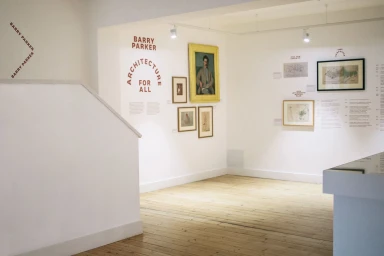
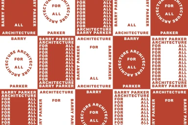
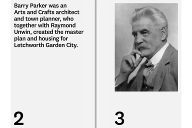
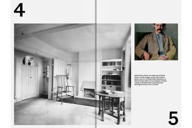
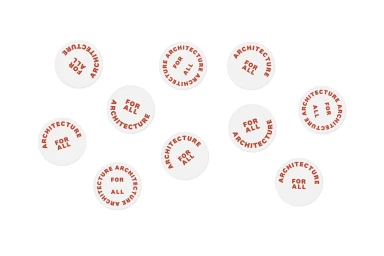
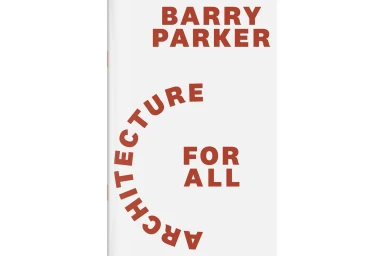
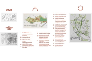
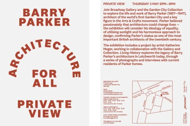
The District delivers a masterclass in cohesive brand identity design for the Barry Parker exhibition, effectively bridging historical architectural significance with contemporary visual clarity. Operating within the Digital Media and Publishers space, this project synthesizes archival materials—such as early 20th-century portraits and master planning schematics—into a sleek, professional language. By leveraging a high-contrast palette of deep terracotta red against stark white, the design team creates a rhythmic visual identity that feels both academic and modern. The project heavily emphasizes typography as a primary narrative tool, utilizing bold sans-serif typefaces arranged in both rigid grids and dynamic circular formations to reflect the precision of architectural drafting. Throughout the collateral, including publication spreads and invitation flyers, the work maintains an unwavering sense of minimalist restraint. Subtle techniques like high-key lighting and clean UI illustration influence how the information is parsed, transforming dense historical timelines into accessible, modular graphic assets. Whether through scattered stickers or formal exhibition signage, the aesthetic consistency ensures that the legacy of Barry Parker remains the focal point. This body of work reads as a sophisticated exploration of heritage branding, where every graphic choice serves to reinforce the overarching ethos of Architecture For All, proving that disciplined, systematic design is the most powerful way to anchor a complex institutional narrative.
Horizontal, Clean, Minimalist
Typography
