
Brand
ProjectBrand Identity
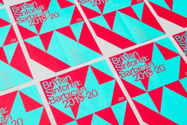
Britten Sinfonia Brand Identity 2019
Associated creatives

Tags
Description
Graphic design brand identity project for Britten Sinfonia created by The District. The flat lay arrangement displays multiple folded posters featuring striking geometric patterns in vibrant turquoise and hot pink. Bold typography overlays the graphic elements with event information and branding details. The clean composition highlights the sharp print finishing and contrasting color palette.