
Old Friends Brewery
Brand Identity
Feb 2017
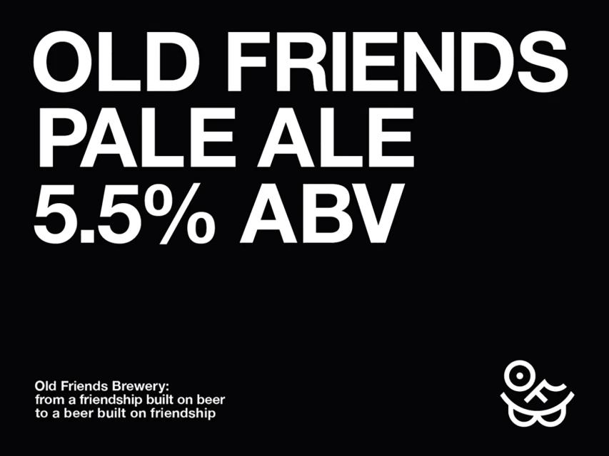
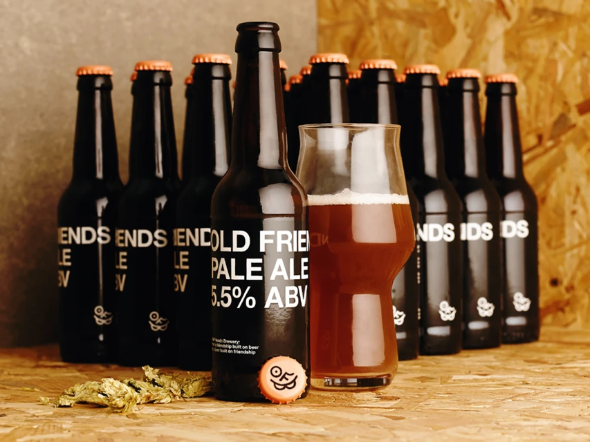
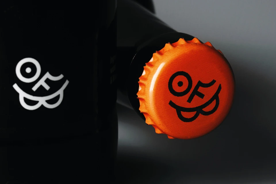
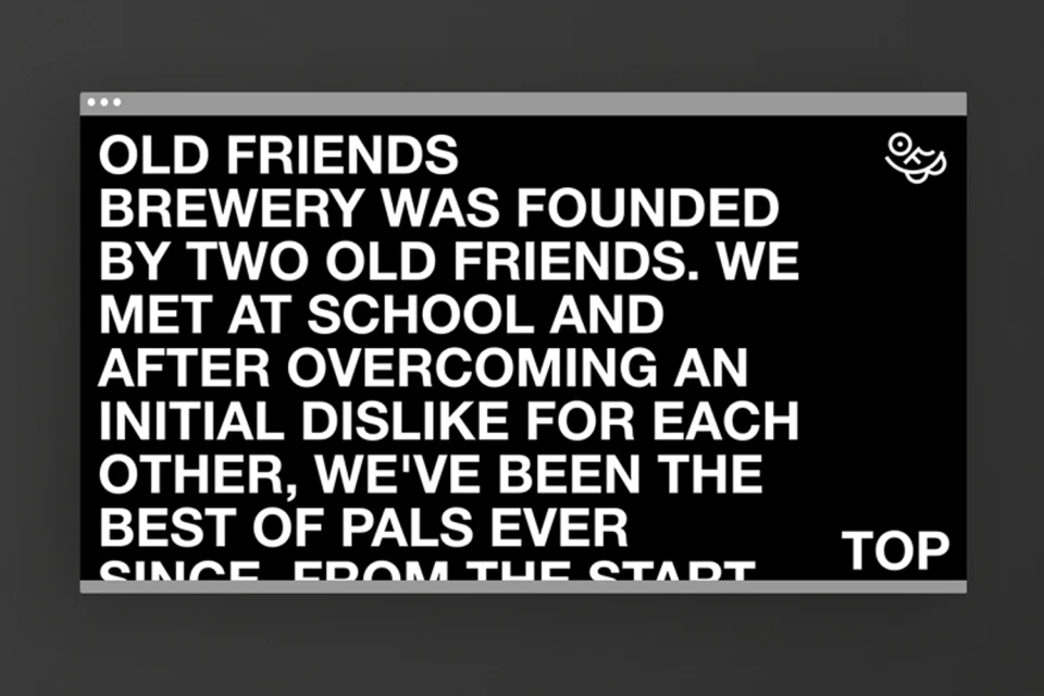
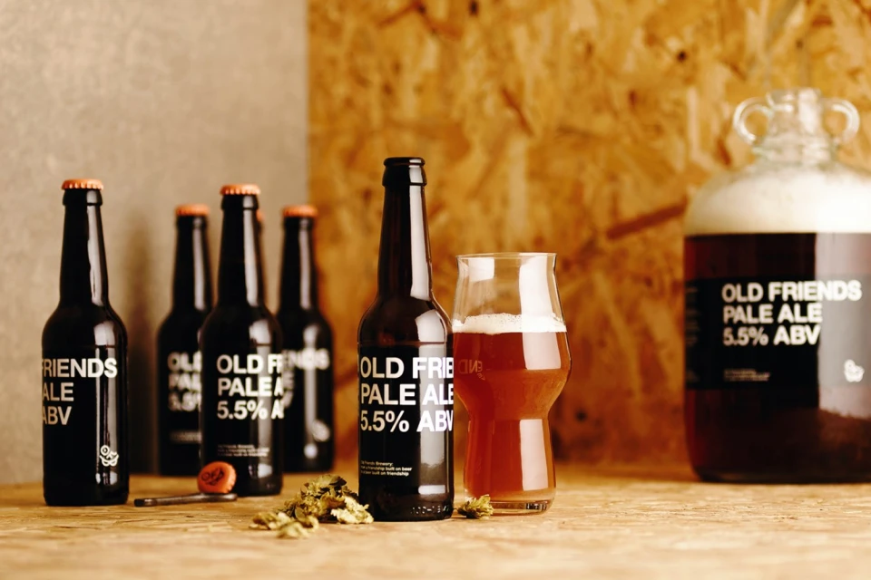
Old Friends Brewery enters the competitive alcoholic beverages sector with a brand identity that masterfully balances artisanal heritage with a sharp, contemporary edge. Executed with precision by The District, the visual language revolves around a high-contrast monochrome color palette that allows the product to command attention in any setting. The brand design utilizes clean, sans-serif typography to establish a modern, approachable feel, while the clever integration of a smiling, abstract face icon into the O and F letterforms injects a sense of playful personality into the identity. Through a mix of commercial product photography and refined graphic composition, the project leans into a minimalist aesthetic that bridges the gap between traditional craft brewing and modern corporate branding. The studio work, defined by precise macro captures and controlled studio strobe lighting, highlights the physical product—from the vivid orange crown caps to the textured dark glass—with surgical clarity. When juxtaposed against the warmth of natural light scenes featuring dried green hops and light-toned wood surfaces, the identity feels both grounded and sophisticated. This cohesive system ensures that the brewery feels as at home on a design-forward digital interface as it does in a classic taproom, effectively communicating the brewery's story through balanced layout, intentional negative space, and a crisp, unmistakable visual signature that invites consumers to connect with the brand on a human level.
Horizontal, Commercial, Clean
Alcoholic Beverages
E-commerce / Product
