
Assembly: Brand Identity

Aug 2018
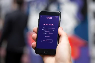
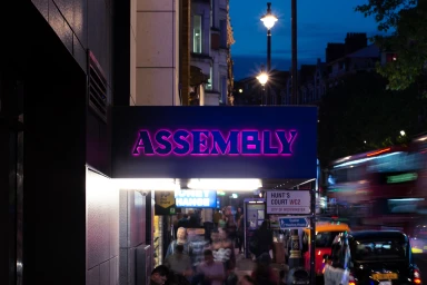
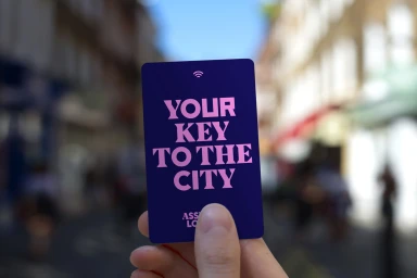
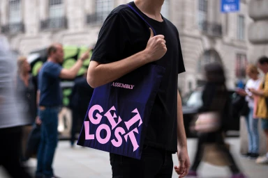
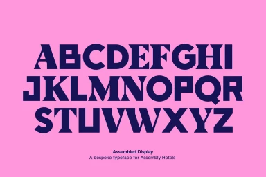
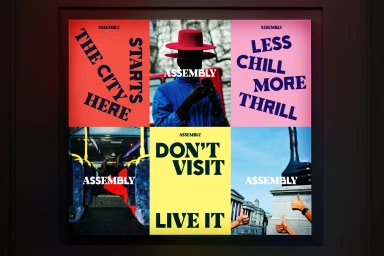
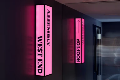
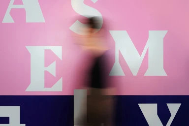
The brand identity for Assembly Hotels, crafted by the design team at Ragged Edge, effectively positions the hospitality brand as an energetic, modern fixture within the London urban landscape. This comprehensive project utilizes a high-contrast aesthetic that marries a deep, sophisticated navy palette with bursts of vibrant neon pink and secondary warm tones. By leaning into bold, angular sans-serif typography, the identity establishes a distinct visual language that feels both authoritative and approachable. Through a series of commercial photography and graphic applications, the project demonstrates how bespoke design elements can transform standard hotel touchpoints into an immersive guest experience. The visual system is anchored by a modular layout that balances cinematic, natural light photography with disciplined graphic design, seamlessly integrating the brand into the fast-paced motion of central London. From sleek UI illustrations found on reservation portals to tactile, lifestyle-driven applications like branded access cards and custom amenity packaging, every detail reinforces the promise of an active, city-centric stay. By pairing high-speed motion blur and stark architectural contrasts, the identity channels a sense of relentless momentum, inviting guests to live rather than just visit. Ultimately, this cohesive visual identity succeeds by treating signage, digital interfaces, and physical collateral as singular, harmonious components of a unified, high-energy hospitality brand that stands out against the bustling backdrop of the city.
Horizontal, Commercial, Clean
Advertising Campaign
