
Batch Organics
Brand Identity
Dec 2017
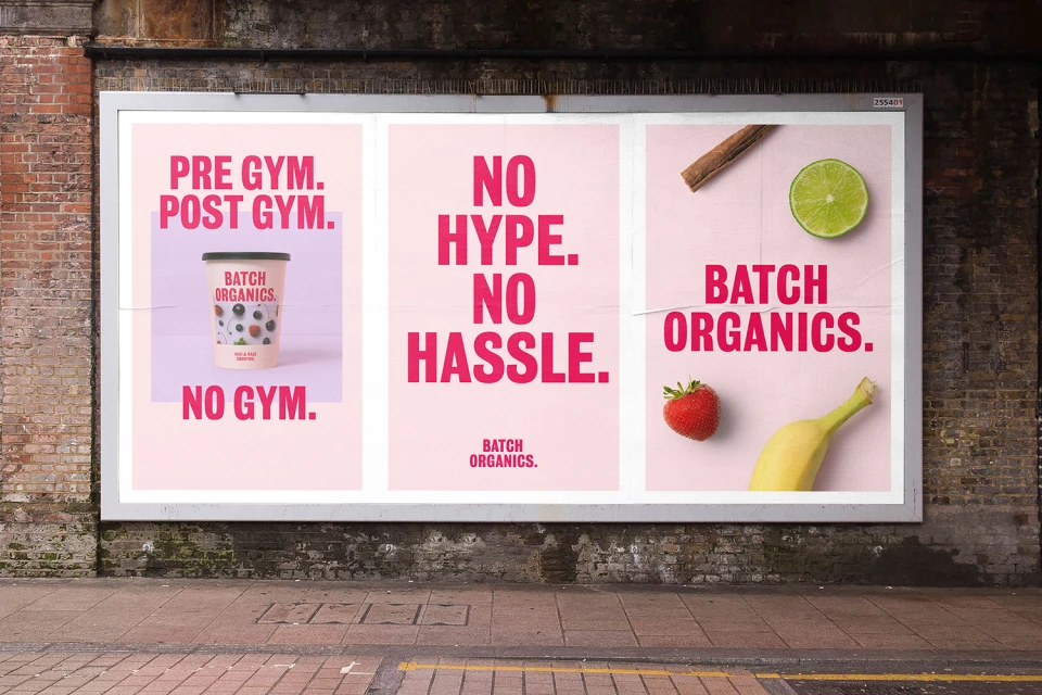
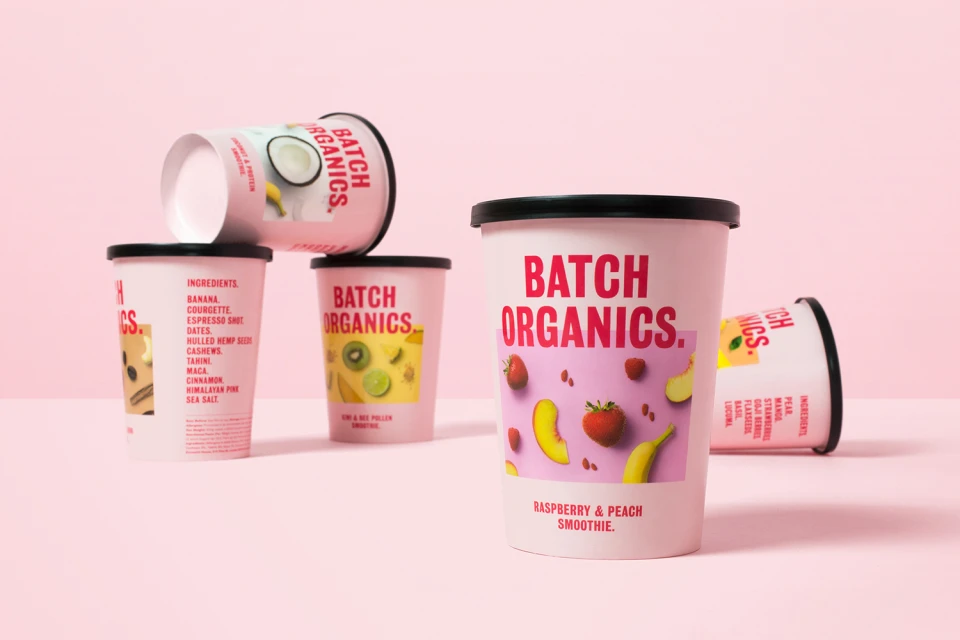
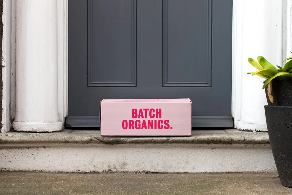
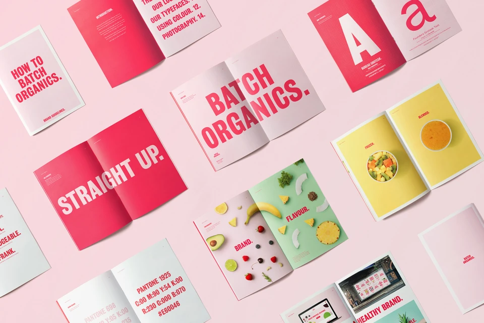
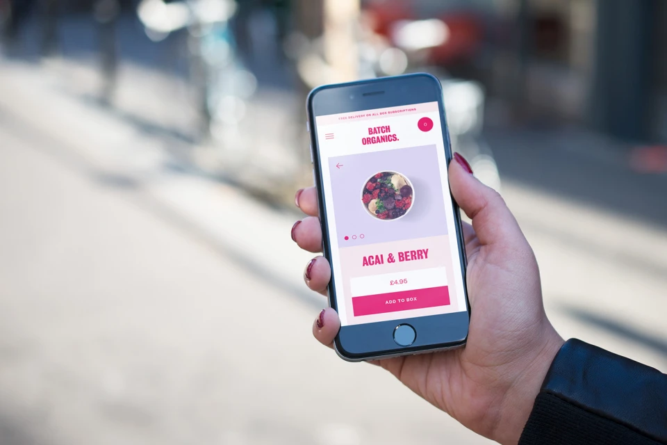
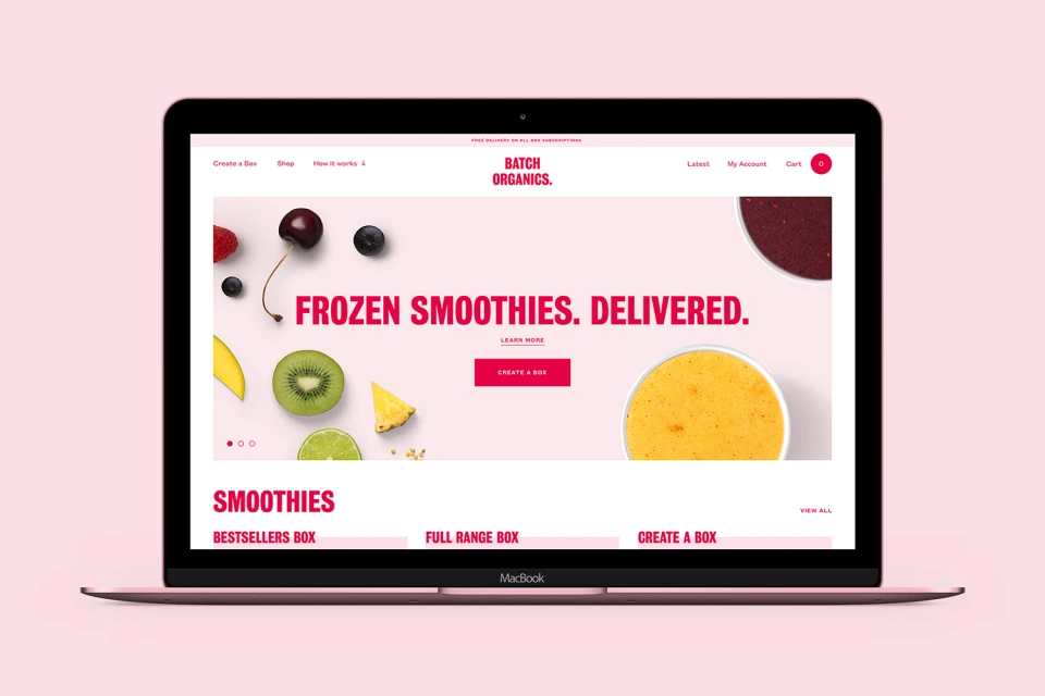
For the direct-to-consumer food and beverage sector, Batch Organics has unveiled a comprehensive brand identity that masterfully translates the simplicity of farm-fresh nutrition into a vibrant, modern visual system. Designed by Ragged Edge, the project prioritizes accessibility through a refined pastel pink and magenta color palette, underpinned by bold, sans-serif typography that communicates the brand promise of no-nonsense convenience. The aesthetic channels a clean and commercial sensibility, whether the identity is applied to tactile doorstep delivery packaging under soft natural light, or scaled to high-impact outdoor billboards in dense urban settings. This strategic use of typography serves as the anchor, effectively balancing the brand’s minimalist ethos with the raw, colorful appeal of its fresh ingredient photography. The identity extends seamlessly into the digital space, where UI illustrations and a professional, user-focused interface reinforce the delivery-first model. By utilizing studio strobe lighting for product imagery alongside sophisticated 3D render and CGI techniques in their identity guidelines, the team at Ragged Edge has built a cohesive ecosystem that feels both approachable and premium. This identity does not merely label a product; it creates a consistent, recognizable experience that bridges the gap between organic health-conscious living and the fast-paced requirements of modern, on-the-go consumers looking for authentic nutrition without the unnecessary marketing hype.
Horizontal, Commercial, Clean
Natural light
CPG / Packaged Food
