
Houst: Brand Identity
Mar 2020
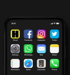
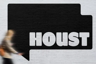
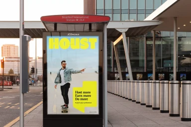
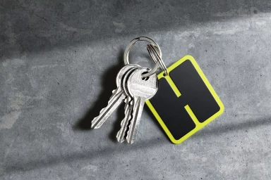
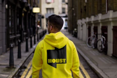
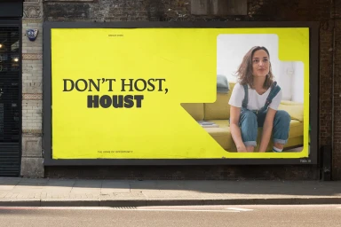
The recent brand identity rollout for Houst signifies a bold evolution in the property management sector, moving beyond traditional corporate aesthetics into a vibrant, lifestyle-driven visual language. Orchestrated by the creative team at Ragged Edge, the project masterfully employs a high-contrast yellow and black palette that anchors every touchpoint, from the sleek UI illustration of their mobile application to expansive urban billboards at Stratford International Station. By leveraging a clever play on words—Don't Host, Houst—the campaign effectively bridges the gap between digital utility and physical presence. The project leans into a clean, commercial sensibility, utilizing natural light and long exposure techniques to ground the brand in the rhythm of city life. Whether seen on high-visibility apparel in narrow alleyways or through studio-lit product photography of branded keychains, the identity remains remarkably consistent. This cohesive system excels by blending the sharp, sans-serif typography with candid, human-centered imagery, ensuring that the brand feels both approachable and authoritative. By integrating the brand across modern mobile ecosystems and large-scale outdoor media, the project succeeds in transforming a functional service into a recognizable lifestyle asset. This identity work demonstrates a sophisticated understanding of contemporary branding, where environmental design and digital presence work in lockstep to build lasting recognition within an increasingly crowded and competitive marketplace.
Commercial, Clean, Horizontal
