Ragged Edge: Brand Identity

Aug 2025
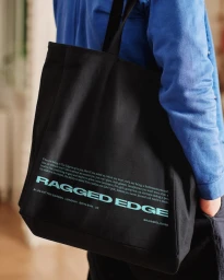
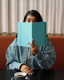
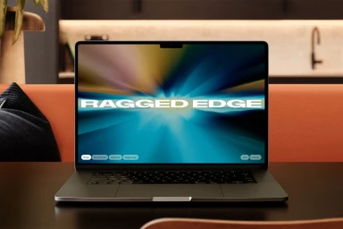
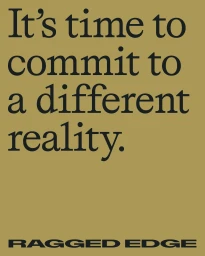
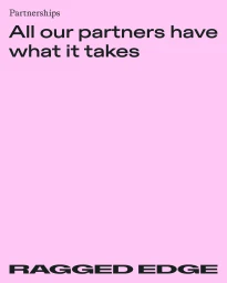
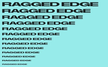
Ragged Edge presents a comprehensive brand identity project that explores the agency’s own visual language through typography, motion graphics, and editorial photography. The project serves as an experimental exploration of design systems, utilizing high-contrast color blocking and minimalist layouts to define a modern, digital-first presence. The execution relies on a blend of clean, vector-based graphic design and dynamic motion sequences. Key elements include bold serif typography paired with geometric sans-serif wordmarks, set against vibrant backgrounds of mustard gold, pink, and turquoise. The documentation of the process, captured by photographers Charlie McKay and Andrew Rankin, highlights the hands-on nature of the studio's strategy and development phase. Technical contributions include illustration by Adam Garbutt and web development by Mud. The resulting brand identity utilizes motion graphics to frame its diverse portfolio, presenting a consistent aesthetic across digital platforms and printed assets.
Vertical, Commercial
Solid Colour