
Heights: Brand Identity



Jan 2020
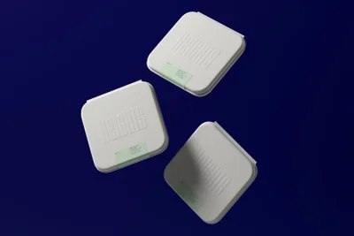
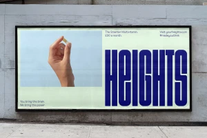
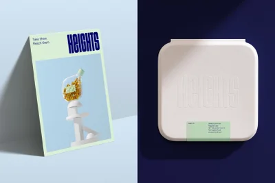
The brand identity for Heights, executed with design prowess by Ragged Edge, marks a definitive shift in the CPG and food and beverage landscape. By eschewing the cluttered visual tropes typical of the supplement industry, the project leans into a sophisticated, editorial minimalism that aligns scientific precision with organic vitality. The visual language utilizes a precise, high-key studio lighting approach, effectively bridging the gap between clinical reliability and natural wellness. Through a meticulously curated palette of powder blues, mint greens, and crisp whites, the work employs a clean, geometric structural style that elevates the product into the realm of high-end design. The campaign showcases an inventive interplay of textures, where macro photography captures the tactile quality of raw nutritional ingredients alongside the sleek, deliberate curvature of the glass packaging. Whether presented through 3D render and CGI techniques that highlight embossed tactile branding or through the grounded, urban application of large-scale outdoor billboard typography, the identity remains remarkably consistent. The synthesis of balanced commercial composition and bold, vertical sans-serif type creates a brand story that is as intellectually grounded as the product itself. By positioning the multivitamin as a modern lifestyle essential rather than a mere utility, the identity successfully crafts a narrative of cognitive power and physical health that resonates through both digital UI illustration and physical packaging design.
Commercial, Clean, Minimalist, Horizontal
