
Hipchips
Brand Identity

Jan 2017
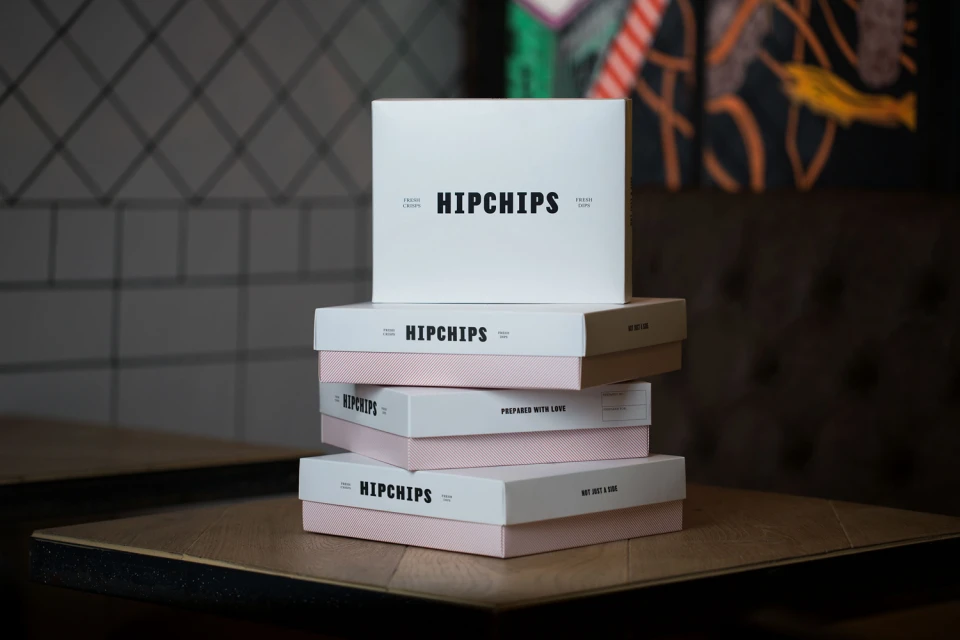
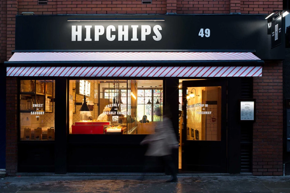
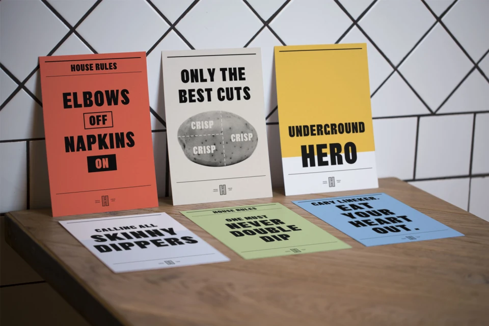
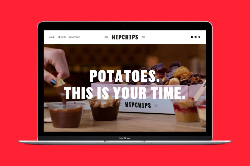
Hipchips has successfully redefined the snack food landscape through a cohesive and visually striking brand identity that balances artisanal quality with playful urban energy. In the competitive CPG and packaged food sector, the brand leverages a minimalist aesthetic to cut through the noise, anchoring its presence in a series of thoughtfully executed assets that range from high-contrast graphic design to inviting, lifestyle-driven photography. The visual narrative, developed by Ragged Edge, leans into a sophisticated typography-led system that pairs bold, sans-serif wordmarks with witty, conversational messaging that resonates across physical and digital touchpoints. By integrating elements like studio strobe lighting for pristine product shots alongside natural light techniques for lifestyle imagery, the identity feels both accessible and distinctly premium. The design language manifests beautifully across diverse applications, from the matte, textured finish of takeaway packaging to the vibrant, UI-driven website headers that capture the tactile nature of the product. This project illustrates how rigorous consistency in branding—visible in everything from the custom denim aprons to the graphic-forward signage of the brick-and-mortar store—can elevate simple, everyday staples into a modern lifestyle statement. With its strategic use of color palettes, including salmon orange and deep blacks, Hipchips establishes a recognizable, contemporary footprint that is as much about the experience as it is the crunch.
Horizontal, Commercial, Clean
Advertising Campaign
