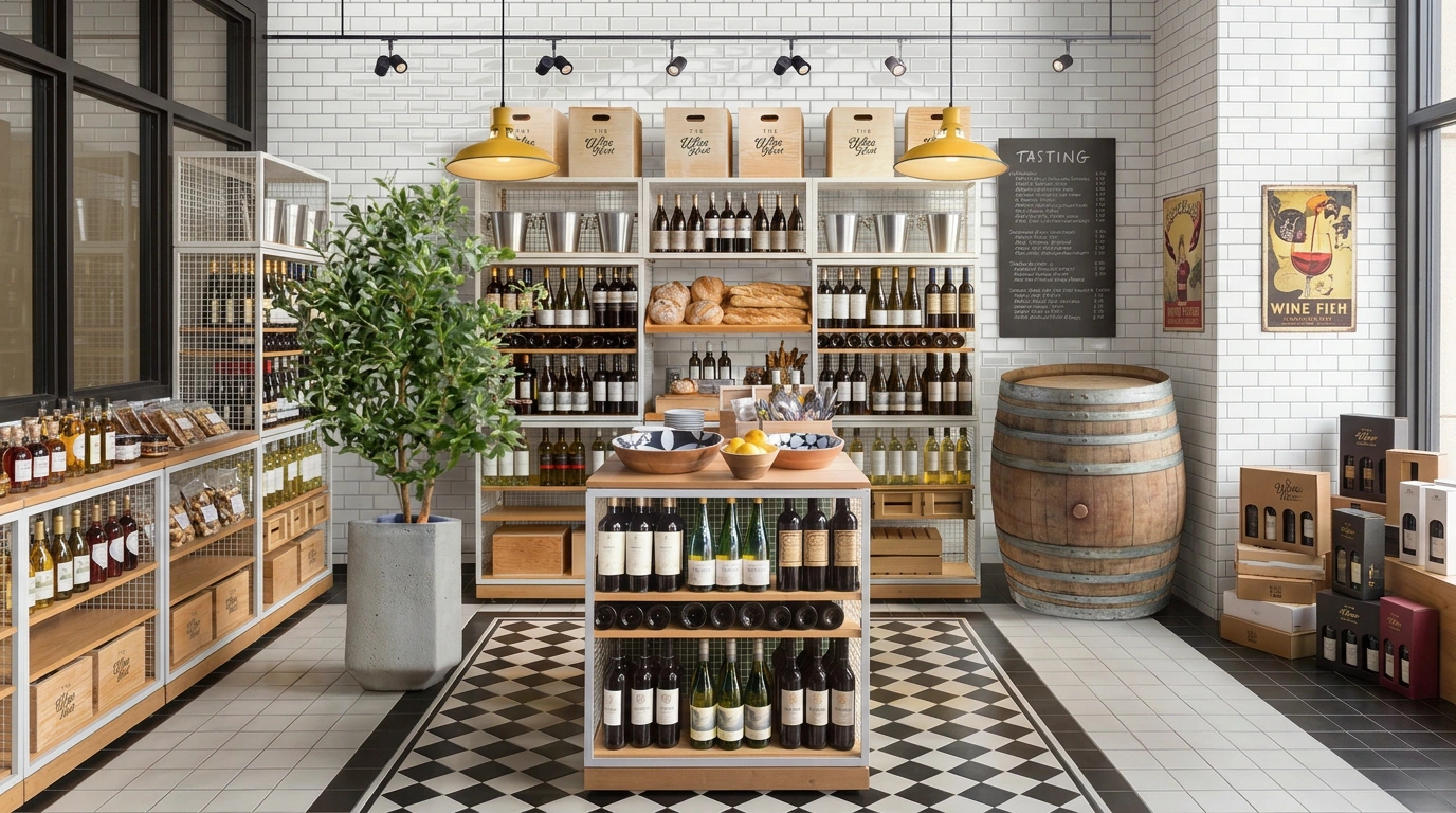
E-commerce Platforms
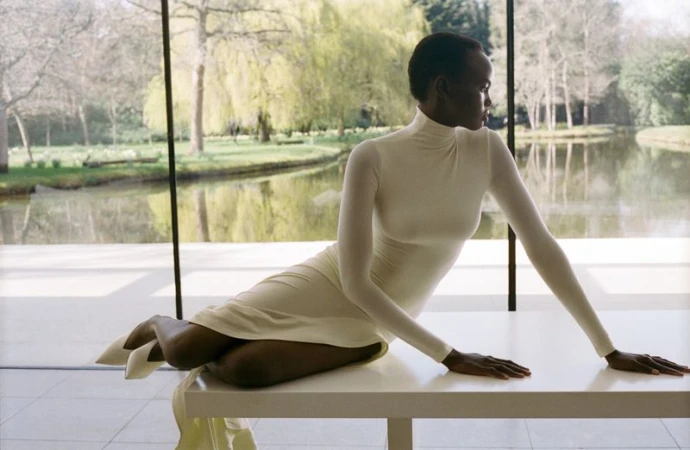
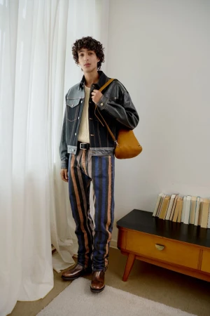
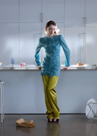
E-commerce Platforms photography has to meet a technical specification before it has to meet a creative one — exact dimensions, a pure white background, a consistent angle, so thousands of sellers' photos display uniformly. On Visie, that craft spans product and packshot photography for marques like Amazon, Net-A-Porter, Zalando, and Etsy, shot to published platform guidelines rather than a single creative brief.
This week's top E-commerce Platforms projects
This week's top E-commerce Platforms projects, carefully handpicked by Visie's expert curators, showcase the best in style and innovation.
Foot Locker · It Always Will Be Foot Locker
Foot Locker leans into the golden era of streetwear with its latest campaign, It Always Will Be Foot Locker, a vibrant homage to the heartbeat of 1980s sneaker culture. By blending the raw energy of urban fashion with a nostalgic lens, the project functions as a love letter to the silhouettes that defined a generation. The creative direction, spearheaded by Derek Siegel, masterfully captures the essence of the decade through a cinematic approach that feels both authentic and immediate. Utilizing an analogue film aesthetic, the campaign employs prominent film grain and a warm, slightly desaturated color grade to evoke the tactile quality of vintage television commercials. This live-action technique breathes life into a montage of diverse protagonists moving between professional basketball arenas, bustling tennis courts, and concrete sidewalks marked by vivid graffiti. The narrative is punctuated by iconic period-correct props—from rattling boomboxes to heavy gold chains—which ground the fast-paced editing in a tangible, historical reality. By prioritizing a lifestyle-focused visual language, the production successfully bridges the gap between retro heritage and contemporary retail relevance. The execution highlights the cultural weight of the sneaker, transforming simple footwear into symbols of personal expression and community identity within an e-commerce landscape that remains deeply rooted in its storied athletic origins.
Project Cocoon · Brand Identity
The brand identity for Cocoon is an exercise in restraint, transforming the act of finding home comfort into a sophisticated visual language. Designed by A Unified Whole, the project eschews the clutter typical of the e-commerce platforms and retail sector in favor of an aesthetic rooted in editorial minimalism. Through a cohesive blend of live-action technique and precise typography, the visual identity centers on the tactile quality of high-end textiles, utilizing natural light to capture the nuanced textures of faux fur, woven blankets, and sculptural stationery. The work excels in its dual focus: it is both a technical masterclass in geometric branding—evidenced by the interlocking circular emblem and meticulous grid-based design guidelines—and an evocative lifestyle campaign. Whether through cinematic video vignettes or macro photography that highlights individual fabric labels, the campaign channels a sense of stillness and luxury. By integrating a clean, intuitive digital interface with a grounded, earthy color palette, the brand manages to bridge the gap between abstract design and tangible human experience. Each asset, from the unboxing animations to the rhythmic street posters, reinforces the core promise that where comfort becomes form, the result is a serene, intentional presence. It is a polished, professional identity that elevates mass-market retail into a curated, sensory-driven journey for the consumer.
Google · Black Owned Friday
Google turns the lens on intentional consumerism with the latest iteration of its Black Owned Friday campaign, a vibrant project that masterfully blends e-commerce platforms with a sophisticated retail narrative. Eschewing the frantic, discount-heavy tropes typically associated with seasonal shopping, the creative direction leans into a polished, high-end commercial aesthetic that celebrates both personal style and community-driven commerce. The central visual sequence features a confident protagonist navigating an urban apartment hallway, an image that reads as both aspirational and deeply human. By prioritizing rich, warm lighting that highlights the intricate textures of the subject's afro and the tactile shearling of her jacket, the production achieves a distinct cinematic quality that elevates the brand message above standard advertising fare. This live-action technique creates a grounded, tangible sense of luxury that invites the viewer to look closer. With seamless production oversight by Max Cooper, the film succeeds in positioning the platform as a curator of quality rather than just a marketplace. It is an exercise in editorial minimalism, proving that even within a busy retail landscape, thoughtful pacing and intentional visual storytelling can effectively bridge the gap between digital utility and authentic cultural representation, ultimately reinforcing the importance of supporting Black-owned businesses through a lens of undeniable class and contemporary relevance.
Depop · Zara Larsson
Depop leans into the vibrant intersection of digital resale and pop culture in this high-energy commercial campaign featuring global sensation Zara Larsson. By blending the immediacy of the mobile marketplace with a curated, whimsical aesthetic, the project elevates the thrifting experience into a high-fashion lifestyle statement. The visuals utilize a polished, high-key lighting approach to bathe chic, pastel-hued domestic interiors in warmth, creating an atmosphere that is both aspirational and inherently approachable. Through the clever deployment of a Rube Goldberg-style machine that automates the listing process, the narrative bridges the gap between utilitarian e-commerce platforms and creative expression. The production employs dynamic live-action techniques, including precise slow motion and rapid-fire cuts, to capture Larsson's effervescent personality as she navigates a series of colorful, textured spaces. With significant contributions to post-production and visual effects from the teams at Company 3 LA and JAMM, the campaign maintains a cohesive, glossy finish that feels perfectly tailored for its youthful audience. The deliberate styling—ranging from bold turquoise robes to playful, layered outfits—reinforces the brand’s identity as a hub for individual style. Ultimately, this collaboration captures the tactile joy of the secondary fashion market, transforming the digital act of selling clothes into a vibrant, cinematic performance that resonates with modern consumers who value personality as much as product.
Instacart · The Male Shopper Project
In a refreshing pivot for e-commerce platforms, Instacart launches The Male Shopper Project, a witty editorial brand campaign that deftly leans into cultural stereotypes surrounding grocery shopping habits. The spot features television personality Antoni Porowski, who anchors the narrative with his signature charm while sitting opposite a skeptical host in a lively, conversational podcast setting. The visual language is defined by a bold, brightly lit aesthetic featuring geometric triangle backdrops that pop against the screen. By utilizing live-action technique and clever slow motion inserts to punctuate the comedic beats, the film transforms relatable social media grievances into a polished commercial piece that feels both timely and authentic. The creative direction from the Instacart team effectively bridges the gap between digital consumer frustration and the convenience of the service itself, grounding the humor in a polished lifestyle framework. By prioritizing sharp dialogue and character-driven comedy over high-gloss artifice, the production succeeds in positioning the brand as a partner in modern domestic life. The final result is a clever, high-energy commentary on modern consumption that feels right at home in today’s social-first landscape, proving that retail advertising can indeed benefit from a healthy dose of self-awareness and a personality-forward approach that resonates deeply with an online audience hungry for genuine, lighthearted engagement.
Amazon Prime · Delivering Feels
Amazon Prime pushes the boundaries of its brand identity with the Delivering Feels campaign, a cinematic commercial spot that masterfully juxtaposes high-octane superhero spectacle with the grounded, mundane reality of e-commerce retail logistics. The narrative hinges on a surreal encounter where a stoic delivery driver navigates a room shattered by the intense confrontation between two powerful superheroes. Amidst a backdrop of crumbling infrastructure and glowing visual cues, the driver remains entirely unfazed, prioritizing the parcel drop-off over the surrounding mayhem. This clever use of humorous storytelling allows the brand to lean into the reliable, omnipresent nature of its service, treating it as an immovable constant in a chaotic world. The production utilizes high-end live-action technique to ground the absurdity, while the seamless integration of advanced VFX / visual effects creates a polished, blockbuster-tier aesthetic. With meticulous post-production work from Untold Studios and evocative sound design by Lime Studios, the spot balances dramatic, warm orange-hued lighting with the comedic timing of a classic deadpan delivery. By anchoring the fantastical premise in the familiar rituals of modern e-commerce platforms, the film effectively highlights the utility of Amazon Prime while delivering a genuinely entertaining, genre-bending experience that resonates far beyond a standard retail advertisement, proving that even in the midst of epic destruction, the promise of delivery remains supreme.
Project Farfetch · Farfetch First
Farfetch First reimagines the intersection of high-end retail and cinematic storytelling, crafting a campaign that transcends traditional e-commerce presentation to capture the kinetic energy of modern fashion. Through a sophisticated interplay of environments, the campaign moves from the moody, marble-clad interiors of an elevator lobby to the sun-drenched, motion-blurred urgency of city streets. Photographers Tanya and Zhenya Posternak leverage a precise mix of cinematic and live-action techniques to define the project aesthetic, grounding the high-fashion editorial narrative in relatable, lifestyle-driven contexts. The visual language shifts seamlessly between the crisp, flat lighting of studio sessions and the dynamic, natural light of urban exploration, highlighting the diversity and sartorial confidence of models like Aweng Chuol and Joseph Uyttenhove. With the expertise of fashion director Tati Cotliar, the project achieves an elevated, curated feel, balancing structured tailoring with vibrant, graphic-heavy styling that commands attention against neutral architectural backdrops. Every frame, from the stark geometric compositions of a crosswalk to the subtle, performative gestures choreographed by Paolo Vecchione, speaks to a vision of retail that prioritizes mood and movement. By seamlessly weaving together commercial intent and artistic flair, the campaign succeeds in creating a distinct visual identity for the platform, ensuring that every curated look feels like a deliberate, stylish event rather than a static product showcase.
Project Zalando · What do I wear
Zalando tackles the perennial holiday sartorial dilemma with its latest What do I wear campaign, a masterclass in lifestyle commercial storytelling that pivots away from rigid lookbooks toward authentic, relatable human moments. By posing rhetorical questions against a backdrop of domestic chaos and festive cheer, the project grounds e-commerce retail in the messy, wonderful reality of the season. Photographer Rosie Marks captures these vignettes with a signature eye for narrative depth, utilizing a live-action technique that feels both staged and spontaneously candid. From the quiet tension of a parent navigating a toddler’s play session to the playful, performative surprise of a holiday mistletoe encounter, the work moves fluidly through various textures—satin, heavy knits, and sequins—brought together by the astute styling of fashion editor Elena Mottola. The visual language is defined by a soft, bright, and warm lighting style that transforms everyday living rooms and bathrooms into intimate stages. Featuring talent such as Oli Green and Tish Weinstock, the campaign leans into the idea that clothing is not just aesthetic, but a companion to our shifting seasonal moods. By framing high-fashion pieces alongside the mundane artifacts of a holiday gathering, Zalando successfully humanizes the shopping experience, ensuring the brand feels like a participant in the user's life rather than just a destination for their next transaction.
Project Zalando · What do I wear
Zalando tackles the perennial holiday sartorial dilemma with its latest What do I wear campaign, a masterclass in lifestyle commercial storytelling that pivots away from rigid lookbooks toward authentic, relatable human moments. By posing rhetorical questions against a backdrop of domestic chaos and festive cheer, the project grounds e-commerce retail in the messy, wonderful reality of the season. Photographer Rosie Marks captures these vignettes with a signature eye for narrative depth, utilizing a live-action technique that feels both staged and spontaneously candid. From the quiet tension of a parent navigating a toddler’s play session to the playful, performative surprise of a holiday mistletoe encounter, the work moves fluidly through various textures—satin, heavy knits, and sequins—brought together by the astute styling of fashion editor Elena Mottola. The visual language is defined by a soft, bright, and warm lighting style that transforms everyday living rooms and bathrooms into intimate stages. Featuring talent such as Oli Green and Tish Weinstock, the campaign leans into the idea that clothing is not just aesthetic, but a companion to our shifting seasonal moods. By framing high-fashion pieces alongside the mundane artifacts of a holiday gathering, Zalando successfully humanizes the shopping experience, ensuring the brand feels like a participant in the user's life rather than just a destination for their next transaction.
Project Zalando · What do I wear
Zalando tackles the perennial holiday sartorial dilemma with its latest What do I wear campaign, a masterclass in lifestyle commercial storytelling that pivots away from rigid lookbooks toward authentic, relatable human moments. By posing rhetorical questions against a backdrop of domestic chaos and festive cheer, the project grounds e-commerce retail in the messy, wonderful reality of the season. Photographer Rosie Marks captures these vignettes with a signature eye for narrative depth, utilizing a live-action technique that feels both staged and spontaneously candid. From the quiet tension of a parent navigating a toddler’s play session to the playful, performative surprise of a holiday mistletoe encounter, the work moves fluidly through various textures—satin, heavy knits, and sequins—brought together by the astute styling of fashion editor Elena Mottola. The visual language is defined by a soft, bright, and warm lighting style that transforms everyday living rooms and bathrooms into intimate stages. Featuring talent such as Oli Green and Tish Weinstock, the campaign leans into the idea that clothing is not just aesthetic, but a companion to our shifting seasonal moods. By framing high-fashion pieces alongside the mundane artifacts of a holiday gathering, Zalando successfully humanizes the shopping experience, ensuring the brand feels like a participant in the user's life rather than just a destination for their next transaction.
Project Floyd · Brand Identity
Floyd has redefined the Direct-to-Consumer furniture landscape by leaning into a rigorous, design-led visual identity that prioritizes clarity, modularity, and an unwavering commitment to minimalist aesthetics. Through a comprehensive corporate brand identity project, the furniture company achieves a seamless cohesion between its digital storefront and physical touchpoints. The project centers on a bold, high-contrast visual language defined by a vibrant orange-red palette and clean, geometric sans-serif typography that feels both approachable and authoritative. By employing precise vector graphics and structural typography, the brand reinforces its presence across a diverse array of assets—from tactile fabric swatches and promotional stationery to architectural exterior signage. Each execution relies on a disciplined use of hard light to ensure the brand name stands out with clinical precision, whether captured in a commercial studio setting or integrated into a lifestyle shot of a delivery box arriving at a residential brownstone. The design system succeeds because it is scalable and modular, mirroring the very nature of the products themselves. By focusing on essential forms and a limited color story, Floyd channels a sense of modern reliability. The result is an cohesive brand identity that feels as intentional as the furniture it represents, proving that effective e-commerce branding relies on the harmonious interplay between utility, graphic consistency, and authentic, human-centered messaging.
Project Back Market · Brand Identity
Back Market has redefined the aesthetic language of the circular economy through a bold brand identity that eschews the sterility often associated with refurbished electronics. By leaning into a high-contrast palette of monochromatic black and white accented by playful pastel motifs, the project establishes a visual system that feels both subversive and remarkably approachable. The creative execution, developed with design leadership from Koto, masterfully blends commercial typography with an irreverent, sticker-inspired design vocabulary that channels a counter-cultural spirit. Across a diverse range of touchpoints, the identity maintains a consistent, minimalist rigor that proves sustainable tech doesn't need to sacrifice style for substance. The work successfully navigates the intersection of e-commerce platforms and physical retail, utilizing natural light to ground its outdoor billboard installations within the gritty, textured reality of urban environments. From vertical transit advertisements to intricate UI illustrations for social media, the brand identity remains cohesive, utilizing a clean, vector-based approach that speaks directly to a generation of conscious consumers. The result is a vibrant, unmistakable presence that transforms the narrative of second-hand devices into an essential fashion statement, effectively positioning the brand as a leader in the refurb revolution while maintaining a sharp, irreverent edge in its communication.
Explore other industries
Explore Visie's leading industries, projects, and the talented creatives representing them.