
Urban Lemonade: Brand Identity
Jun 2020
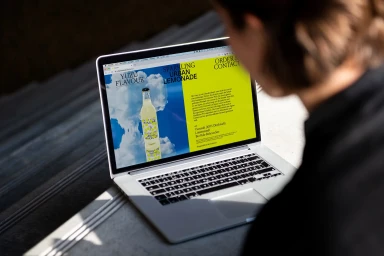
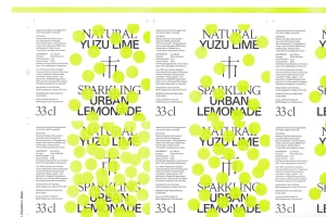
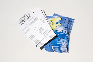
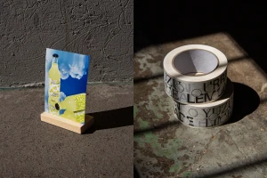
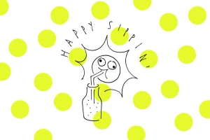
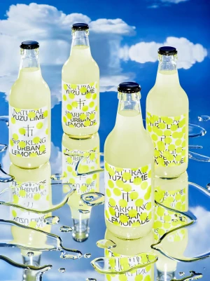
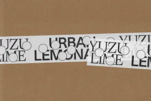
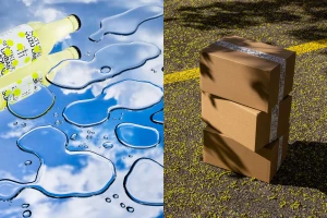
The brand identity for Urban Lemonade, a premium CPG beverage, masterfully bridges the gap between clean, corporate precision and whimsical, artistic flair. Through a comprehensive suite of assets, the project establishes a refreshing visual language that leans into the intersection of modern typography and vibrant, nature-inspired imagery. Graphic designers Kevin Högger and Jalscha Römer have curated a system that thrives on contrast, pairing stark, minimalist serif typography against playful, hand-drawn vector illustrations and geometric polka-dot patterns. This commercial approach is further elevated by the photography of Studio Siebrecht, which captures the product in diverse environments, utilizing hard light and natural light to emphasize the crispness of the glass bottles and the fluidity of the brand's celestial, blue-sky motifs. Whether displayed on industrial corrugated cardboard, high-end mirrored surfaces, or digital UI illustrations, the identity remains cohesive and punchy. The execution manages to feel both structured, thanks to its clear grid-based layout and print-ready production files, and lighthearted, successfully capturing the essence of a sparkling yuzu beverage. By balancing sharp graphic design with an almost cinematic approach to lifestyle photography, the team has built a visual identity that is as refreshing as the product itself, ensuring that Urban Lemonade stands out in a crowded marketplace with a distinct, memorable, and cheerful presence.
Horizontal, Commercial, Clean
Natural light
Advertising Campaign


