
The Sans: Brand Identity

Sep 2022
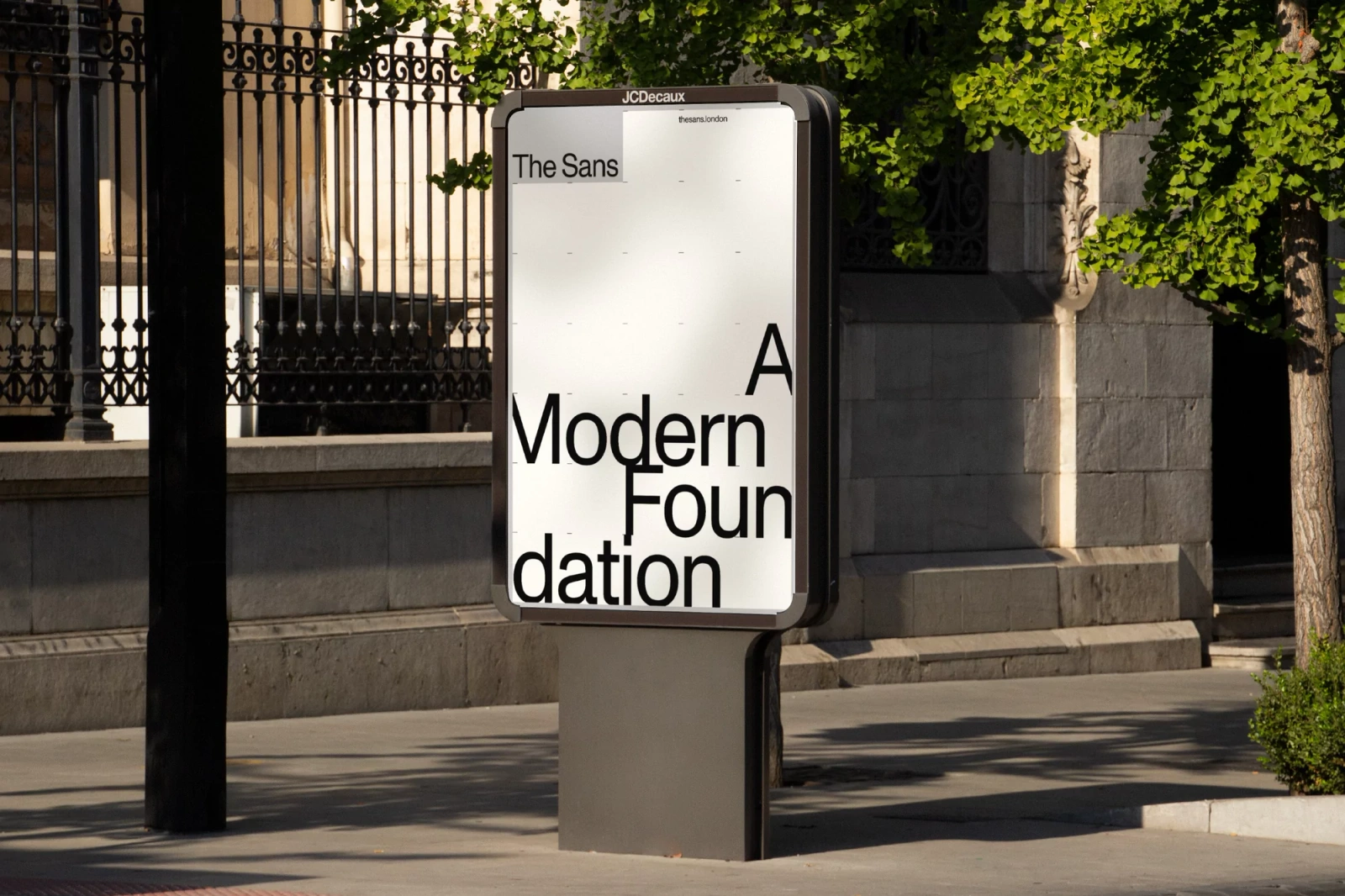
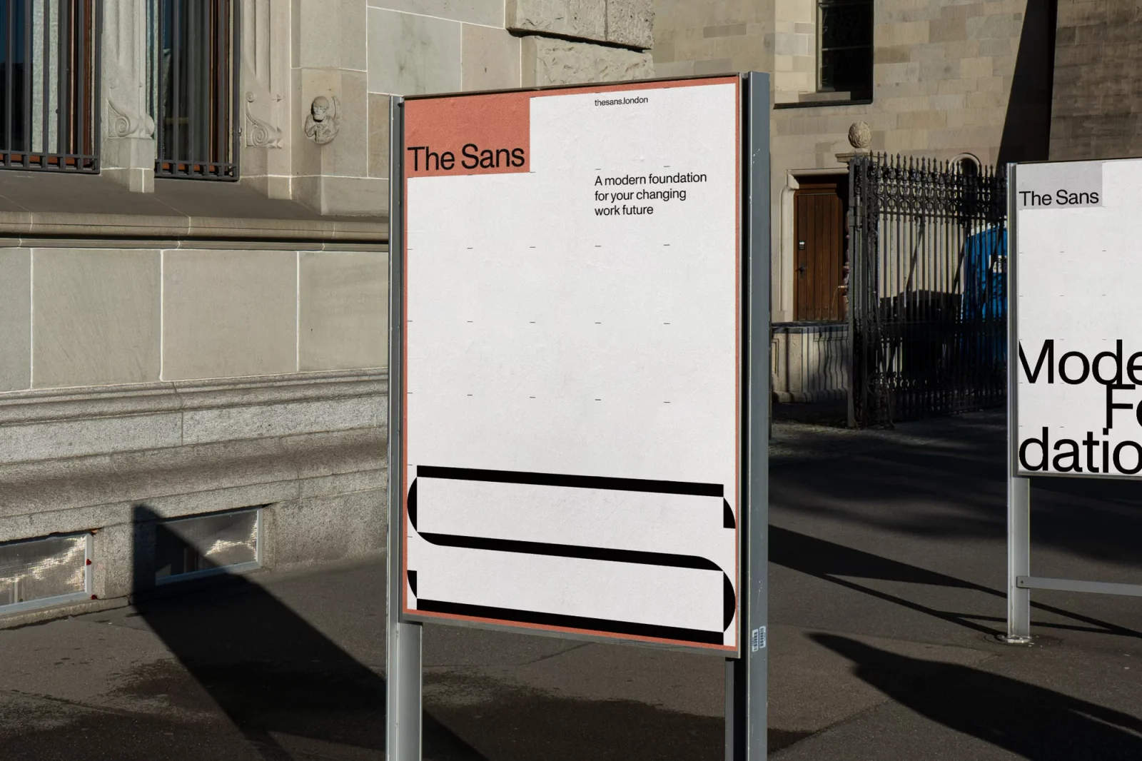
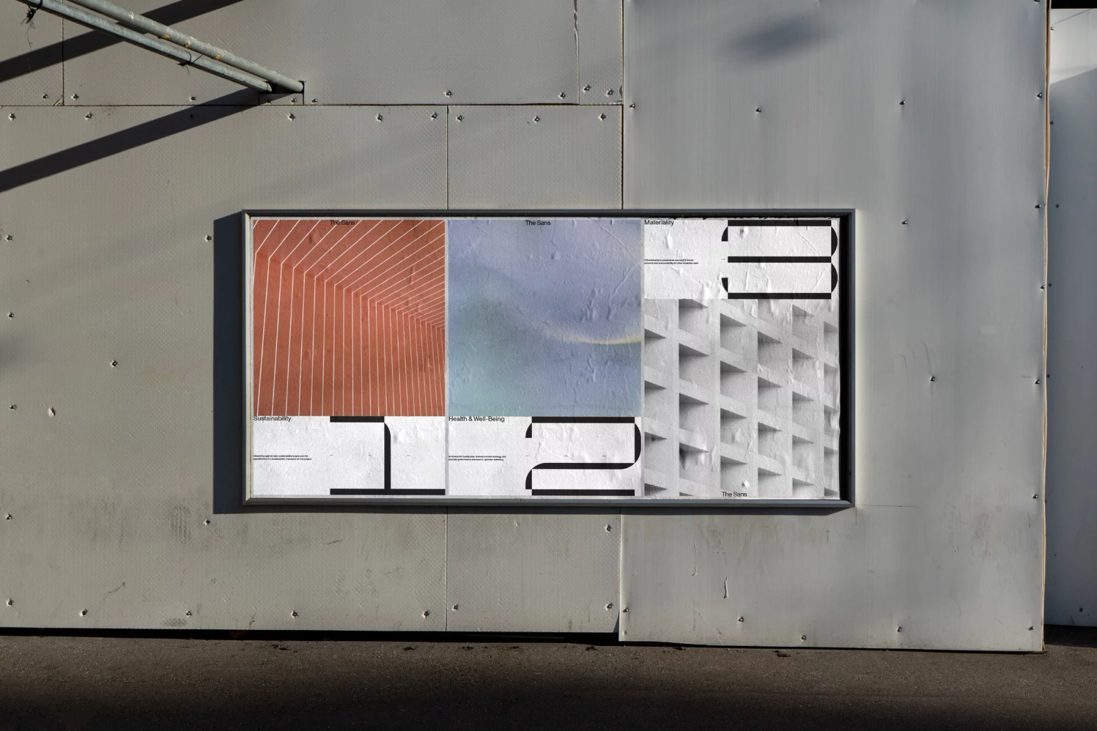
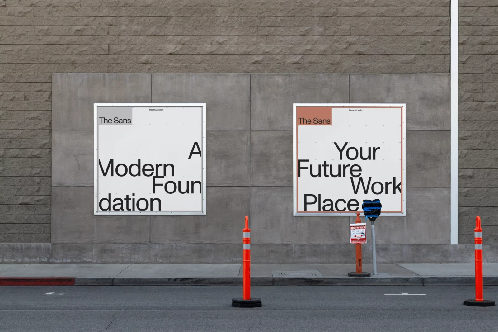
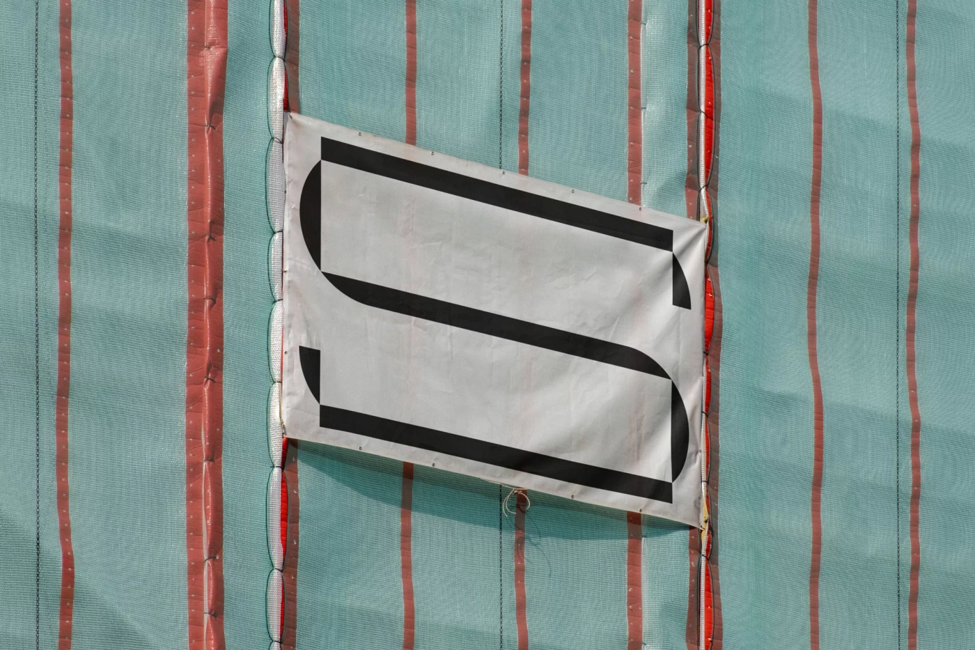
The Sans brand identity project centers on a minimalist graphic design system that integrates precise typography with architectural geometry. Developed by Campbell Hay, the work utilizes a monochromatic palette and bold, clean lines to establish a modern visual framework. The project manifests across various outdoor media, including large-scale billboard posters and street-level signage. These applications leverage industrial textures—such as corrugated metal and concrete—as a backdrop for high-contrast typographic layouts, effectively balancing negative space with structured graphic arrangements. Building on this identity, the design system extends into motion graphics. The sequence features a geometric lettermark animation and rigid grid structures, maintaining a consistent aesthetic of minimalism and clarity throughout the physical and digital environments.
Commercial, Clean, Minimalist, Horizontal
Typography
