
TaylorMade: Brand Identity


Brand
Date
Mar 2021
Description
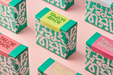
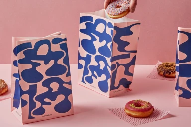
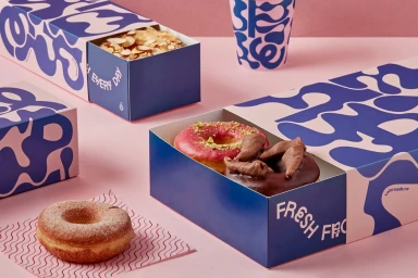
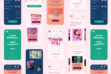
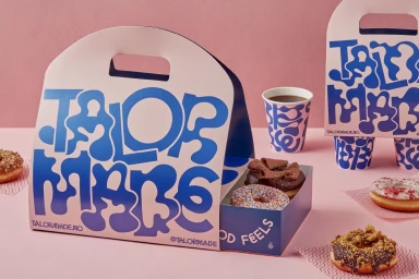
TaylorMade’s brand identity project, designed by Bielke&Yang, establishes a vibrant visual system centered on a bold palette of pink and deep blue. The execution spans digital and physical touchpoints, incorporating clean, minimalist packaging alongside dynamic motion graphics and mobile application UI design. The project leans into a playful aesthetic, featuring custom typography with organic fluid patterns and rounded letterforms. Across print and digital formats, the work maintains a high-contrast graphic style, utilizing natural light and clean studio compositions to emphasize the tactile quality of product packaging and the consistency of the brand’s digital interaction.
Style
Horizontal, Commercial, Clean
Background
Solid Colour
Associated creatives

5000+ creatives to discover
Sign up to gain access to the entire directory. It’s free.
Visie is a curated library of creative professionals.