
Brand
ProjectBrand Identity
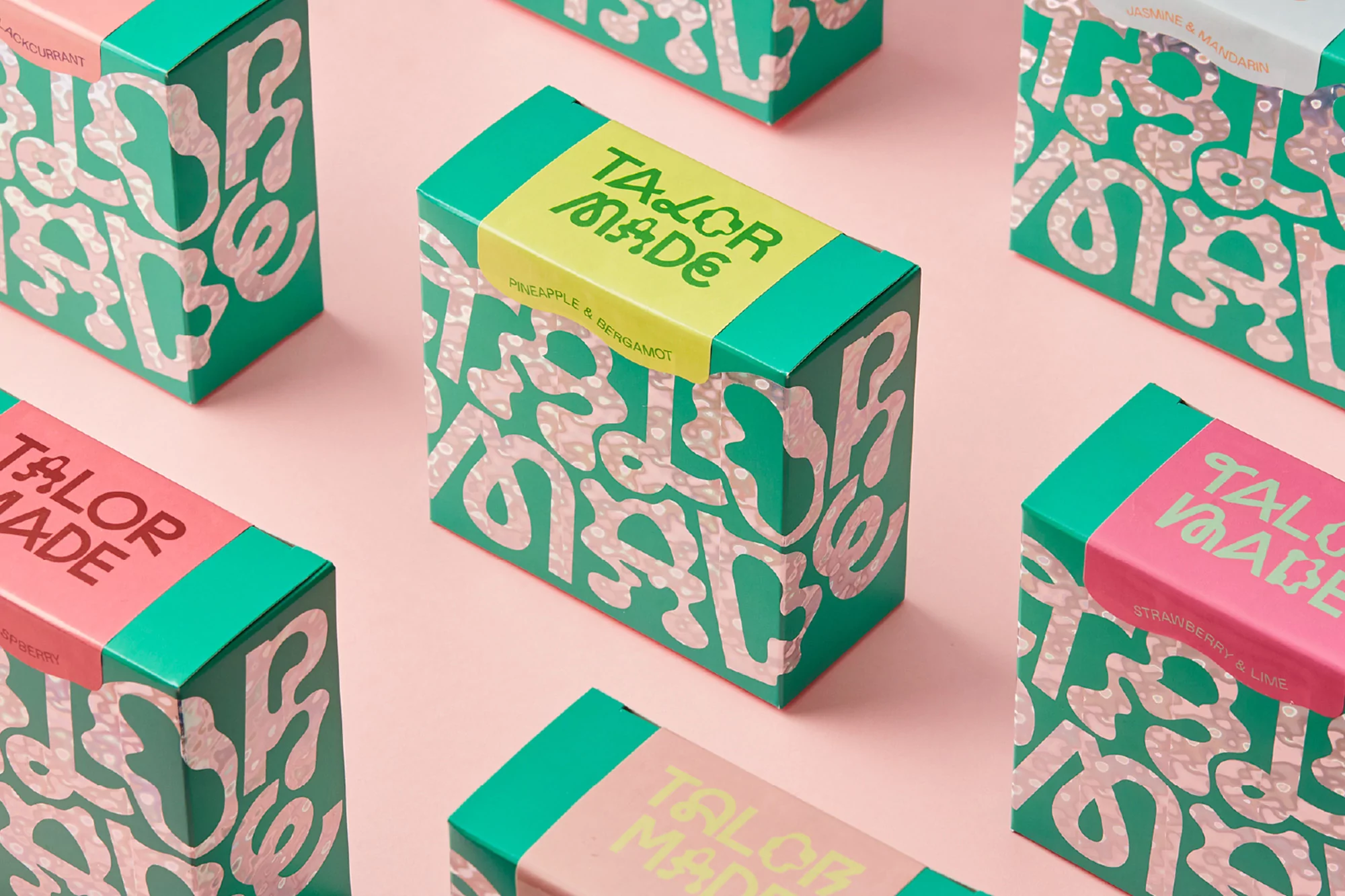
TaylorMade Brand Identity 2021
Associated creatives

Tags
Description
This product packaging design showcases multiple rectangular boxes arranged neatly on a solid pale pink surface. The packaging features vibrant green and pink color schemes adorned with organic patterns and playful custom typography. The lighting is soft and even, casting subtle shadows that create depth across the composition. Created by Bielke & Yang as part of the Brand Identity project for TaylorMade, the clean and modern arrangement highlights the tactile qualities of the printed surfaces.