
Brand
ProjectBrand Identity
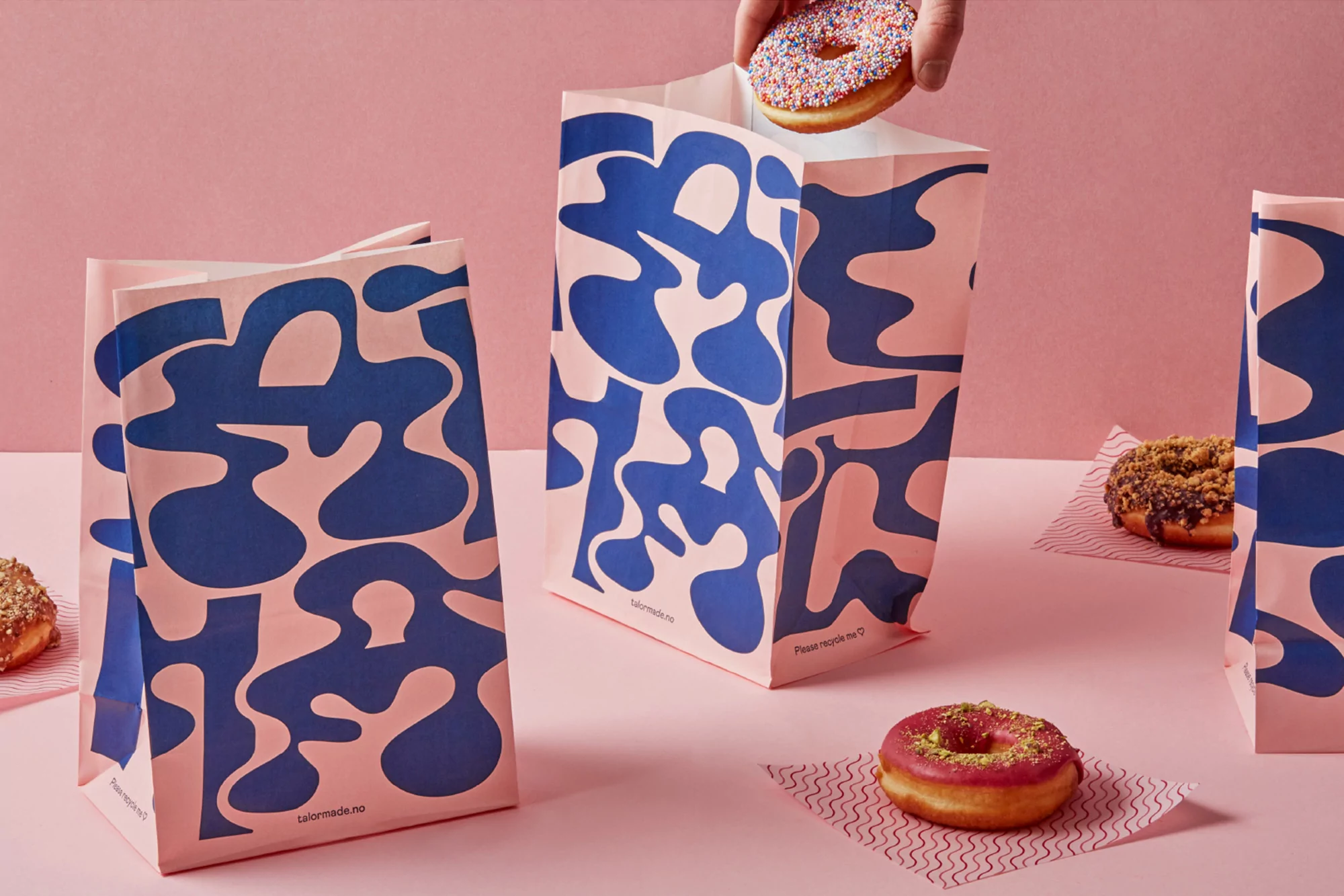
TaylorMade Brand Identity 2021
Associated creatives

Tags
Description
This image showcases brand identity packaging featuring pink paper bags adorned with bold blue organic fluid patterns arranged on a solid pink tabletop. Several glazed donuts, some topped with colorful sprinkles and others with chocolate and pistachios, are placed on patterned paper liners around the bags. A hand is captured in the act of placing a sprinkle-covered donut into the open top of the central bag. The lighting is soft and even, highlighting the smooth textures of the paper and the glossy finishes of the pastries. Bielke&Yang designed the graphic identity for the TaylorMade project.