
Sweep: Brand Identity



Jul 2021
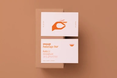
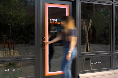
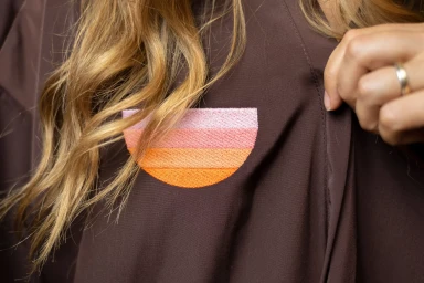
The brand identity for Sweep, developed by The Office of Ordinary Things, establishes a cohesive visual language across both physical collateral and storefront architecture. The system leans into warm, earthy tones and minimalist typography to ground the brand’s aesthetic, which is applied consistently from tactile business card layouts to large-scale exterior signage. By integrating structured graphic design with organic elements, the project creates a distinct presence within the commercial beauty space. The execution relies on a blend of clean, high-contrast imagery and textural photography, featuring techniques such as embroidery and long exposure to communicate movement and quality. From the precise application of orange and pink gradients on window frames to detailed brand markings on salon tools, the identity functions as a comprehensive system. The visual narrative extends into outdoor editorial content, where the brand’s color palette is mirrored in set design and styling to maintain its distinct character.
Commercial, Clean, Horizontal
Natural light
Advertising Campaign
