
unknown: Brand Identity


Dec 2019
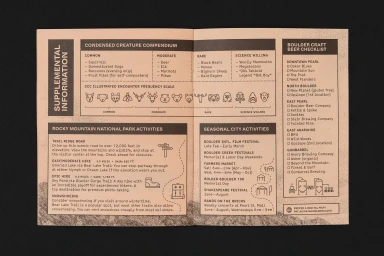
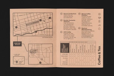
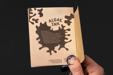
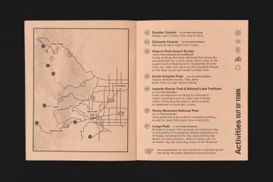
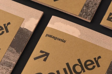
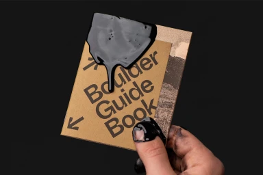
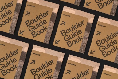
This comprehensive brand identity project for a Boulder-based visitor guide expertly balances utilitarian data visualization with a sophisticated, tactile aesthetic. Executed by The Office of Ordinary Things, the identity leans into a minimalist graphic design philosophy, utilizing clean sans-serif typography and structured infographics to navigate the complexities of local travel. The collateral—ranging from detailed maps of Boulder to creature compendiums for Rocky Mountain National Park—is brought to life on textured, natural-fiber paper stock that emphasizes a commitment to organic materiality. By pairing these high-quality, matte print elements with the raw, performative process of ink preparation, the project creates a dialogue between corporate professional polish and the gritty, hands-on reality of traditional printmaking. The visual language is anchored by a grainy, stippled aesthetic that evokes a sense of permanence and craft, further reinforced by the high-contrast interaction of opaque black inks against warm, peach-toned paper. Through the use of macro photography and deliberate, minimalist line-art icons, the identity transcends simple informational display, offering a cohesive and deeply tactile experience. This approach to brand development demonstrates how thoughtful typography and purposeful, abstract graphic elements can transform a standard visitor guide into a collectable piece of commercial design that feels both grounded in its local environment and modern in its execution.
Horizontal, Commercial, Clean
Typography
