
CleanO2: Brand Identity


Sep 2022
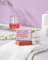
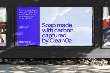
The brand identity for CleanO2, developed by The Office of Ordinary Things, establishes a visual system centered on the intersection of carbon capture technology and personal care. The project utilizes a cohesive color palette of vibrant blues, purples, and warm yellows, pairing minimalist studio photography with motion graphics to communicate the brand's core mission. Execution across the identity relies on clean typography and geometric layouts to maintain a commercial, approachable aesthetic. Supporting elements—including orange wedges, textured surfaces, and floating translucent bubbles—provide tactile contrast to the clinical precision of the packaging. The identity scales across various touchpoints, from digital animation and 3D rendered product reveals to large-format outdoor signage.
Commercial, Clean
