
Verkat: Brand Identity





Mar 2020
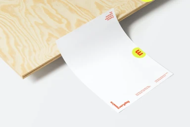
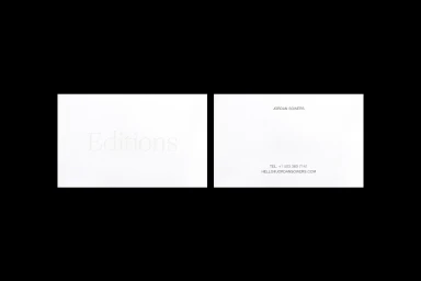
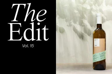
The brand identity for Verkat serves as a masterclass in commercial design, seamlessly blending corporate precision with a sophisticated lifestyle aesthetic. Across a diverse range of touchpoints, the visual system leans into an ethos of editorial minimalism, prioritizing clean layouts and tactile depth. By utilizing high-key lighting and thoughtfully curated textures—ranging from embossed stationery to frosted glass partitions—the project achieves a cohesive, premium look that feels both grounded and aspirational. The creative execution, developed through the collaborative efforts of Metaklinika, The Office of Ordinary Things, Jordan Sowers, and Unifikat Design Studio, demonstrates a nuanced approach to typography and spatial arrangement. Whether applied to wine packaging, large-scale construction site hoardings, or bespoke business cards, the identity maintains a distinct, graphic language that is as functional as it is evocative. The use of natural light and soft, diffused environments further underscores this polished identity, creating a bridge between abstract brand values and tangible product presentation. By balancing crisp, sans-serif elements with evocative photographic vignettes, the work establishes a versatile visual framework that feels inherently modern. This project succeeds by rejecting visual clutter, instead opting for a refined, professional clarity that allows the brand to speak through its own deliberate, well-considered components, ultimately proving that high-end identity design is best served through restraint and technical exactitude.
Horizontal, Commercial, Clean, Minimalist
White Seamless
E-commerce / Product


