Oroton: Brand Identity

Sep 2020
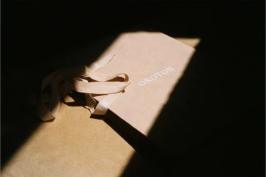
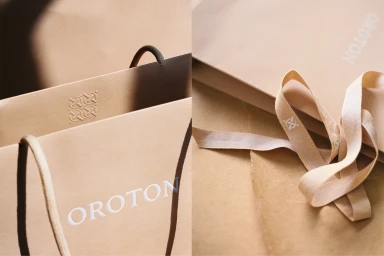
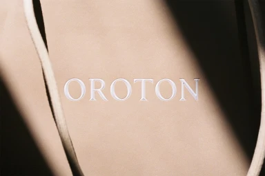
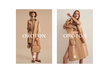
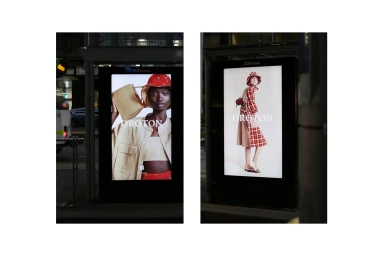
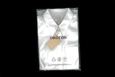
The latest brand identity project for Oroton masterfully channels an aesthetic of refined, monochromatic elegance that elevates the heritage of the Australian fashion label. By leaning into a soft palette of camel and neutral beige, the visual language achieves a sense of timeless sophistication that feels both contemporary and grounded. The execution utilizes a blend of editorial minimalism and cinematic lighting, with the photography by Simon Lekias, Victoria Zschommler, and the team at Years Months Days capturing both the tactile, paper-based textures of the packaging and the structured silhouettes of the seasonal apparel. This identity work integrates emboss and deboss techniques to highlight the brand's commitment to craftsmanship, while the use of natural light and chiaroscuro creates depth across the campaign imagery. The campaign seamlessly transitions from the intimate, macro-focused detail of the retail experience to expansive, live-action technique billboards situated in urban settings. With graphic design and creative direction from the agency Years Months Days, the project successfully balances a high-end commercial polish with an artistic, vector-based geometric precision. This cohesive brand identity reinforces the house's narrative, inviting consumers into an elevated, curated world that prioritizes clean lines and high-quality materials, ensuring the Oroton name stands out as a hallmark of structured, modern luxury in an increasingly cluttered retail landscape.
Horizontal, Commercial, Clean