
Brand
ProjectBrand Identity
Mohawk Brand Identity 2024
Associated creatives


Tags
Description
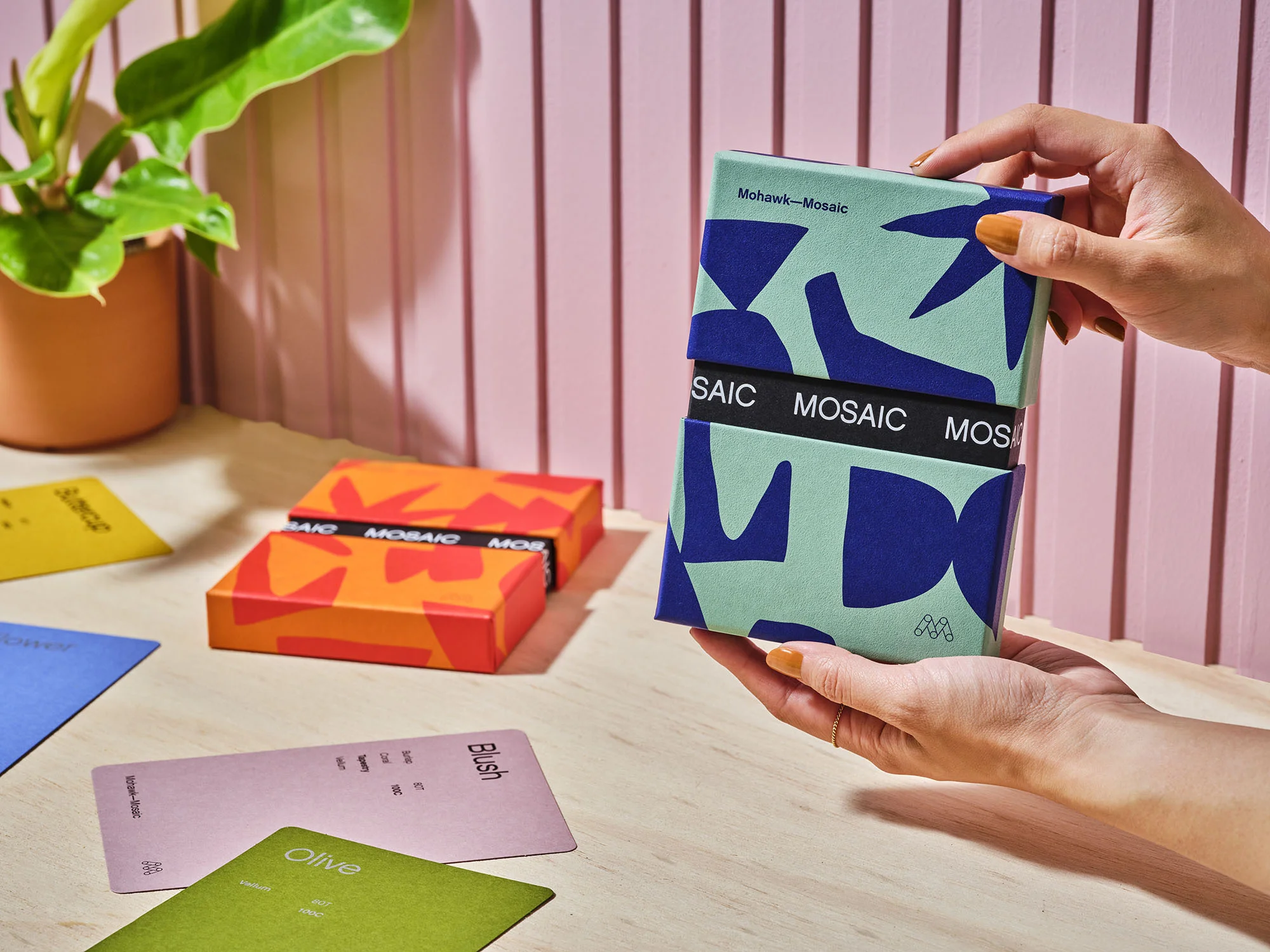
This product photography piece showcases the brand identity and packaging design for Mohawk Mosaic, captured by photographer Rob Williamson with graphic design by Hybrid Design and styling by Megan Petrilla. Hands gently hold a rectangular paper box wrapped in a teal and blue geometric patterned sleeve with a black central band displaying the Mosaic title. Additional orange and red patterned boxes and coloured paper samples rest on the light wooden tabletop surface. In the background, a vertical pink paneled wall provides a soft, structured backdrop alongside a potted green plant on the left. The composition uses bright, natural lighting and clean styling to highlight the tactile qualities of the paper and print finishing.