
Brand
ProjectBrand Identity
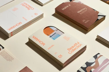
Mohawk Brand Identity 2023
Associated creatives


Tags
Description
This top-down photograph showcases stacked sample booklets created for Mohawk by Hybrid Design, with photography by Henrik Kam as part of the Brand Identity project. Several booklets feature cream covers with prominent orange typography reading Mohawk and Beautiful Collection, alongside die-cut arched windows revealing interior imagery. Other booklets display rust-brown covers or abstract geometric patterned papers arranged on a pale neutral background. Crisp lighting casts soft, directional shadows across the composition, highlighting the rich tactile qualities of the specialty paper stocks.