LOT61 Coffee Roasters: Brand Identity





Sep 2020
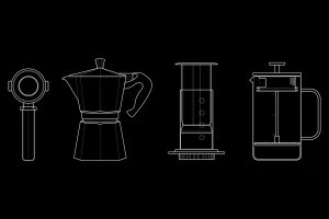
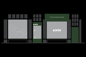
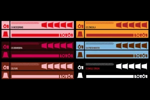
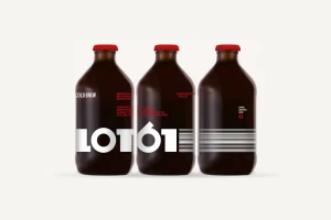
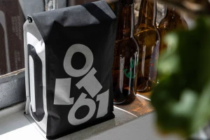
LOT61 Coffee Roasters has cultivated a distinct visual language that merges industrial precision with a modern lifestyle appeal, effectively positioning the brand as a leader in the competitive specialty coffee industry. The brand identity project, spearheaded by the design studio Smörgåsbord, masterfully balances technical clarity with aesthetic warmth. Through a sophisticated application of minimalist typography and bold vector graphics, the brand establishes a high-contrast corporate identity that feels both established and accessible. The design system leans into a rigorous use of line art to detail coffee equipment, while concurrently utilizing a vibrant, data-driven color palette across their packaging suite to differentiate individual roasts. This visual consistency is anchored by a commitment to clean, functional design, evident in everything from the symmetrical architectural elevations of their storefronts to the high-key studio photography of their cold brew bottles. By integrating these graphic elements with authentic lifestyle photography that captures the everyday texture of coffee culture, LOT61 achieves a versatile identity that remains legible across physical retail, digital interfaces, and physical product labels alike. The result is a cohesive brand ecosystem where every touchpoint—from the matte finish of professional brewing hardware to the tactile nature of their paper packaging—serves to reinforce the precision, quality, and origin stories that define the company’s global roasting footprint in Amsterdam and beyond.
Horizontal, Commercial, Clean
Advertising Campaign