
ipanema: Brand Identity



Brand
Date
Feb 2021
Description
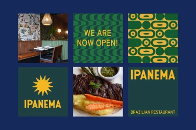
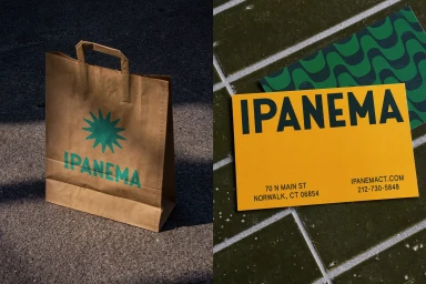
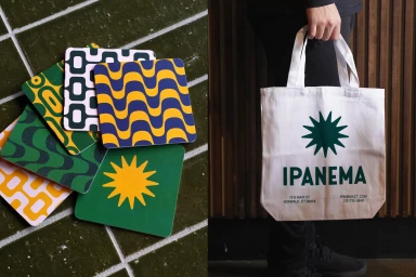
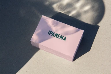
Saint-Urbain develops a comprehensive brand identity for Ipanema, grounding the restaurant's visual language in a palette of forest green, deep blue, and golden yellow. The execution leans into clean, minimalist graphic design, utilizing a consistent starburst icon and bold typography across diverse brand touchpoints. The project explores tactile applications, spanning storefront signage, promotional merchandise, and print collateral. The identity balances raw, earthy textures—such as stone masonry and concrete surfaces—with crisp vector graphic elements to maintain a cohesive commercial aesthetic.
Style
Horizontal, Commercial, Clean
Techniques
Natural light, Typography
Color
Golden Yellow
Forest Green
Context
Advertising Campaign
Associated creatives

5000+ creatives to discover
Sign up to gain access to the entire directory. It’s free.
Visie is a curated library of creative professionals.