
GAPTOOTH
Brand Identity
May 2026
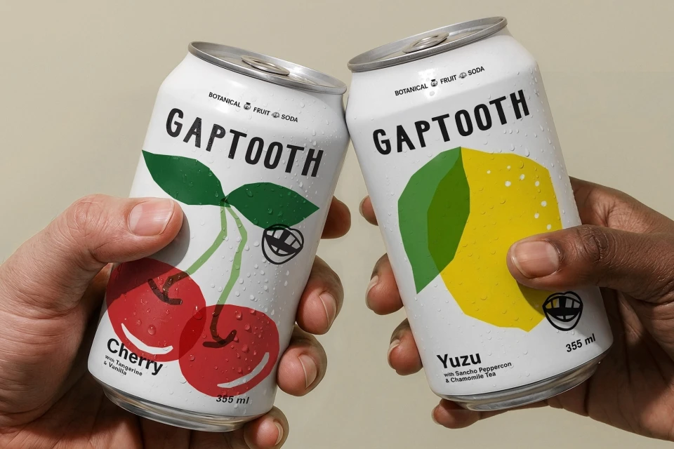
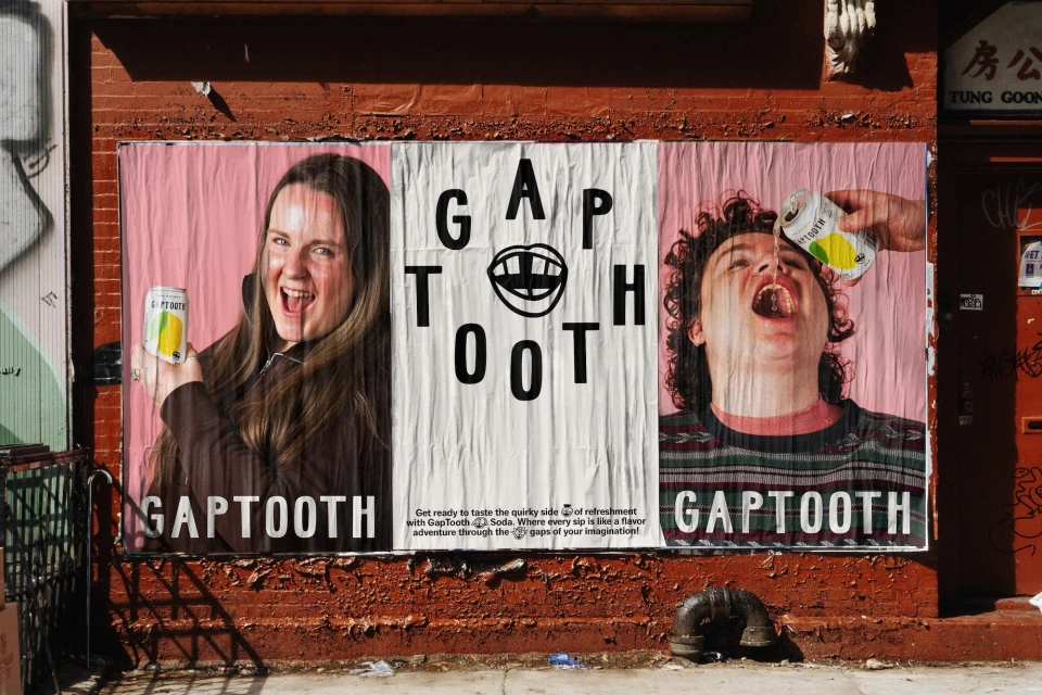
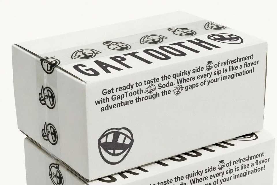
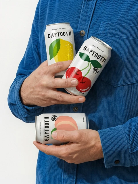
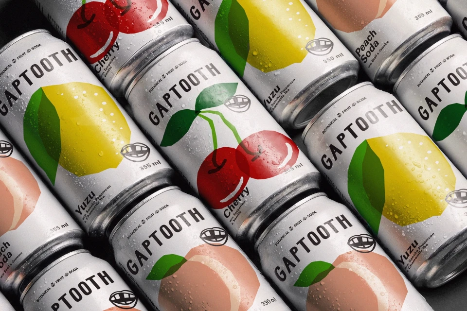
Gaptooth establishes a refreshing visual presence in the crowded beverage market through a bold, identity-forward design system that balances quirkiness with crisp commercial precision. Led by the design team at Saint-Urbain, the brand identity centers on a distinct, playful mouth logo that serves as both a literal namesake and a whimsical signature across its entire product ecosystem. The project demonstrates an mastery of commercial packaging, utilizing modern sans-serif typography and minimalist fruit illustrations to communicate flavor profiles like Yuzu with Sancho Peppercorn or Cherry with Tangerine. By blending these graphic elements with studio-lit, high-contrast imagery, the identity transcends simple branding, leaning into a lifestyle aesthetic that feels both approachable and premium. The application of these assets across physical touchpoints, from wheatpasted outdoor advertising on weathered brick to meticulously stacked packaging boxes, showcases the versatility of the visual system. Supported by 3D rendering from Javier Rosant and motion design from Oli Sabin, the brand utilizes live-action techniques and studio strobe lighting to create a cohesive, tactile experience for the consumer. Whether captured through natural light in a candid toast or presented in a highly structured, symmetrical grid of cans, the identity remains anchored in a clear, consistent visual language. Ultimately, this work represents a successful exercise in editorial minimalism, ensuring the product pops while maintaining a distinct, character-driven personality that is unmistakably Gaptooth.
Vertical, Commercial, Clean
Beverages
Brand Film / Corporate Video


