
Digs
Brand Identity
Apr 2026
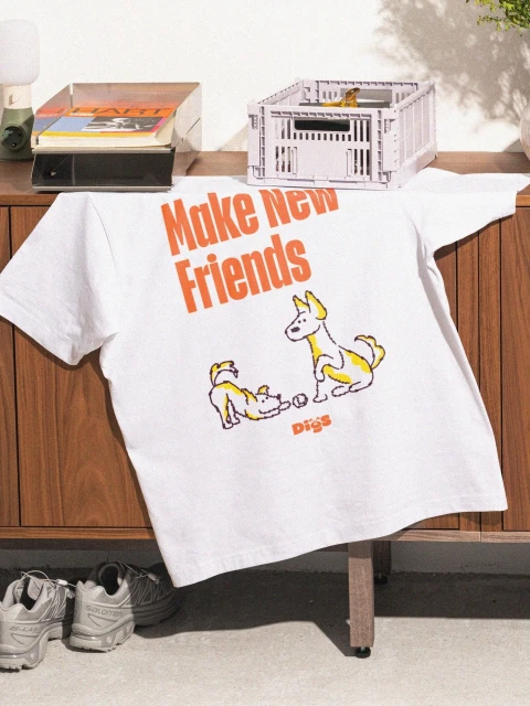
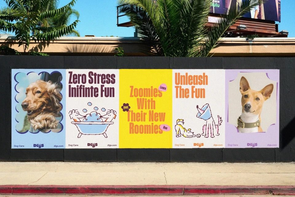
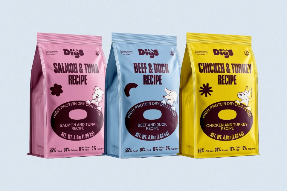
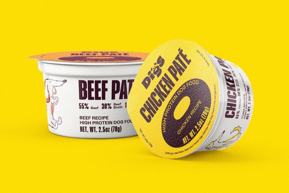
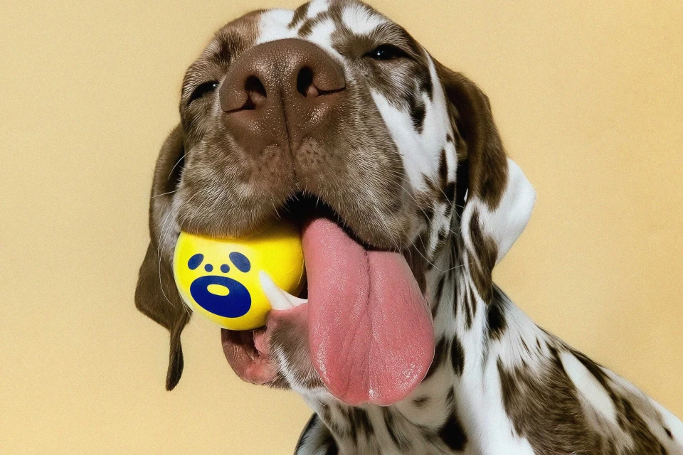
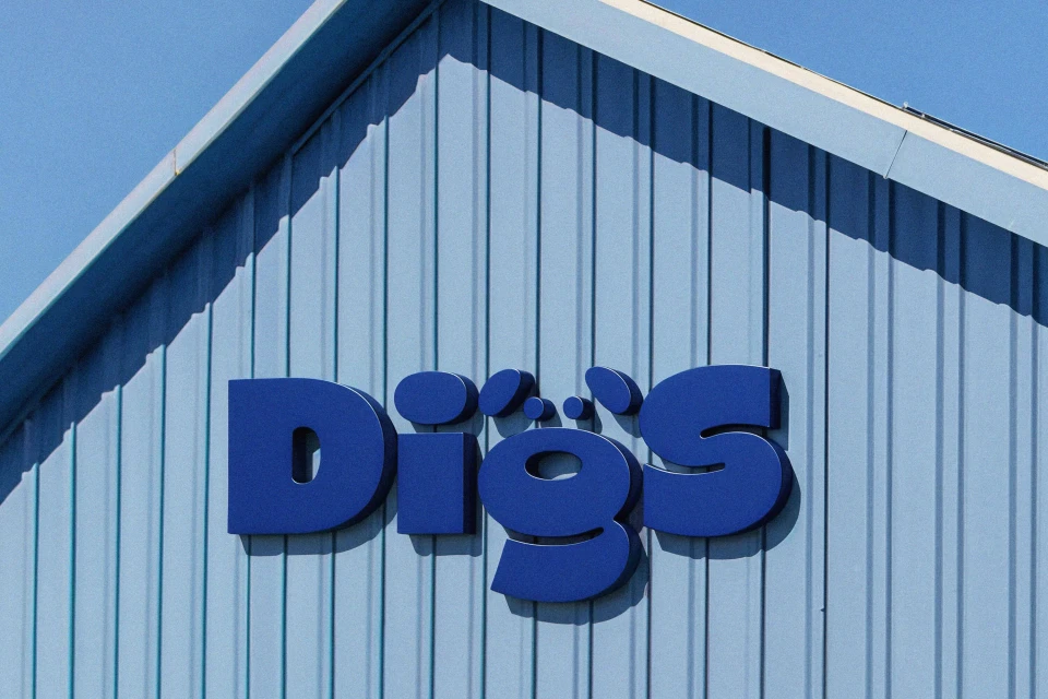
The brand identity for Digs serves as a masterclass in modern commercial design, seamlessly blending playful aesthetics with a clean, high-contrast visual language. By moving beyond traditional pet care imagery, the project leans into a vibrant color palette of yellow, lavender, and sky blue, which immediately establishes a friendly and approachable personality. Developed with design expertise from Saint-Urbain, the identity leans into a minimalist composition that feels both premium and accessible. Across a diverse array of touchpoints, from lifestyle apparel and outdoor signage to sleek product packaging, the creative work remains consistently sharp. The use of studio strobe lighting for product shots ensures that the gusseted dog food bags pop with professional clarity, while the natural light imagery of dogs and merchandise brings a grounded, relatable texture to the brand. With sophisticated 3D contributions from Javier Rosant and fluid motion work by Amélie Haeck and Oli Sabin, the project masterfully utilizes live-action techniques to bridge the gap between digital identity and physical presence. The result is a cohesive, highly identifiable system that balances bold, serif typography with charming illustrative elements, ensuring that every element—from the architectural signage to the individual-serving pate containers—feels like an intentional extension of the Digs mission. It is a striking example of how cohesive art direction can elevate everyday commercial goods into a memorable lifestyle brand experience.
Commercial, Clean, Vertical


