
Holden: Brand Identity




Aug 2019
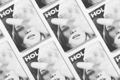
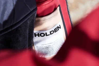
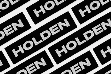
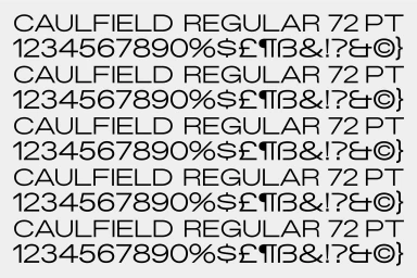
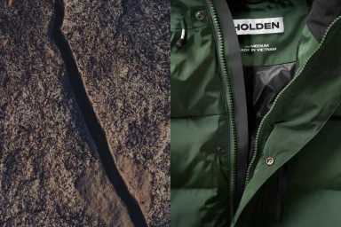
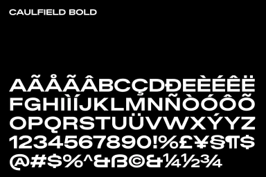
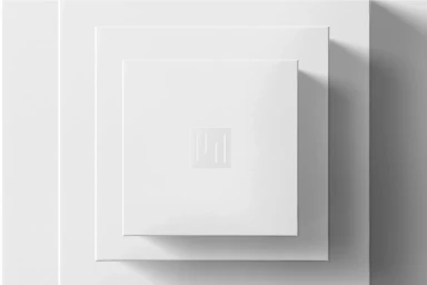
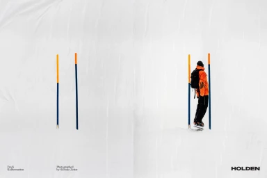
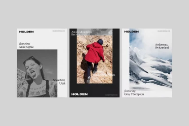
Holden’s comprehensive brand identity project serves as a masterclass in minimalist design, bridging the gap between high-performance technical apparel and sophisticated, editorial storytelling. Developed by Javas Lehn Studio, the visual language prioritizes a clean, monochromatic palette that leans into a high-contrast aesthetic. By juxtaposing stark black-and-white typography—anchored by the custom Caulfield typeface—against the organic, granular textures of snowy landscapes and rocky terrains, the brand achieves a distinct sense of alpine precision. The design system is anchored in geometric rigor, employing clever use of negative space, debossed logos, and rhythmic, repetitive patterns that emphasize the brand’s industrial yet human-centric ethos. Through detailed macro shots of intricate embroidery and embossed knitwear, the project highlights the tactile quality of the materials, grounding the abstract graphic identity in the reality of its product line. This identity is not merely a collection of assets; it is a holistic corporate experience that communicates resilience and modern elegance. From the functional UI illustration of the typography specimens to the cinematic editorial panels capturing outdoor explorers in settings ranging from the Andes to the Swiss Alps, every element serves to reinforce a cohesive, high-end commercial presence. The result is a sharp, balanced, and deeply intentional identity that feels as rugged as the environments it inhabits while remaining impeccably polished for a modern, design-conscious audience.
Horizontal, Commercial, Clean, Minimalist
Advertising Campaign
