Surface Magazine: Brand Identity
Apr 2021
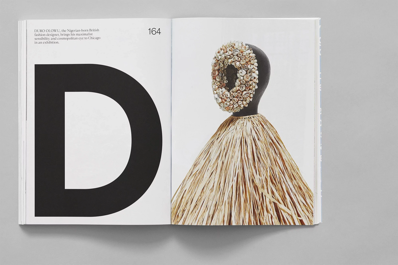
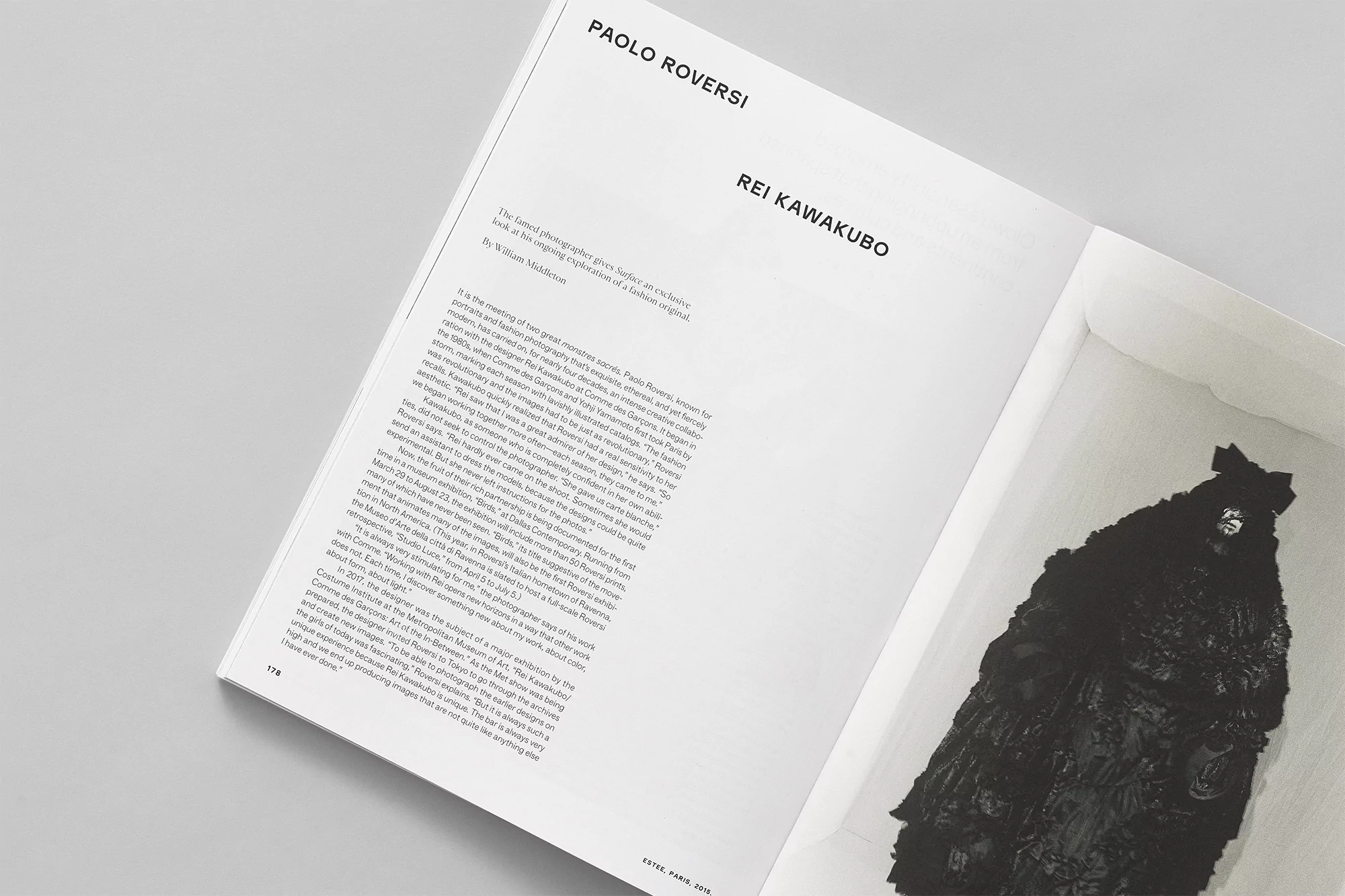
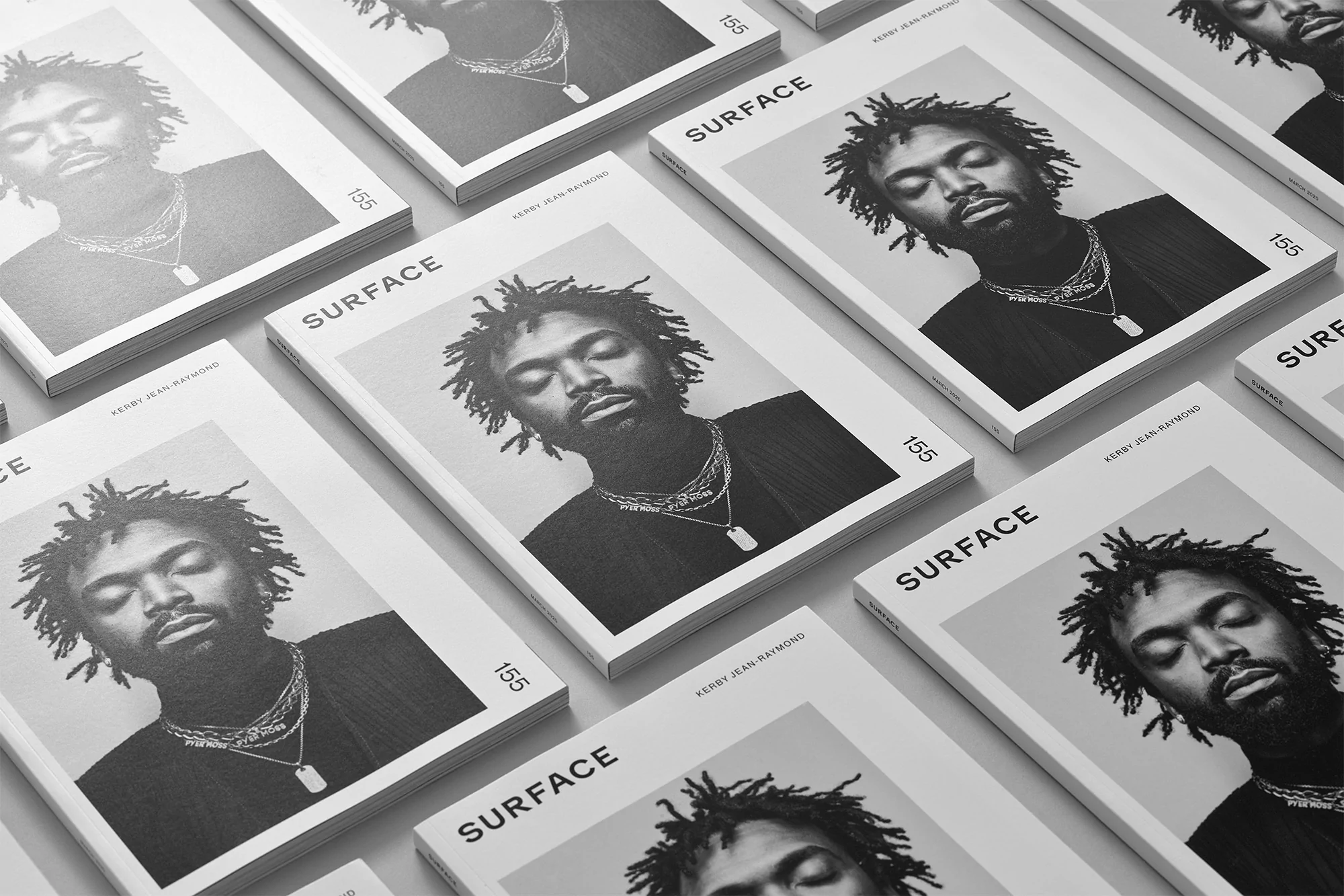
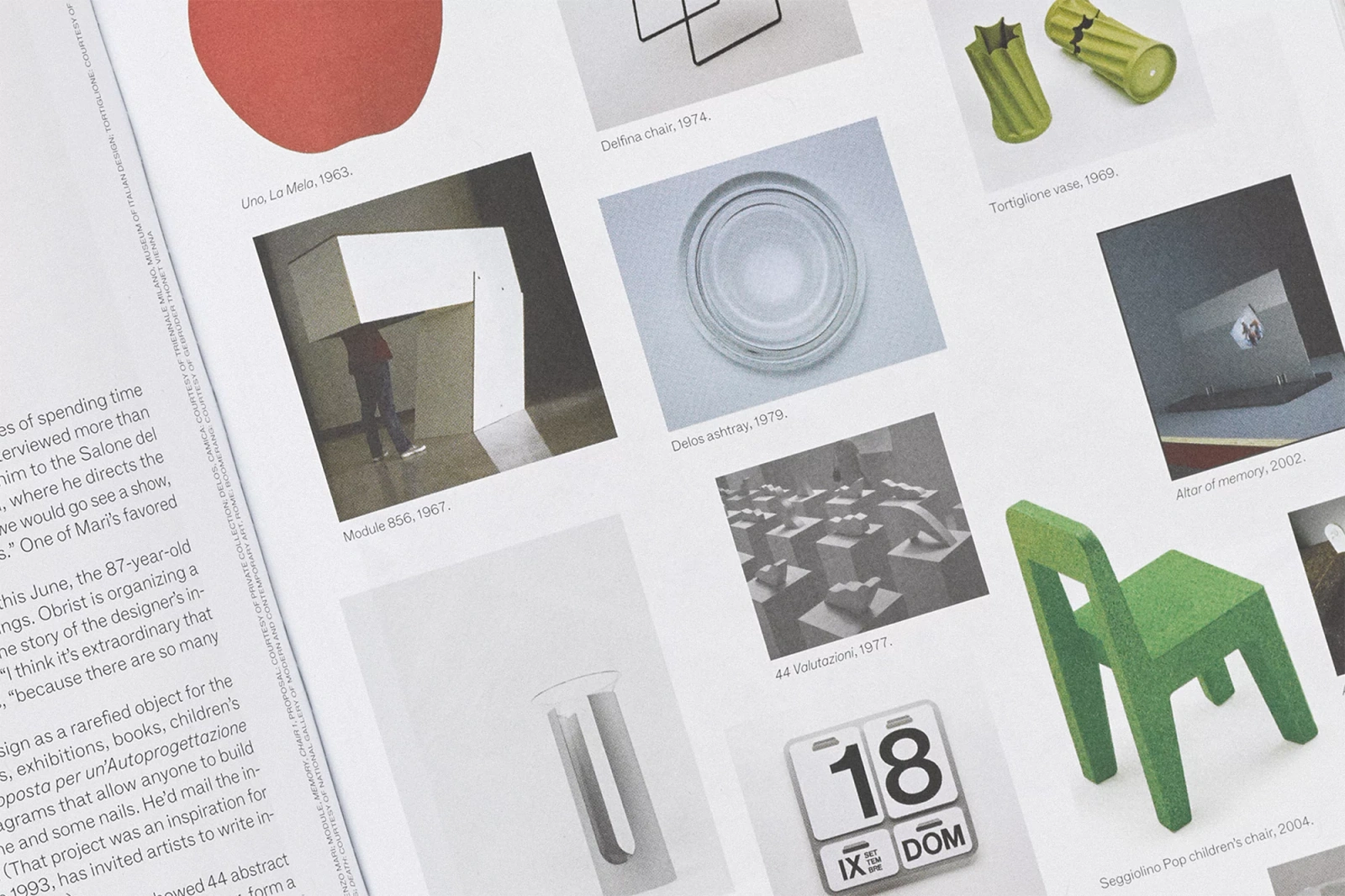
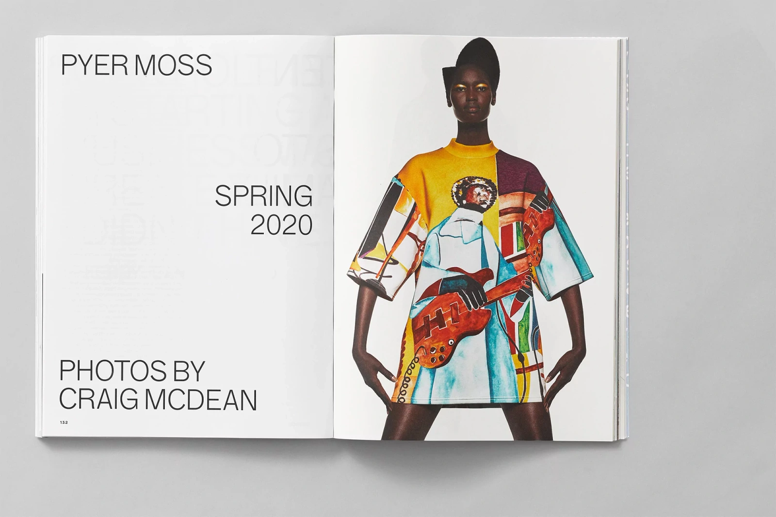
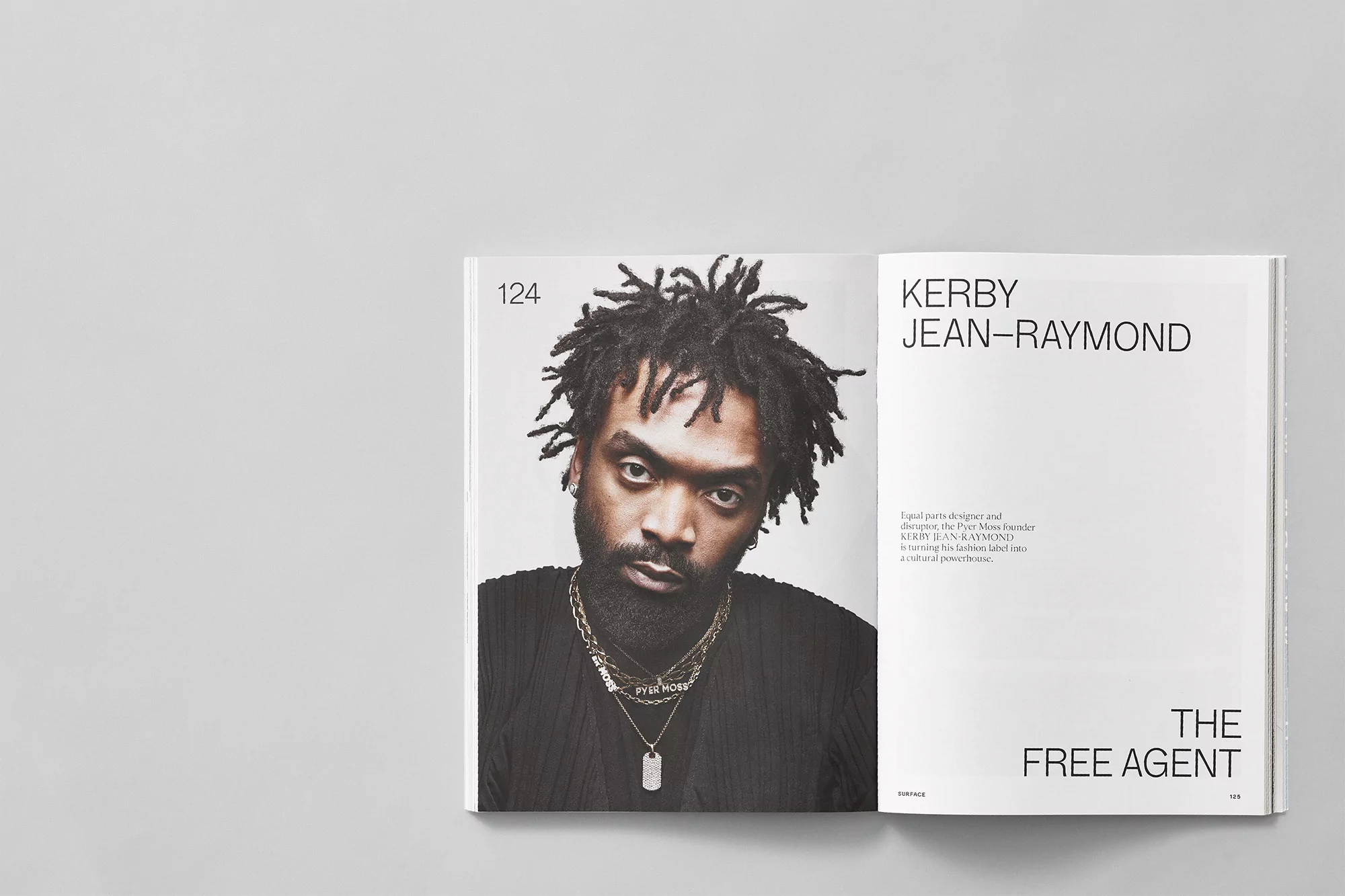
Surface Magazine unveils its refined brand identity, a project that bridges the gap between high-end editorial design and media documentation. The layout leans into a minimalist aesthetic, utilizing precise grid alignment and bold, sans-serif typography to create a clean, contemporary reading experience. Through the integration of monochromatic photography and high-contrast composition, the visual language establishes a structured, professional framework for the publication. The project features art direction by Scott Massey and graphic design by Javas Lehn Studio, with photography provided by Craig McDean. The editorial spreads showcase a range of content, from architectural documentation and industrial design to portraiture, maintaining a consistent, refined visual tone throughout the magazine.
Editorial, Horizontal, Clean
Typography
Editorial