
The Robey
Brand Identity
Nov 2016
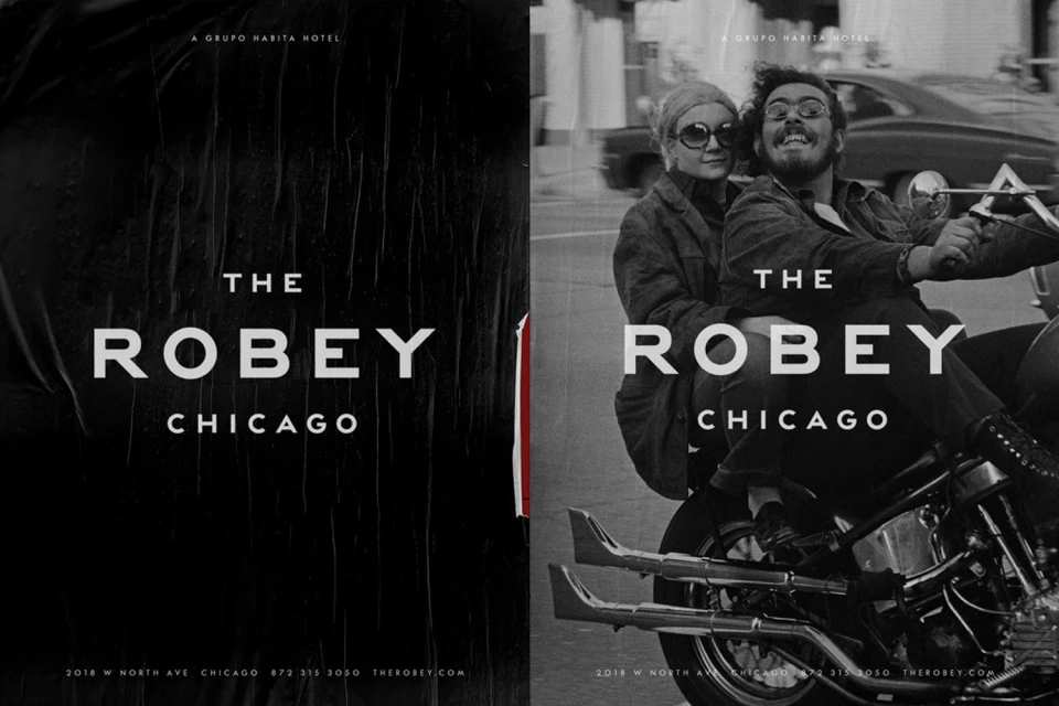
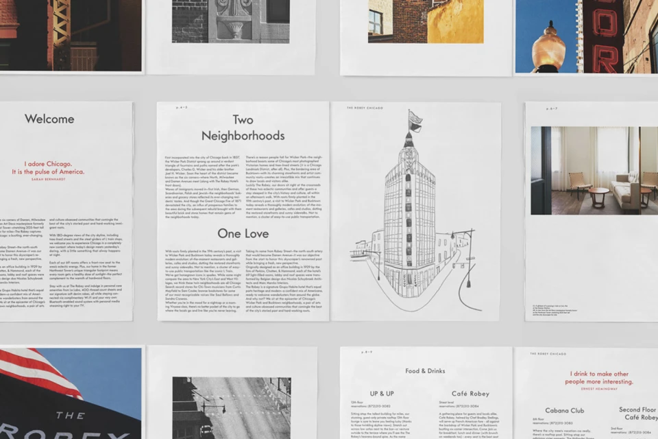
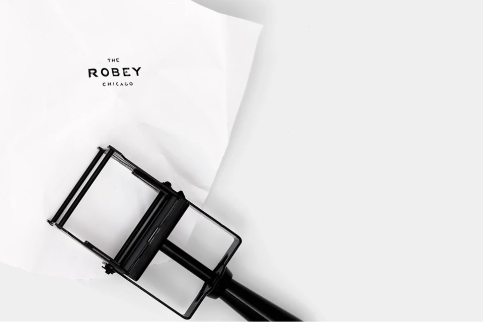
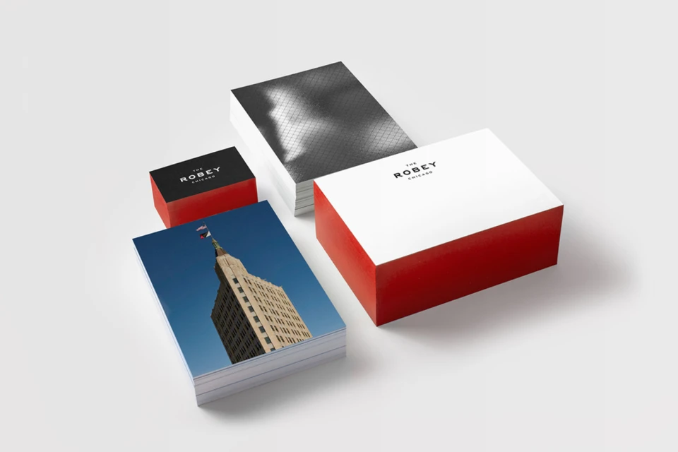
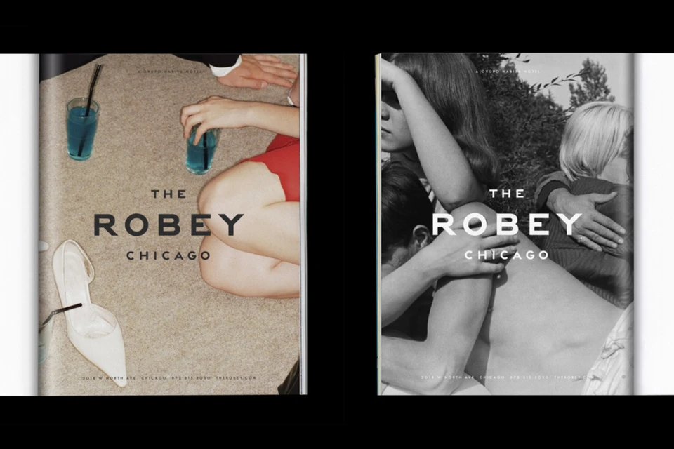
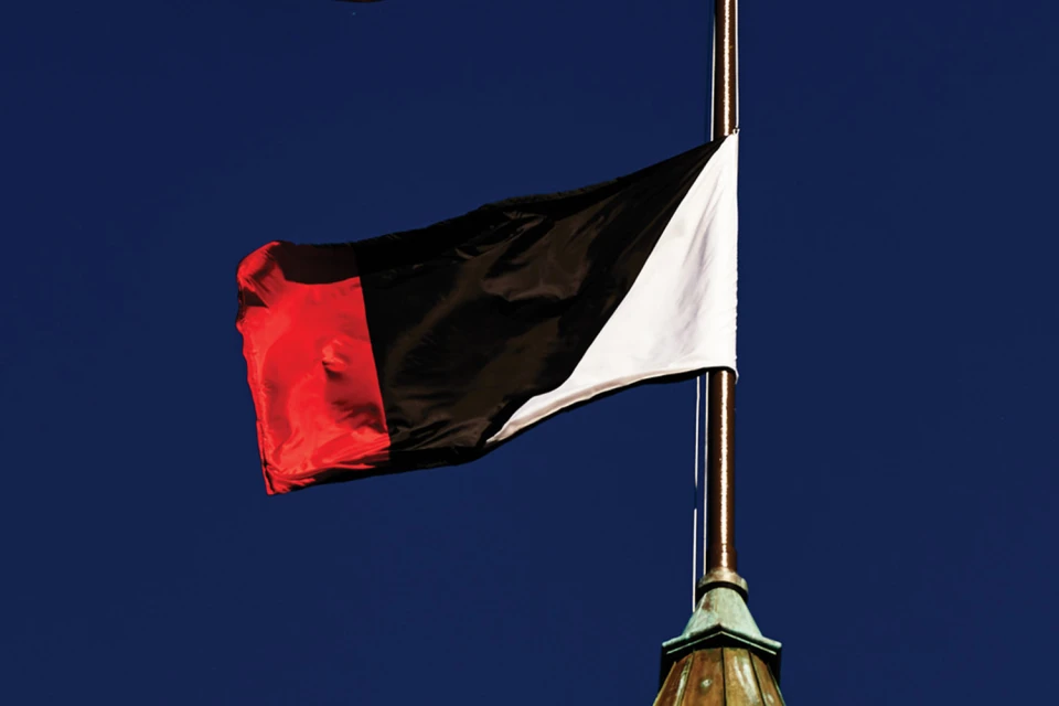
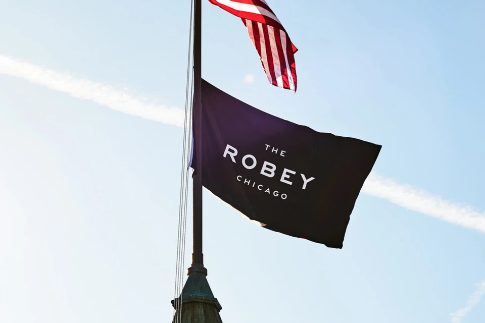
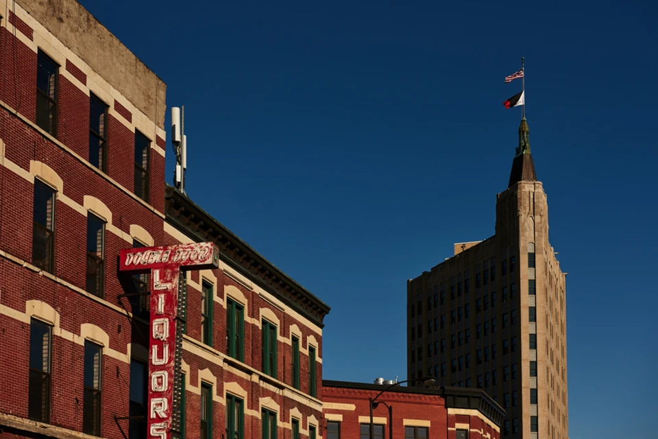
Capturing the essence of a historic landmark, the brand identity for The Robey Chicago serves as a masterclass in modern hospitality design. The project, executed with precision by Javas Lehn Studio, bridges the gap between urban heritage and contemporary minimalism. By leaning into a sophisticated monochrome palette punctuated by bold red accents, the visual system creates a cohesive thread across diverse touchpoints. The project utilizes a mix of editorial lifestyle photography and sharp, clean typography to evoke an atmosphere of refined city living. From the application of industrial-style hand stamps on textured stationery to the architectural ink illustrations that honor the building’s distinct character, every asset feels intentional. High-key studio strobe lighting lends a polished, commercial finish to the printed collateral, while natural light landscape imagery captures the hotel as a storied anchor within the city’s skyline. The inclusion of live-action technique photography adds a layer of authentic, gritty humanity, grounding the high-end branding in the lived experience of the neighborhood. This comprehensive approach results in a visual identity that is both grand and intimately approachable, perfectly reflecting the duality of The Robey as both a destination for travelers and a fixture of Chicago’s architectural fabric.
Horizontal, Commercial, Clean
Typography
Advertising Campaign
