
150 Wooster
Brand Identity
Feb 2018
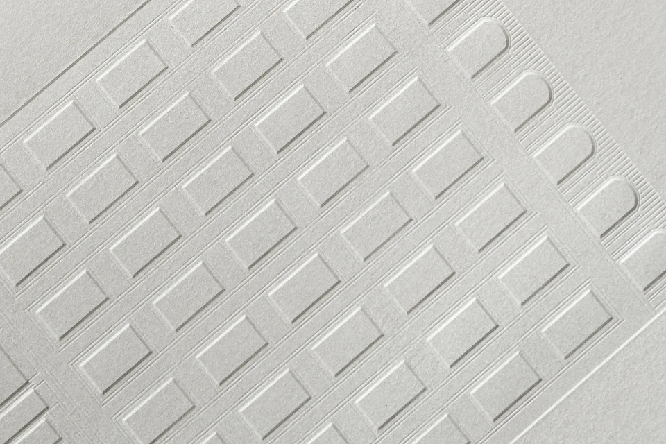
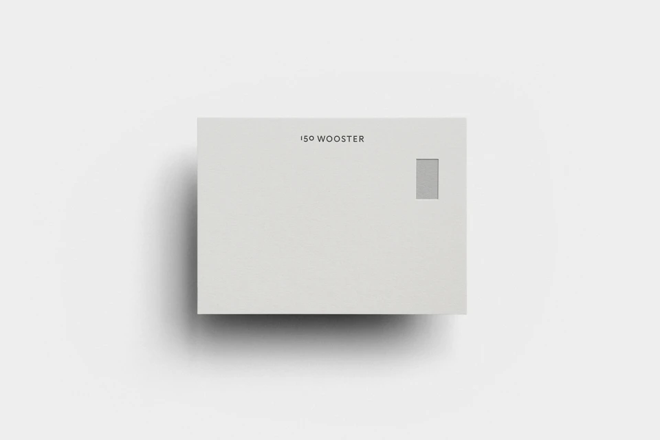
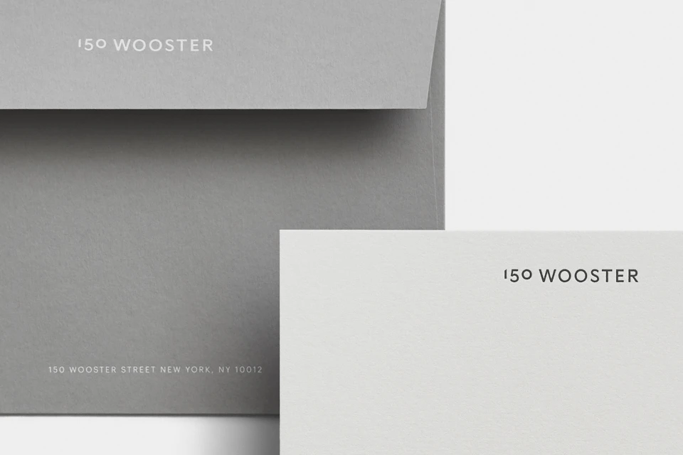
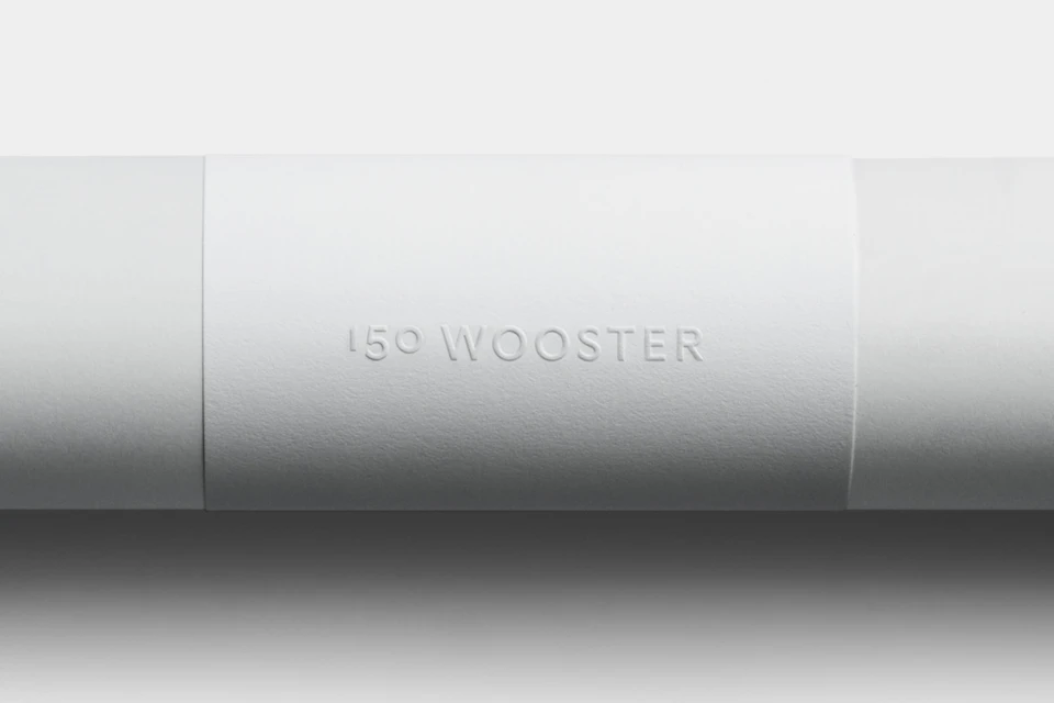
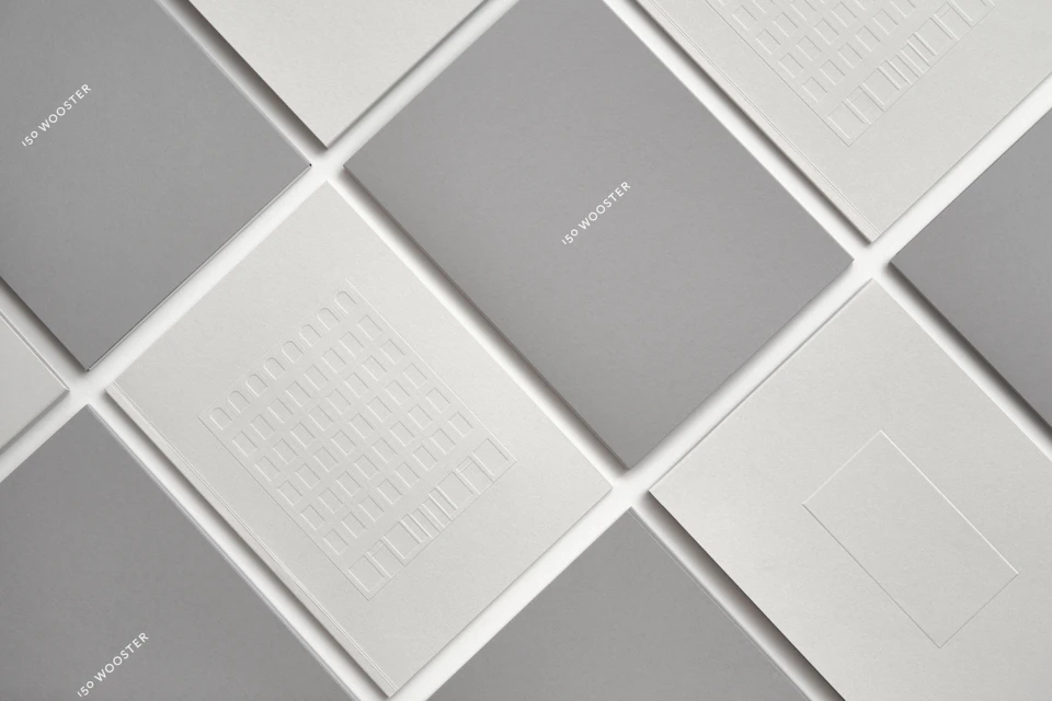
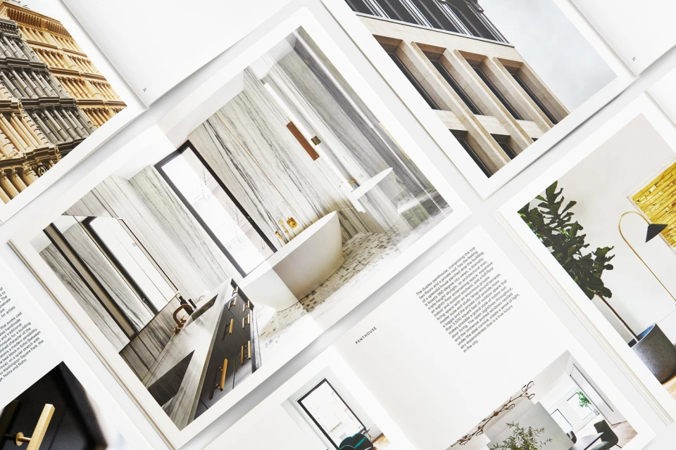
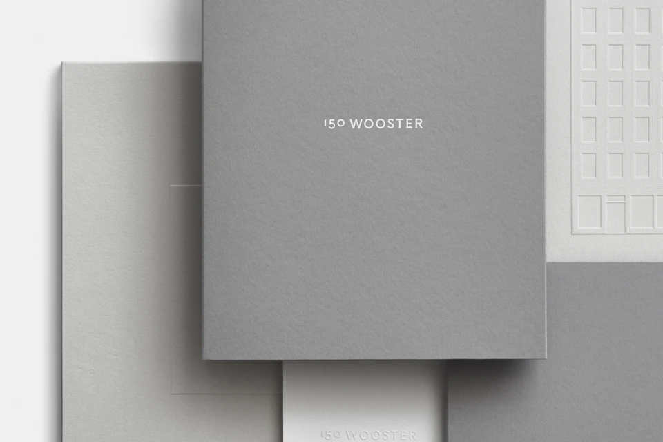
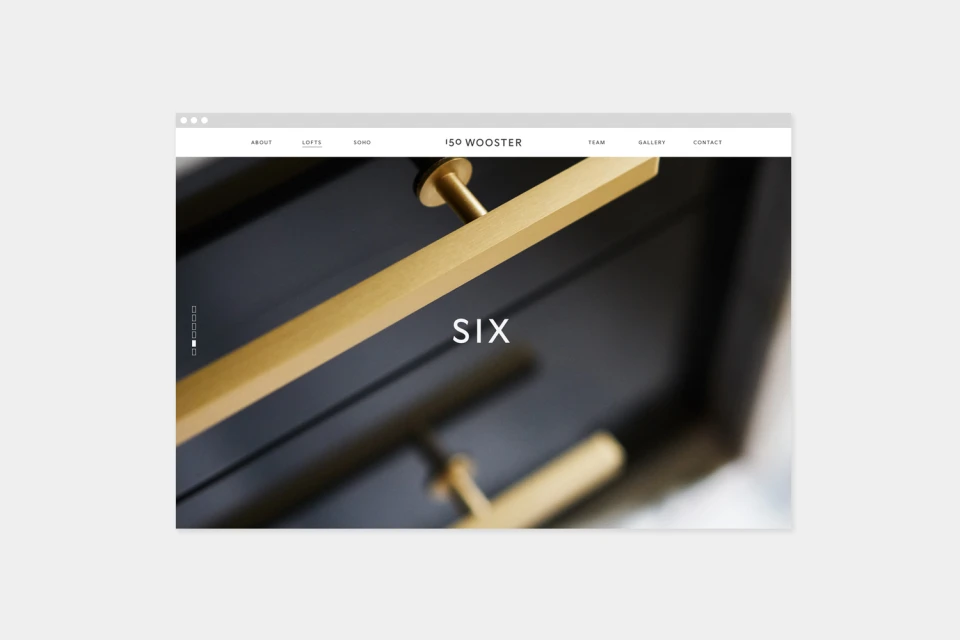
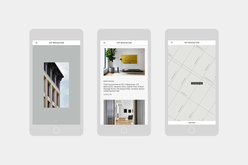
The brand identity for 150 Wooster functions as a masterclass in minimalist restraint, perfectly positioning the property within the competitive landscape of luxury real estate. Developed by Javas Lehn Studio, the visual language prioritizes architectural precision and tactile sophistication to convey the project's premium market standing. Through a consistent application of crisp, sans-serif typography and a restrained, neutral palette of greys and off-whites, the identity leans into a high-end corporate aesthetic that feels both timeless and modern. The execution relies heavily on artisanal details, such as deep-embossed motifs inspired by structural window frames and the use of thick, textured paper stocks that invite physical engagement. This focus on materiality—captured through macro photography and deliberate studio strobe lighting—translates seamlessly into the project's digital presence. Whether showcased in print brochures featuring polished interior design photography or across clean, intuitive UI illustrations for mobile, the branding maintains a rigorous symmetrical rhythm. By balancing the cold, sharp lines of urban architecture with the warm, tactile quality of premium collateral, the project creates a cohesive narrative of exclusivity. The work succeeds by eschewing unnecessary ornamentation, instead allowing the inherent quality of the design, typography, and material craft to communicate the prestige of the 150 Wooster address.
Horizontal, Clean, Minimalist, Commercial
Typography, Emboss & Deboss
