
Chicago Cubs: Brand Identity


May 2026
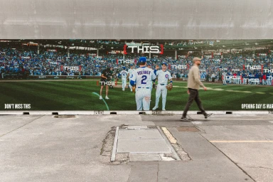
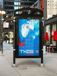
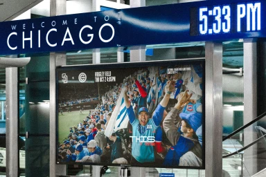
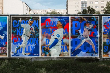
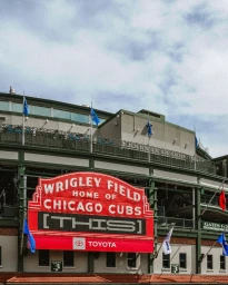
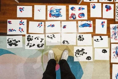
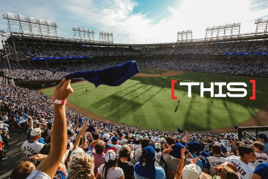
The Chicago Cubs brand identity project serves as a masterclass in modernizing legacy sports aesthetics while maintaining the deep, emotional resonance of a historic franchise. Under the creative direction of Kent Carmichael, Peter Carnevale, and Scott Serilla, with design contributions by Christopher A. Ritter, the campaign successfully bridges the gap between stadium heritage and contemporary media consumption. The work leans into a strategy of visual repetition, utilizing the recurring prompt of THIS to command attention across diverse touchpoints, from digital transit kiosks to massive outdoor billboards. By blending high-contrast commercial photography with raw, lifestyle-driven reportage, the identity captures the kinetic energy of a live-action game day at Wrigley Field. The aesthetic is anchored by deliberate typography and bold, cinematic color blocking that mirrors the iconic Cubs palette. The team’s commitment to a cohesive narrative is further highlighted by a behind-the-scenes look at the creative process, where ink-based experimental layouts suggest an iterative, human approach to brand building. Whether framed by the dramatic natural light of a golden hour cityscape or integrated into the bustling urban architecture of Chicago, the identity channels a sense of tradition that feels fresh, urgent, and undeniably local. This multifaceted project establishes a robust visual language, proving that even the most established legacy brands thrive when they allow their graphic identity to evolve alongside their passionate audience.
Horizontal, Commercial


