
Cincinnati Ballet: Brand Identity







Apr 2025
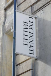
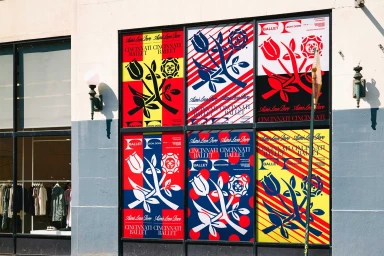
This brand identity project for the Cincinnati Ballet establishes a visual system defined by bold typography and vibrant graphic illustrations. The execution leans into high-contrast color blocks, utilizing a palette of red, blue, and yellow to create a recognizable presence for the performing arts organization. The identity is applied across a diverse range of touchpoints, including printed posters, editorial calendar layouts, and branded apparel. The work incorporates vector-based floral motifs and abstract gradients, balanced by clean typographic arrangements that anchor the visual storytelling. Developed by a creative team including graphic designer Christopher A. Ritter and type designers Albra and Ultra Kuhl, the project utilizes various presentation techniques. These include mock-up integration, commercial photography, and editorial design to demonstrate how the brand exists across digital interfaces and physical, architectural spaces.
Vertical, Warm, Clean, Commercial
Advertising Campaign


