
BOO: Brand Identity


May 2020
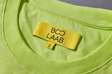
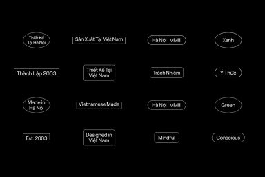
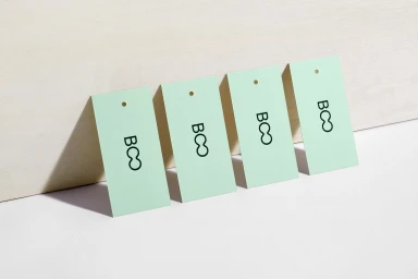
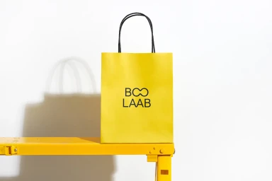
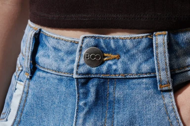
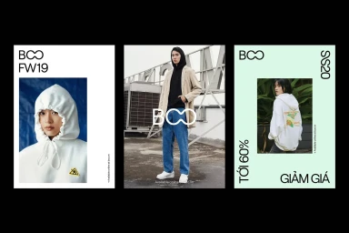
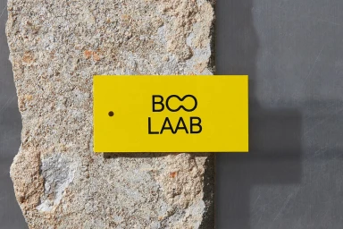
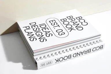
The brand identity for BOO functions as a masterclass in modern, minimalist commercial design, bridging the gap between functional retail packaging and high-end corporate aesthetics. Through a series of intentional visuals, the project demonstrates how a consistent visual language can permeate everything from everyday apparel to bespoke stationary. Graphic design by Rice Studios anchors the identity, utilizing a clean, geometric typeface and a high-contrast palette of sunny yellow, industrial black, and neutral tones. The work skillfully balances lifestyle portraiture with macro product photography, allowing the viewer to appreciate the fine details of cotton jersey textures, metallic hardware, and precision stitching. By incorporating technical UI illustration and balanced triptych layouts, the identity feels both approachable and systemized. The use of soft light throughout the campaign creates a cohesive, polished look that elevates simple paper tags and shopping bags into essential markers of the brand experience. This project leans into editorial minimalism, where the focus remains strictly on the structural integrity of the branding, ensuring that every element—from a denim button to a spiral-bound brand book—communicates a clear, intentional story. It is a refined example of how disciplined typography and material contrast can transform standard commercial collateral into a powerful and recognizable modern identity that feels both established and refreshingly contemporary.
Horizontal, Commercial, Clean, Minimalist
E-commerce / Product
