
Marou: Brand Identity

Jun 2019
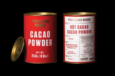
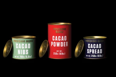
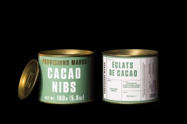
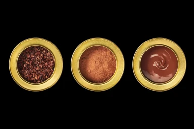
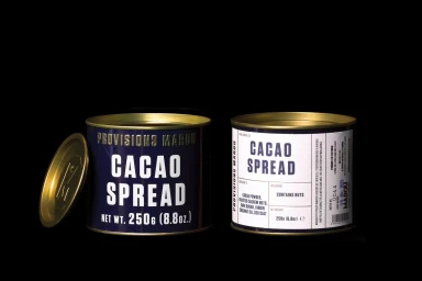
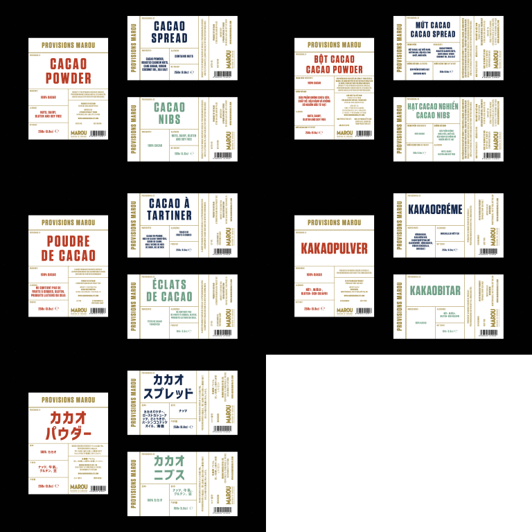
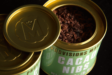
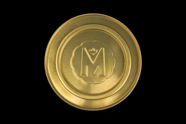
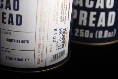
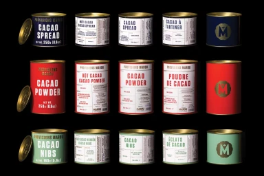
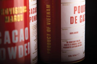
The brand identity for Marou Provisions serves as a masterclass in minimalist packaging design, anchoring the premium CPG and food and beverage line in an aesthetic that is as refined as its artisanal ingredients. Through a series of highly controlled studio shots, the creative direction from Rice Studios emphasizes a cohesive visual language built upon bold, sans-serif typography and a striking color-blocked palette of red, mint green, and navy blue. The imagery utilizes beauty light and macro techniques to draw focus to the tactile details of the collection, from the soft matte finish of the cylindrical metal tins to the precision of the embossed gold-toned lids. By placing these geometric forms against a stark, pitch-black backdrop, the composition highlights the structural elegance of the branding while simultaneously grounding the products in their source material through an expansive, cinematic landscape shot of Vietnamese hillsides. This juxtaposition between the raw, agricultural origin and the sleek, commercial presentation creates a sophisticated, modern narrative. The project expertly balances the functional requirements of clear nutritional labeling with a luxury-leaning, editorial flair, ensuring the packaging feels consistent across every SKU. Every element, down to the thin gold lines and debossed botanical iconography, reflects a meticulous attention to detail that elevates the product range into a high-end, contemporary consumer experience.
Horizontal, Commercial, Clean
Black Seamless
E-commerce / Product
