
Publik Office: Brand Identity

Feb 2019
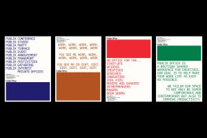
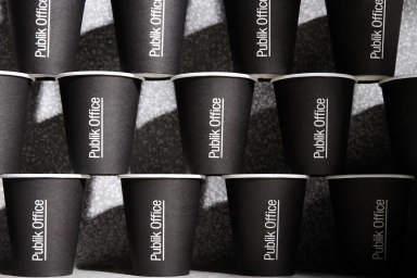
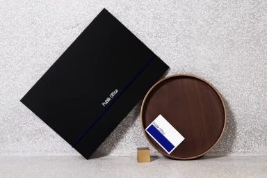
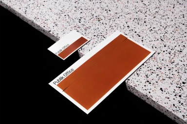
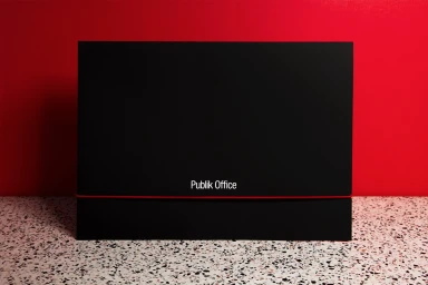
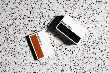
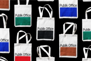
The brand identity for Publik Office, crafted with expert graphic design by Rice Studios, establishes a vibrant and highly structured visual language tailored for the modern creative community. By marrying artistic flair with commercial functionality, the project creates a cohesive aesthetic that spans physical collateral, digital animations, and signage. The design philosophy leans into editorial minimalism, utilizing a rhythmic interplay of bold, solid color blocks—ranging from deep navy and earthy brown to vibrant red and forest green—against clean, matte black elements and white speckled terrazzo surfaces. Throughout the stationery set, including folders, business cards, and canvas tote bags, the typography remains the anchoring force; a crisp, sans-serif typeface provides clarity, often paired with strategic infographic elements to communicate the brand's mission of networking and mail handling. The photography employs high-key lighting to emphasize geometric repetition and hard-light shadows, effectively turning functional office props like paper cups and sponges into artful, sculptural objects. Whether through the use of vector-based layouts or dynamic CGI and collage-based animation, the identity maintains a consistent, high-contrast pulse. This approach elevates standard corporate materials into a stylized, cohesive system, ensuring that every touchpoint feels deliberate, sharp, and unmistakably modern. The final result is a sophisticated brand presence that balances institutional professionalism with a playful, creative spirit.
Horizontal, Commercial, Minimalist, Clean
Advertising Campaign
