
Rooster: Brand Identity
Aug 2020
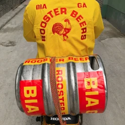
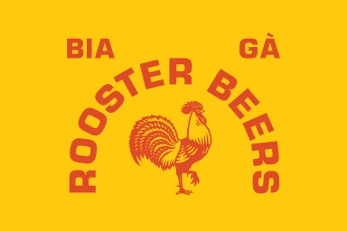
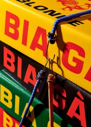
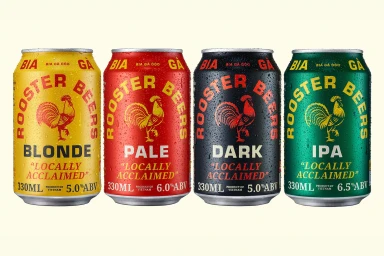
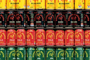
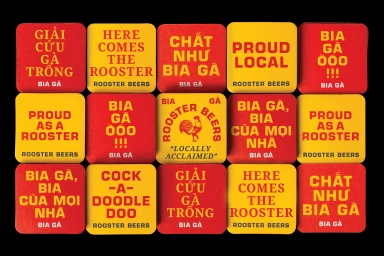
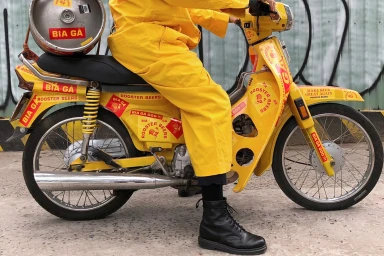
The brand identity for Rooster Beers is a masterclass in high-saturation visual storytelling, effectively bridging the gap between urban lifestyle branding and premium beverage packaging. Through a collaborative effort involving the expert graphic design team at Rice Studios and the intricate, hand-drawn illustration work of Ruby Châu, the brand establishes an immediate, punchy presence. The project leans heavily into a bold red and yellow palette, utilizing a clean, sans-serif typography that feels both industrial and approachable. Captured through the lens of Lý Xuân LợiWing Chan, the brand assets utilize a mix of commercial techniques, from high-speed freeze photography that highlights the chilled condensation on product cans to a live-action technique that places the identity within a gritty, concrete-textured urban environment. The campaign masterfully balances the artistic, macro-focused textures of corrugated cardboard and bungee cords with the rhythmic, repetitive geometry of stacked aluminum cans. By integrating playful slogans and bilingual branding across coasters and apparel, the project creates a cohesive ecosystem that feels locally rooted yet globally polished. This collection of assets not only defines a product lineup but crafts an entire cultural aesthetic, proving that strong, consistent art direction can transform standard beverage packaging into a vibrant, tactile experience that resonates across both digital and physical retail spaces.
Clean, Commercial, Graphic, Horizontal
Advertising Campaign


