
Arjowiggins Creative Papers: Brand Identity
Oct 2018
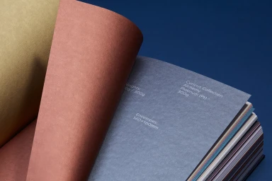
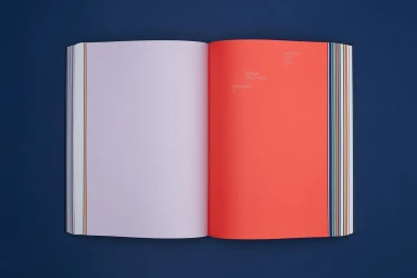
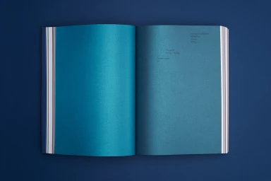
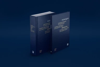
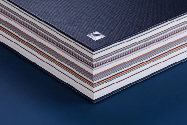
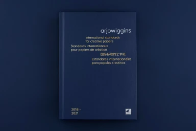
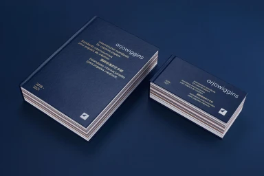
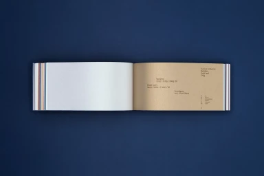
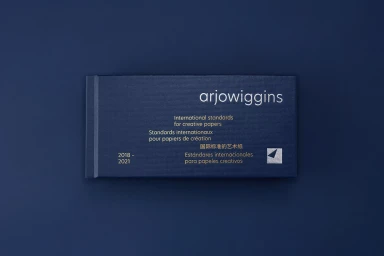
In the highly competitive world of CPG and premium packaging, the brand identity for Arjowiggins Creative Papers stands as a masterclass in editorial minimalism and material sophistication. This project, which meticulously catalogs the brand's expansive range of specialty stocks, transcends the traditional corporate reference guide by treating paper as a tactile, artistic medium. With graphic design led by North, the identity system leverages a stark, monochromatic navy blue backdrop to elevate the vibrant, multi-dimensional color palette of the collection. Through a series of carefully composed studio captures, the project emphasizes the intersection of functional design and sensory detail. The execution channels a refined corporate aesthetic, utilizing high-key macro photography to highlight delicate emboss and deboss techniques, metallic foil accents, and the rich, textural quality of the paper itself. By employing a disciplined approach to typography—clean, sans-serif, and multilingual—the design ensures that technical specifications regarding weights and sheet sizes never interfere with the visual narrative of the brand. The result is a cohesive, professional identity that functions as both a logistical tool and a testament to quality, proving that when handled with precision, even the most utilitarian materials can command a powerful, cinematic presence in a commercial landscape.
Horizontal, Commercial, Clean, Minimalist
Typography
Solid Colour
