
Strangelove Sodas and Poor Toms: Brand Identity

Jan 2020
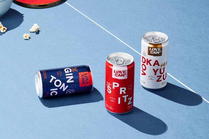
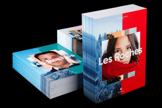
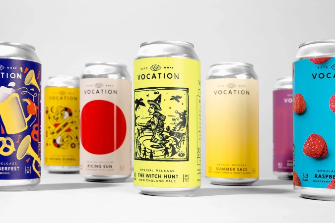
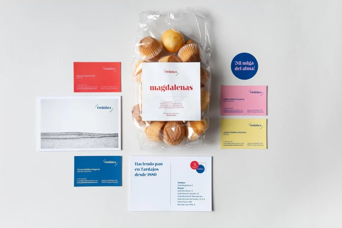
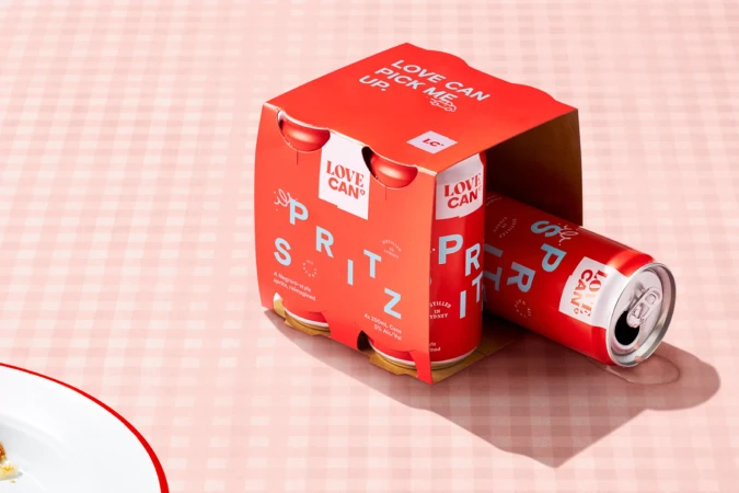
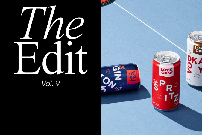
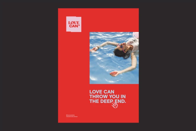
The brand identity for the Strangelove Sodas and Poor Toms collaboration stands as a masterclass in commercial beverage design, balancing vibrant, eclectic aesthetics with a disciplined graphic approach. Executed through a series of striking visual assets, the project leans into high-contrast color-blocking and bold typography to create a cohesive, modern market presence. The photography utilizes both hard light and soft light techniques to emphasize the distinct textures and metallic finishes of the packaging, while the integration of playful, artistic illustrations against minimalist backdrops reinforces the brand's youthful, adventurous spirit. By employing sharp directional lighting and a clean, high-angle product photography style, the creative team ensures that each can, from the signature red Spritz to the versatile Gin & Tonic, commands attention. Beyond the primary product shots, the identity extends into lifestyle imagery and promotional posters that incorporate aquatic, atmospheric motifs, effectively grounding the brand in a broader, aspirational context. With design contributions from notable studios such as Marx Design, North, Estudio Marina Gońi, Robot Food, and OPX Studio, the project demonstrates a sophisticated synthesis of minimalist principles and vivid visual storytelling. This comprehensive approach to identity design successfully elevates the drink line, positioning the collaboration as a contemporary staple that prioritizes high-quality, graphic-forward communication across every touchpoint.
Horizontal, Commercial, Clean


