
Liberty: Brand Identity
May 2020
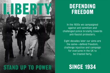
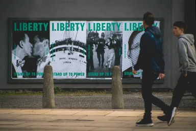
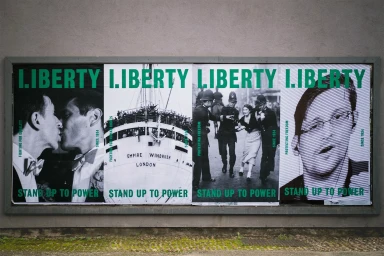
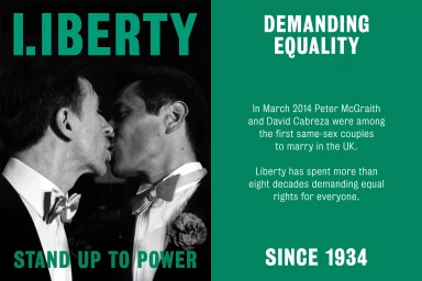
The new brand identity for Liberty masterfully bridges the gap between historical archival weight and contemporary public awareness design. Spearheaded by the team at North, the visual system leans into a striking, high-contrast palette that anchors the organization's mission of social advocacy in a bold, authoritative aesthetic. By integrating raw black-and-white documentary photography with punchy, saturated green typography, the identity avoids the soft-edged sentimentality often found in non-profit branding, opting instead for a gritty, urban tone that feels urgent and undeniably present. The project utilizes a clever interplay of analogue film textures and sharp, modernist layouts to frame stories of activism, from historical marriage equality milestones to mid-century civil rights encounters. This cohesive approach to visual communication succeeds in turning a sprawling, multi-decade history of human rights defense into a singular, recognizable brand experience. Through the clever use of live-action technique in its street-level executions, the brand manifests as a physical presence on city walls, grounding its lofty mission in the everyday environment of the people it serves. The result is a rigorous exercise in editorial minimalism, proving that when typography is treated with this level of architectural precision, it can serve as a powerful catalyst for public discourse and institutional transformation, effectively standing up to power through design.
Horizontal, Commercial, Graphic
Typography
Advertising Campaign
