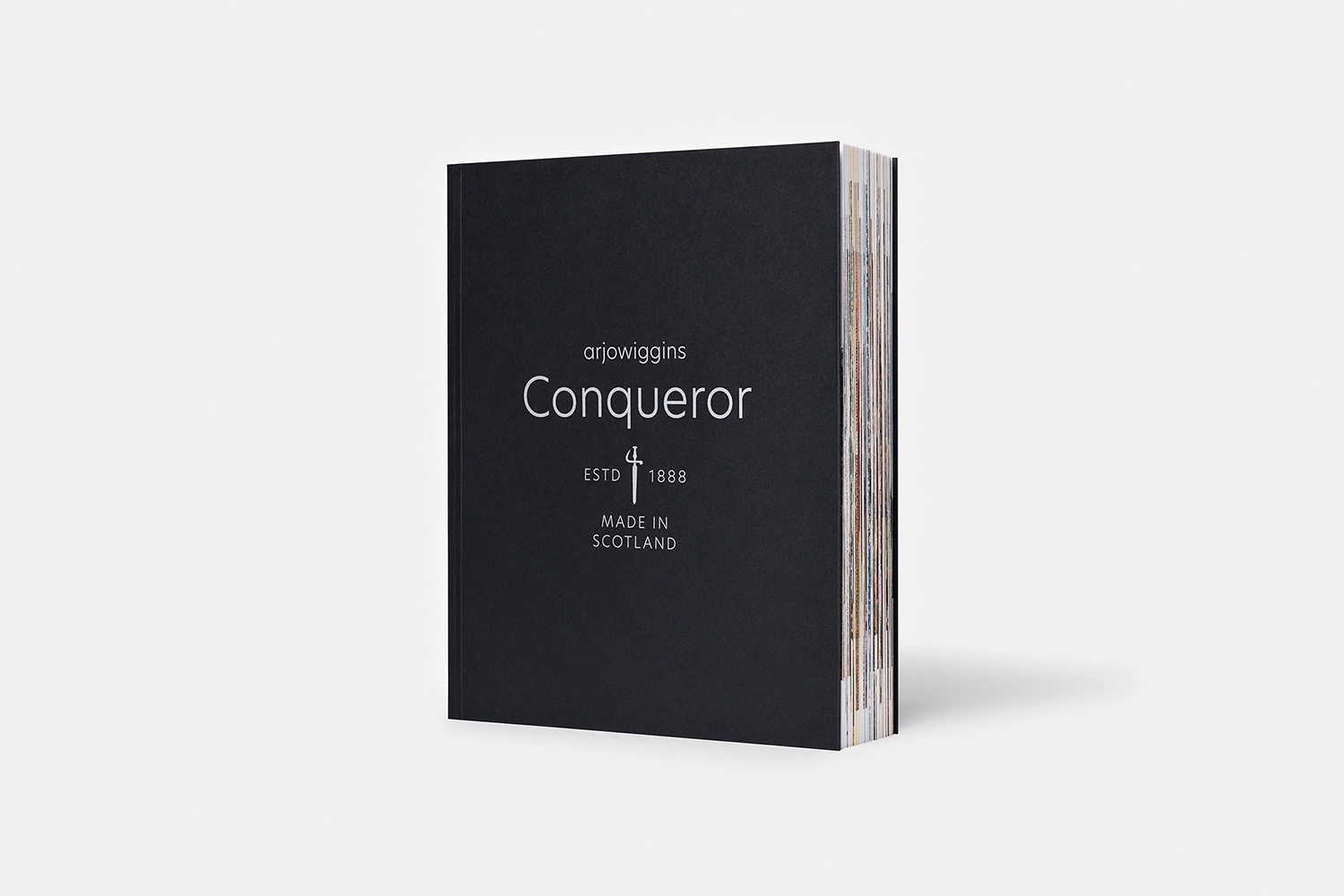
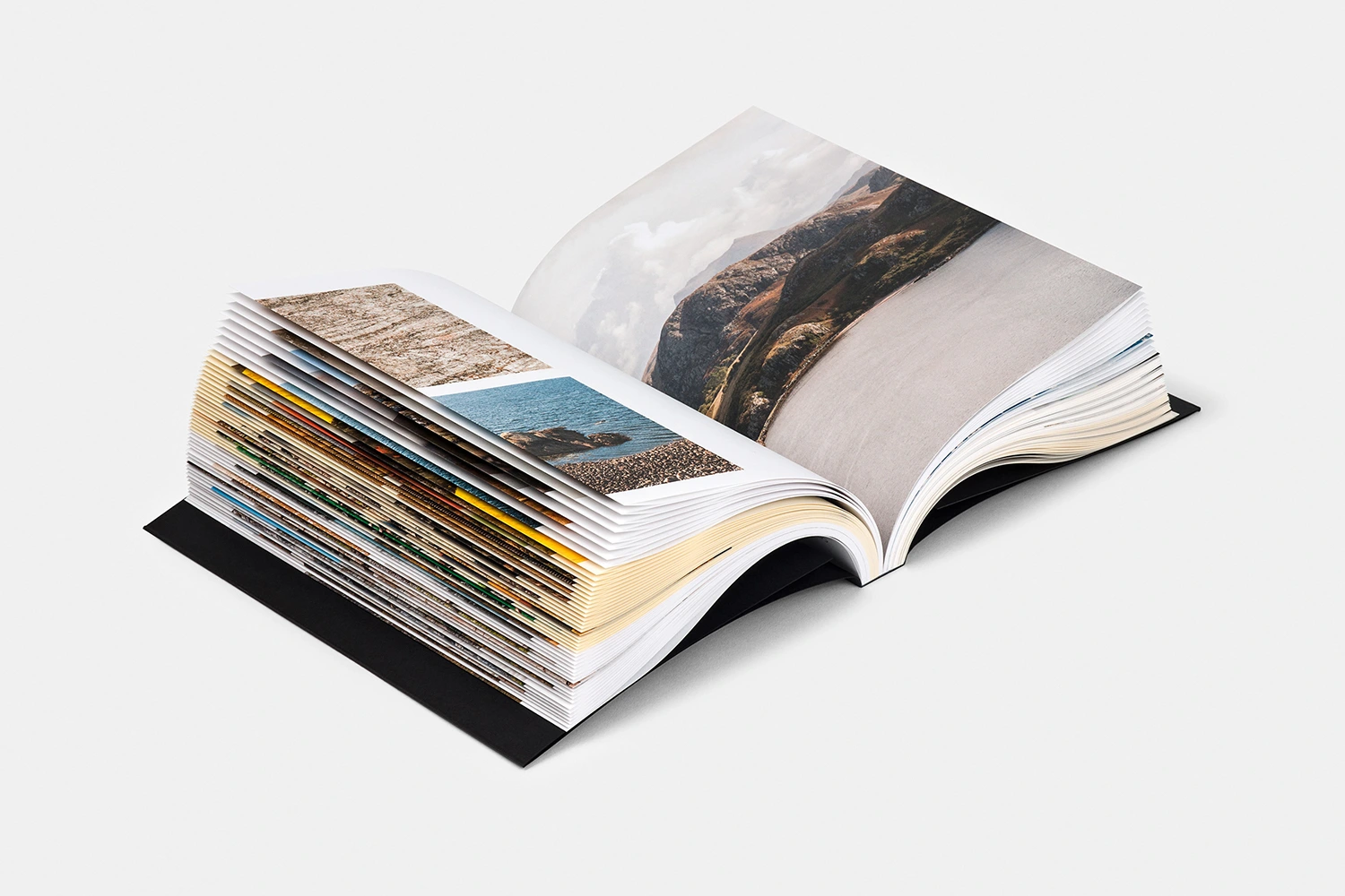
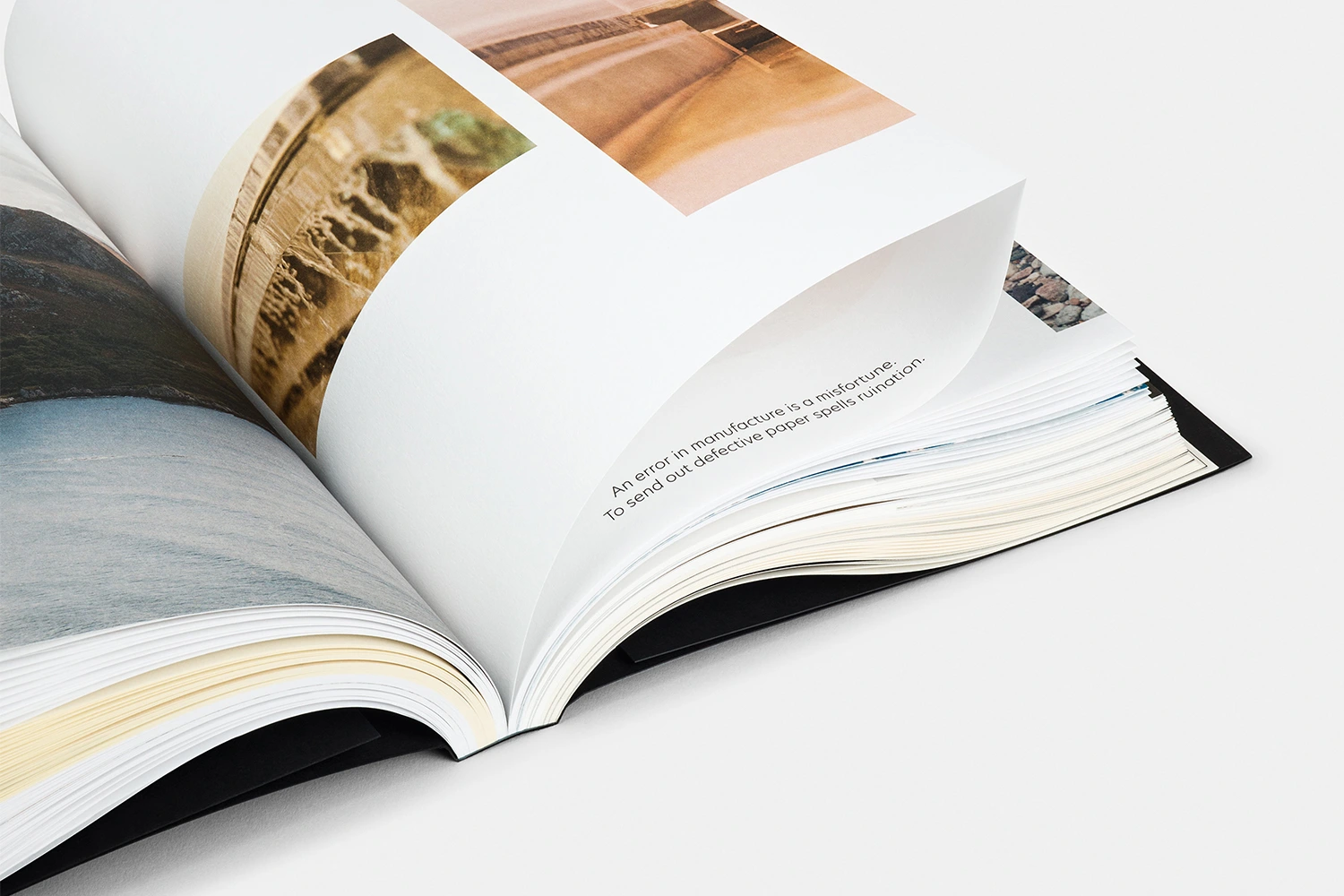
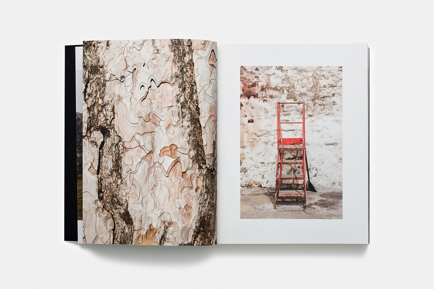
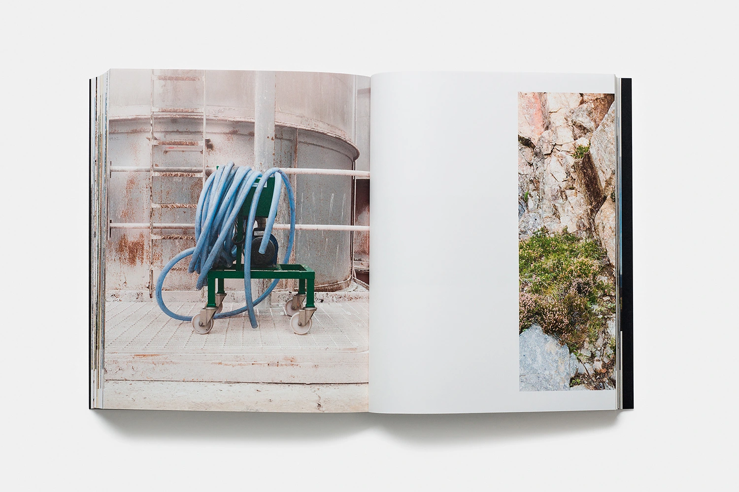
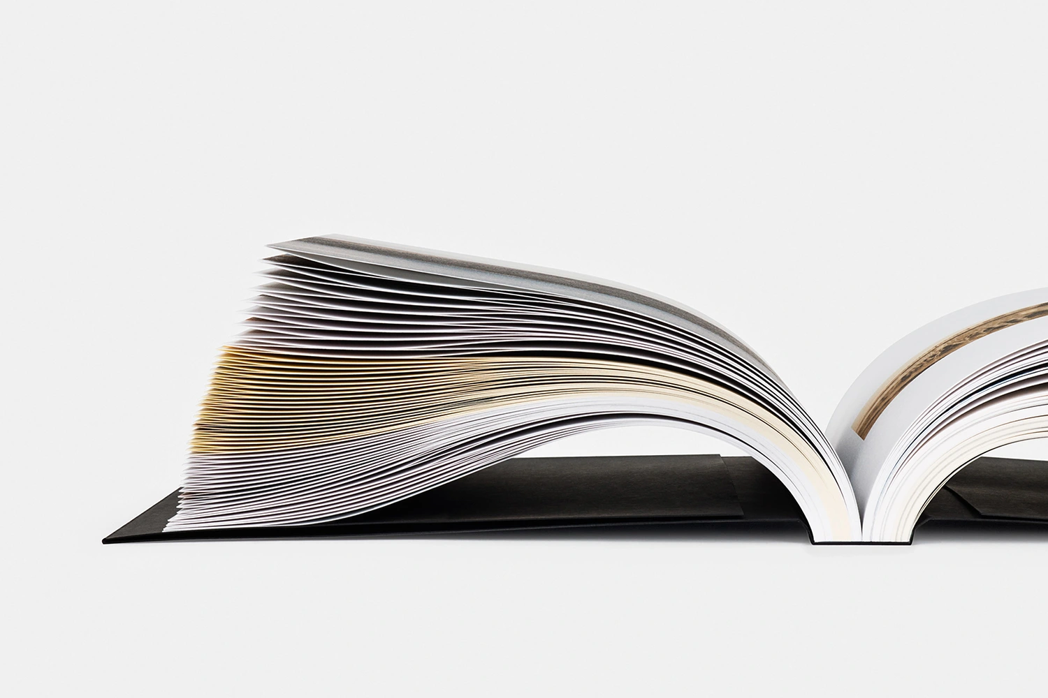
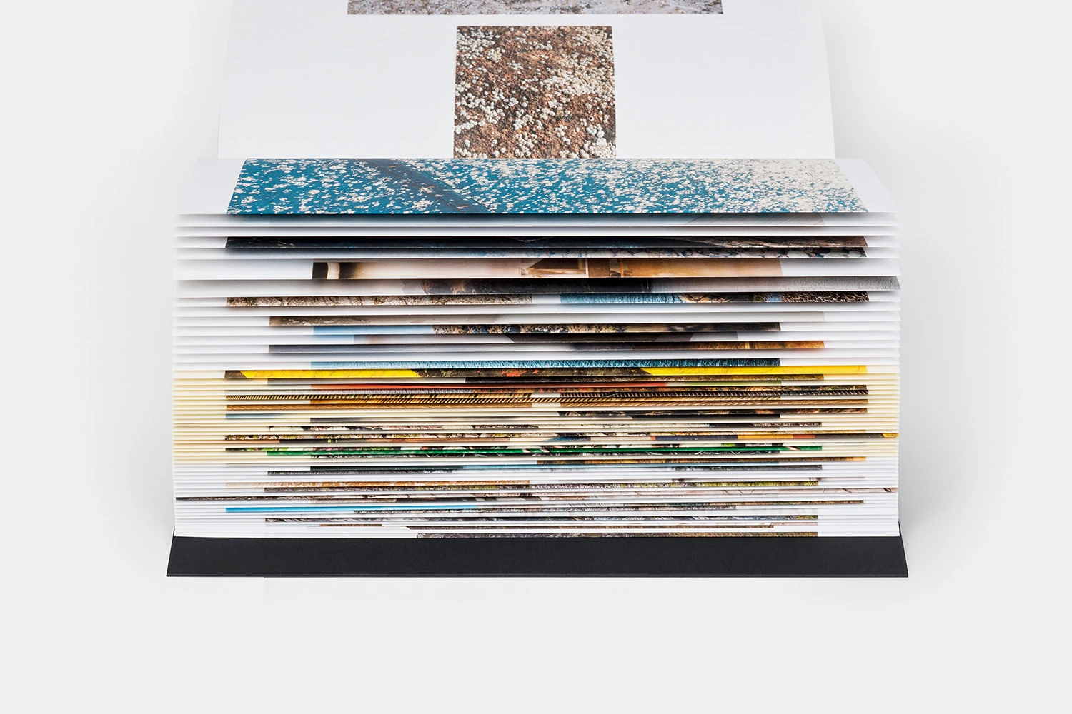
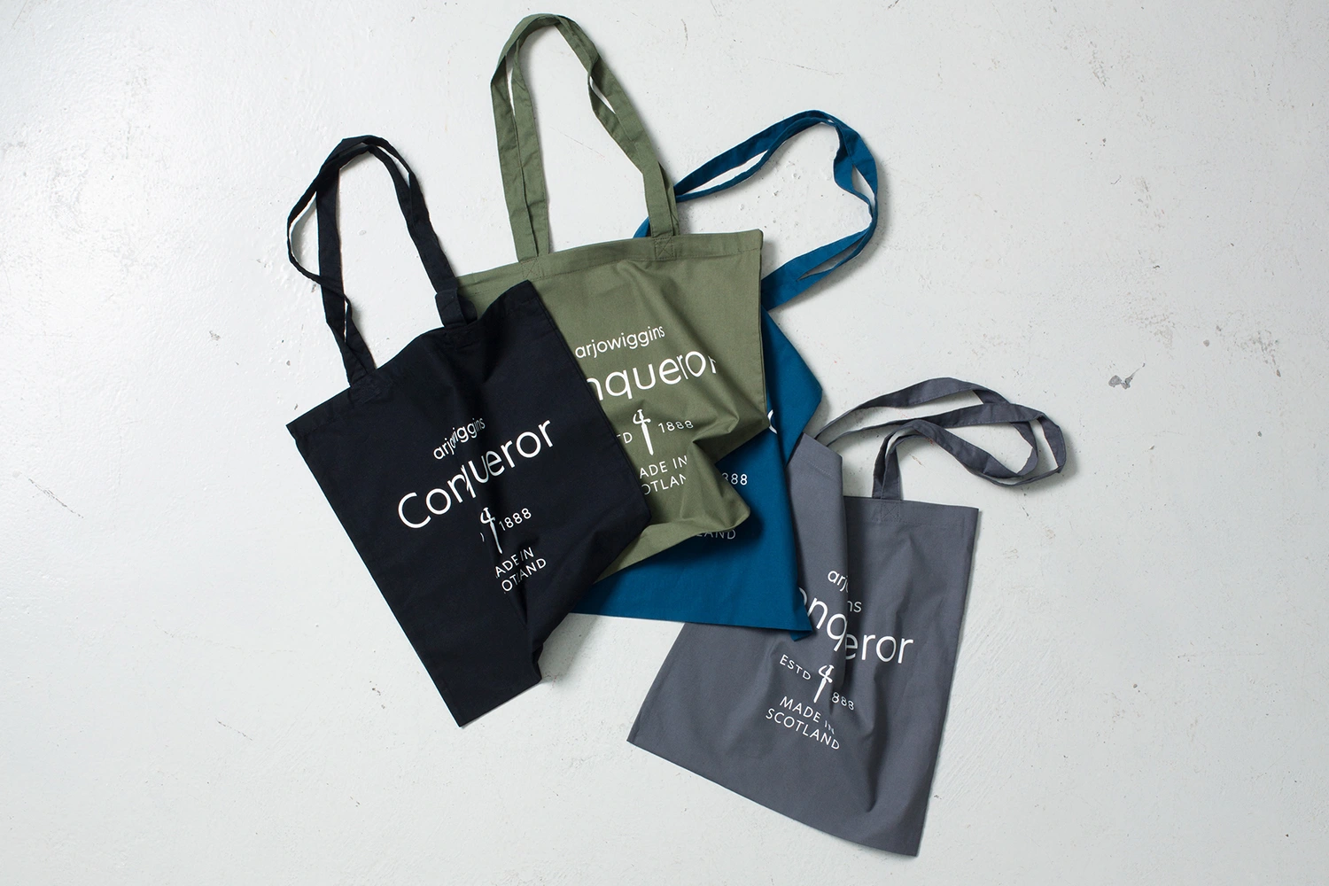
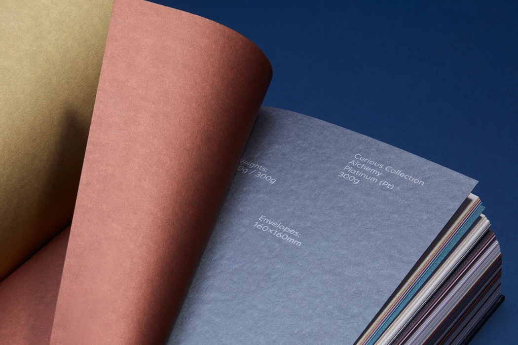
In the world of high-end paper manufacturing, brand identity is more than a logo; it is a tangible experience defined by texture, weight, and print fidelity. This extensive brand identity project for Arjowiggins Conqueror captures the legacy of the heritage brand through a sophisticated, editorial-driven showcase. Led by the design experts at North, the campaign utilizes a clean, high-key aesthetic to elevate paper from a simple commodity to a luxury medium. By employing precise studio strobe lighting and macro photography, the project emphasizes the tactile quality of various paper stocks, ranging from raw, grooved tree bark to crisp, metallic-edged pages. The imagery leans into a rhythmic contrast, balancing the industrial geometry of man-made objects with the organic, muted tones of Scottish landscapes. Each spread serves as a masterclass in layout design, using wide white margins to anchor vivid photographic detail and sharp, minimalist typography. Beyond the printed collateral, the project extends its professional branding into curated commercial assets, such as the tactical arrangement of branded tote bags. By focusing on the interplay between deep-grooved texture and sleek, modern composition, the project effectively communicates the brand's enduring commitment to craftsmanship. This body of work stands as a testament to the power of editorial minimalism, proving that when the medium itself is premium, the design need only frame its innate beauty to leave a lasting impact.