
Apt: Brand Identity

Nov 2018
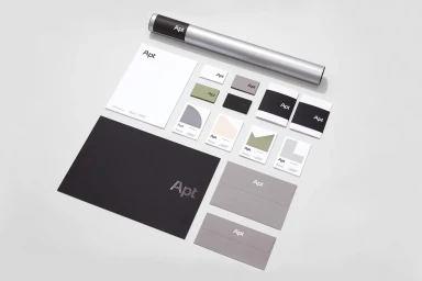
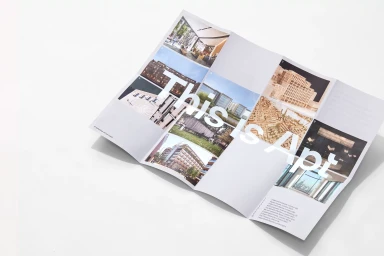
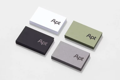
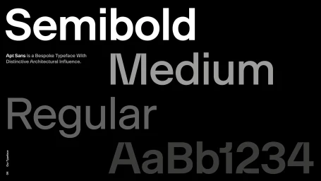
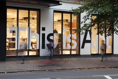
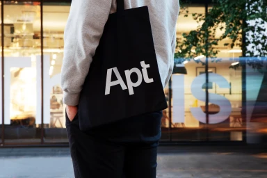
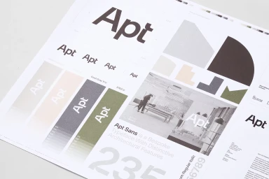
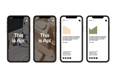
The brand identity for Apt, developed by the design agency Greenspace, masterfully channels the precision and structural clarity inherent in the architectural industry. This comprehensive visual system leans into an aesthetic of editorial minimalism, where every touchpoint—from the bespoke Apt Sans typeface to the tactile stationery suite—functions as an extension of the firm’s spatial philosophy. The project utilizes high-key lighting and sophisticated emboss and deboss techniques to lend a tangible, premium quality to the corporate collateral, emphasizing the brand's commitment to clean, intentional design. Across various media, including sharp typographic studies and environmental graphics, the project maintains a restrained palette of muted sage green, charcoal, and white. The identity transcends static print, extending seamlessly into digital interfaces and site-specific architectural applications where bold, sans-serif messaging grounds the firm’s public presence. By balancing large-scale, atmospheric imagery with the rigorous organization of a professional grid, the identity conveys a narrative of order and modern sophistication. The inclusion of live-action photography and motion blur elements provides a necessary human connection, framing the brand within a real-world, kinetic urban environment. Ultimately, the Apt identity serves as a cohesive masterclass in corporate branding, demonstrating how disciplined typography and consistent visual hierarchies can elevate a firm's presence across diverse physical and digital mediums, solidifying its position within the competitive landscape of architectural practice.
Horizontal, Commercial, Clean, Minimalist
Typography
White Seamless
