
Pilbrow & Partners: Brand Identity


Jul 2020
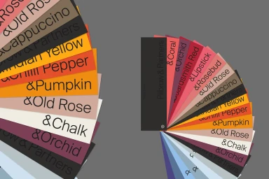
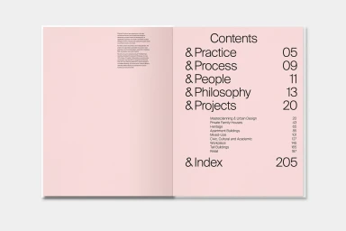
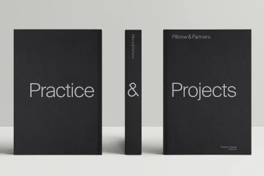
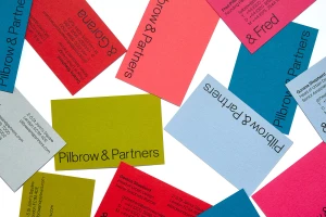
The new brand identity for Pilbrow & Partners serves as a masterclass in architectural corporate design, balancing rigorous structure with a sophisticated, minimalist aesthetic. Executed with precision by the team at Greenspace, the project channels a high-end, editorial sensibility that elevates functional communication into a cohesive visual language. By leaning into a clean, monochromatic foundation and pairing it with a surprisingly vibrant spectrum of color, the identity system feels both timeless and distinctly contemporary. The collateral—ranging from tactile, matte-finish business cards to a meticulously organized, hardbound monograph—demonstrates an uncompromising commitment to detail. Through the clever use of sans-serif typography, the design achieves an understated authority, ensuring that the firm's output remains the central focus. Whether in the monochromatic clarity of the official wordmark or the structured, infographic-heavy layouts found within the firm's brochures, the project consistently emphasizes clear lines and modern graphic design principles. The deliberate use of natural light in its product photography highlights the high-quality print finishes and textured paper stocks, lending a premium feel to every touchpoint. This is a deliberate, expert exercise in corporate branding that trades excess for clarity, resulting in a flexible system that effectively categorizes complex project types like masterplanning and urban design while maintaining a sharp, professional composure that is synonymous with elite architectural practice.
Horizontal, Commercial, Clean, Minimalist
Typography
