
The OWO: Brand Identity
Aug 2021
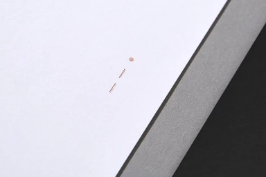
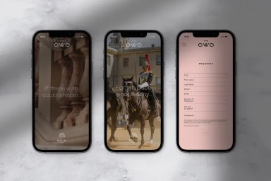
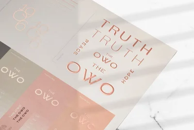
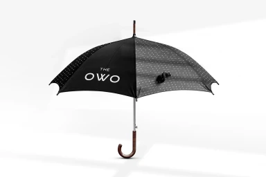
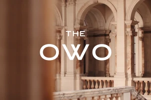
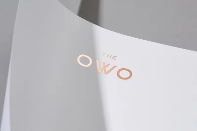
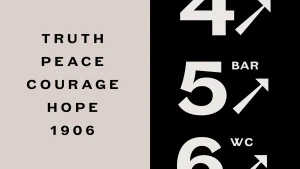
Greenspace developed the brand identity for The OWO, creating a comprehensive visual language that integrates tactile print production with digital interface design. The project centers on a bespoke typeface, 1906, which takes inspiration from early 19th-century Grotesks to provide a distinctive typographic foundation across both physical collateral and wayfinding systems. Materiality serves as a key component of the identity, employing high-contrast monochrome tones, debossed metallic copper foil, and heavy textured paper stock. These graphic design elements extend into a minimalist mobile UI and functional applications, maintaining a clean, editorial perspective that balances geometric precision with the architectural context of the brand space.
Horizontal, Clean, Minimalist, Commercial
Typography
Advertising Campaign
