
APD: Brand Identity
Aug 2019
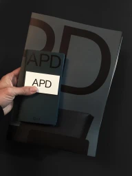
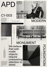
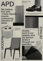
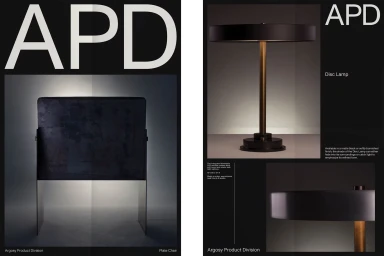
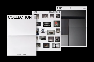
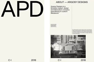
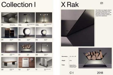
The brand identity for APD serves as a masterclass in editorial minimalism, translating the raw precision of industrial metalwork into a sophisticated corporate language. Developed by New Studio, the project leans heavily into a monochromatic aesthetic, utilizing a disciplined grid structure to bridge the gap between heavy-duty fabrication and high-end design. By anchoring the visual system with the ABC Monument Grotesk and Dinamo typefaces, the identity achieves a stark, modern presence that feels both timeless and aggressively functional. The collateral ranges from tactile, matte-finish stationery that emphasizes premium material quality to expansive catalogue layouts that meticulously document the mechanical nuances of the APD collections, including the iconic Plate Chair and Disc Lamp. Throughout the materials, the design prioritizes a high-contrast balance, juxtaposing the soft light of studio photography with the gritty, live-action reality of a Brooklyn workshop floor. This dual approach, supported by careful use of infographics, transforms technical specifications into design assets, reinforcing the brand's commitment to craftsmanship. The final output is more than a simple logo implementation; it is a cohesive, highly structured visual ecosystem that elevates commercial corporate identity through a refined, architectural lens. Every element, from the layout of the project manifestos to the subtle grain of the imagery, works in concert to define APD as a leader in the intersection of industrial design and editorial excellence.
Artistic, Vertical, Clean, Minimalist
Typography
Solid Colour


