
The Brooklyn Circus: Brand Identity

Apr 2021
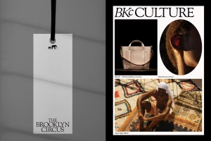
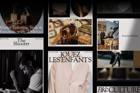
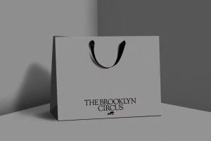
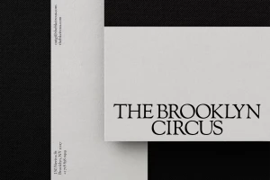
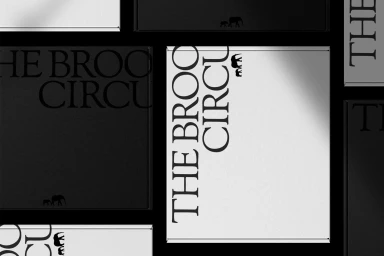
New Studio develops a comprehensive brand identity for The Brooklyn Circus, anchoring the label’s visual language in a clean, editorial aesthetic. The project spans print collateral, packaging, and digital interfaces, unifying disparate touchpoints through a cohesive use of serif and sans-serif typography. Across magazine-style spreads and product packaging, the design language favors a minimalist approach. The inclusion of consistent iconography, such as the elephant silhouette, reinforces the brand's graphic system, while the layouts utilize structured grids and textured paper elements to maintain a sophisticated, tactile feel. The digital execution carries this design philosophy into web and social media spaces. By integrating editorial photography with sharp UI elements, the identity project establishes a clear visual framework for the brand’s multi-channel communication.
Horizontal, Clean, Minimalist, Commercial
Typography
