Festivals & Events
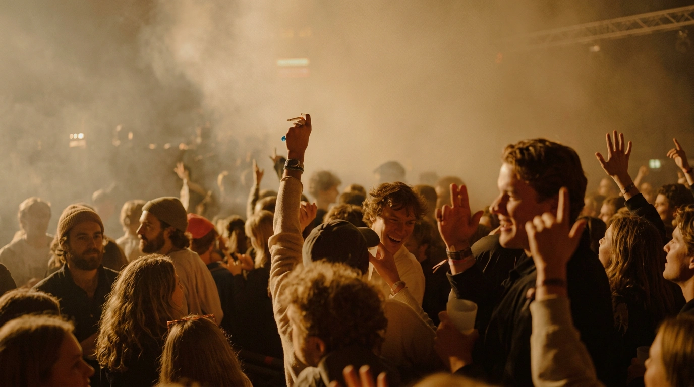
Festivals & Events photography happens live and once, with no retakes — the schedule doesn't move for weather or a missed moment. On Visie, that craft spans live event and red carpet photography for organisations like Sundance Film Festival and Ticketmaster, typically shot in much higher volume than a studio campaign to guarantee usable coverage.
This week's top Festivals & Events projects
This week's top Festivals & Events projects, carefully handpicked by Visie's expert curators, showcase the best in style and innovation.
 Project
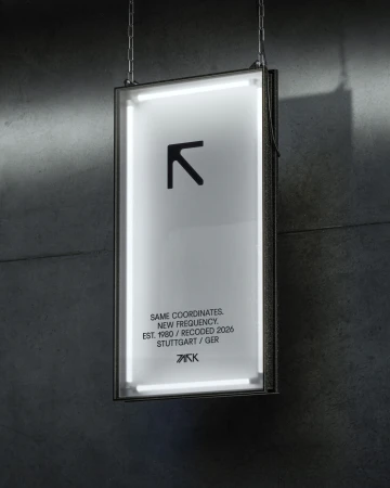
 PARK, the renamed Stuttgart club · Brand Identity
Stuttgart-based club PARK introduces a comprehensive brand identity system, reimagined to bridge its history with a forward-looking digital aesthetic. Developed by Hochburg and the Hanke Brothers, the project spans graphic design, 3D motion, and videography to establish a cohesive visual language for the venue. The identity leans into a stark monochrome palette, utilizing high-contrast editorial photography, geometric grid systems, and minimalist typography to ground the brand's evolution. The execution integrates both physical and digital touchpoints, ranging from illuminated signage and branded apparel to dynamic animation sequences. By utilizing clean 3D render/CGI techniques and experimental VFX, the creators translate the club's spatial presence into a flexible system of motion graphics and vector-based templates. This project establishes a precise, industrial identity that prioritizes clarity and structural rhythm across all media.
photography festival · Brand Identity
For the 9th Triennale der Photographie Hamburg 2026, the visual identity, developed under the project title Alliance Infinity Love, establishes a sophisticated and contemporary language for one of the photography industry's most anticipated events. The project, brought to life through the design and motion expertise of dipshop alongside print production by Leon Lechner and Katharina Hetzeneder, centers on a refined aesthetic that bridges minimalist structuralism with a vibrant, humanistic color palette. By utilizing soft-focus gradients of pink, orange, and green against stark white and neutral backdrops, the identity succeeds in creating a modern, cohesive look that remains accessible yet elevated. This commercial branding initiative leverages clean, sans-serif typography to anchor the exhibition materials, while the integration of large-scale environmental graphics—including vertical banners and bold wall treatments—transfers the conceptual elegance of the printed brochures directly into the physical gallery space. The result is a seamless, cinematic presentation that leans into natural light to highlight the precision of the layout and the tactical quality of the materials. By balancing geometric abstraction with an invitation to engage with the theme In The Face Of The Other, the design team has crafted an identity that feels both timeless and urgent, perfectly reflecting the evolving, multifaceted nature of contemporary photographic discourse within the public sphere.
 Project
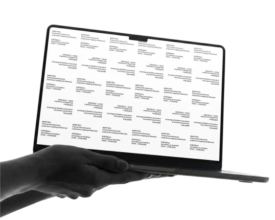
 MAPP · Brand Identity
For the latest iteration of the MAPP MTL festival, Baillat Studio has crafted a brand identity that leans into a rigorous, monochromatic aesthetic, perfectly capturing the high-energy intersection of projection mapping and urban culture. By utilizing a stark, high-key palette and aggressive, sans-serif typography, the visual system prioritizes clarity and scale, ensuring that the digital event details remain the focal point across every touchpoint. The project channels a modern, graphic design-led sensibility, where bold text treatments are layered over abstract, repeating patterns to create a sense of structured movement. With UI illustration techniques and precise 3D render and CGI elements, the branding translates seamlessly from static print assets to dynamic mobile interfaces, reflecting the festival's commitment to cutting-edge digital experiences. The execution feels intentionally sparse yet impactful, creating a professional and cohesive presence that anchors the festival's diverse programming—from laser projections to DJ sets—within a unified aesthetic language. Through the collaborative efforts of Baillat Studio on design and motion, supported by Applied Archive Atelier on web development, the identity transforms technical event information into a high-contrast, immersive narrative. This identity avoids unnecessary clutter, instead relying on the raw power of typography and sharp visual hierarchies to engage audiences within the Festivals & Events space, signaling a bold transition for the 2025 edition.
Skyn · EEUU
Skyn explores the visceral energy of live performance in the EEUU project. The film captures the raw atmosphere of a stadium crowd, moving from intimate close-up shots to wide, high-energy vistas of supporters during a live event. Produced by Fertil with creative agency L&C, the spot leans into a cinematic aesthetic. The execution uses saturated tones and warm lighting to emphasize the collective intensity of the audience, relying on a live-action technique to document the movement and scale of the celebration.
Amazon · But is it Art - Director's Cut
Amazon steps into the gallery space for 'But is it Art - Director's Cut,' a project that documents the intersection of audience and exhibition within a contemporary setting. The work focuses on the social dynamics of an art gallery, capturing visitors engaging with abstract paintings and sculptural installations. Produced by Imposter, the footage leans into a clean, cinematic aesthetic. The narrative observes the environment of minimalist displays and geometric forms, maintaining a neutral perspective on the exhibition space.
Coachella · Visual Identity
Coachella’s visual identity project leans into a tactile aesthetic, utilizing stop-motion animation to bring a vibrant desert landscape to life. Produced by Hornet, the creative execution centres on hand-crafted felt materials, building a world populated by miniature characters, palm trees, and playful roadside elements. The project explores the intersection of animation and sculpture, emphasizing physical texture over digital polish. By utilizing felt figures and set pieces, the work creates an earthy, rhythmic movement that distinguishes the visual branding through traditional craftsmanship.
Sotheby's · Auction Pre Show with Kurt Anderson
Sotheby's presents an exclusive auction preview hosted by writer and author Kurt Andersen. This production offers a guided walkthrough of the house’s upcoming fall art sales in New York City, highlighting a selection of impressionist, modern, and contemporary masterworks. Captured through a clean, live-action technique, the video moves through the gallery spaces to showcase high-profile paintings and sculptures. The edit focuses on the exhibition environment, providing an intimate look at the inventory ahead of the primary auction events.
 Project
 LIFI (Leeds International Festival of Ideas) · Brand Identity
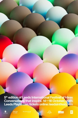
The brand identity for the Leeds International Festival of Ideas (LIFI) centers on a playful and expansive visual language that blends 3D render/CGI elements with clean, bold typography. The project creates a cohesive aesthetic across digital and physical touchpoints, including event signage, brochures, and dynamic billboard displays. Designed by Rabbithole with 3D and motion work by Joseph Töreki, the identity leans into a saturated color palette of pink, yellow, blue, and magenta. The execution incorporates whimsical, organic character forms and abstract geometric spheres, resulting in a futuristic and highly tactile visual system that functions across static print and motion graphics.
LEGO · Chinese New Year
LEGO celebrates the spirit of the season in this festive commercial campaign, tracing a series of vignettes that highlight tradition and family connection. The narrative moves through travel, communal gatherings, and traditional lion dance performances, anchoring the brand within the cultural backdrop of Chinese New Year celebrations. Executed through a cinematic lens, the production utilises live-action techniques and vibrant, warm lighting to bring the vignettes to life. The film captures intimate moments and wide-scale festivities, with creative input from The LEGO Group.
Samsung, Hypebeast · “Art Basel”
Samsung and Hypebeast join forces for this documentary-style project centered on their exhibition at Art Basel. The production offers a behind-the-scenes look at the technical execution required to transform a raw industrial space into a curated gallery, documenting everything from the installation of floor paths to the precise hanging of framed artwork. The edit leans into a clean, observational aesthetic, highlighting the intersection of high-end consumer technology and fine art. Throughout the piece, visitors interact with custom-cased smartphones and smartwatches integrated into the exhibition environment, balanced against traditional canvases and concrete textures. Creative agency No Problem led the production of this live-action sequence.
 Project
 Birmingham Royal Ballet · Brand Identity
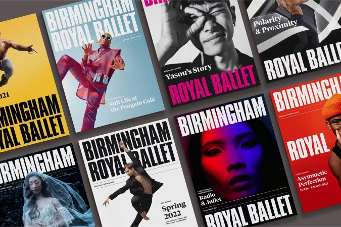
Birmingham Royal Ballet’s brand identity project establishes a visual language that transitions from performance-focused editorial design to digital and product-based applications. The system utilizes high-contrast color blocking and bold typography to unify a range of touchpoints, from out-of-home advertising installations and theatrical posters to a streamlined e-commerce digital interface. Collaborative contributions from NB Studio, Design by Twist, BOND, Simoul Alva, and Antonio Calvino shaped the project's graphic execution. The work features a commercial and editorial aesthetic, leveraging clean layouts and minimalist line art to balance the dynamic nature of performance art with structured brand consistency. Product packaging and environmental signage further extend the identity through the use of tactile materials and stark architectural contrasts.
Mama Hungara · Historia
Mama Hungara's Historia project serves as a dynamic vertical video showcase, capturing the breadth of the collective's creative output across live cultural events and performance arts. Through a fast-paced montage, the production bridges the gap between polished stage spectacles and raw, documentary-style documentation. The reel utilizes a cinematic, clean aesthetic to present diverse highlights, including musical performances, immersive experiences, and graphic design assets. Kinetic typography overlays anchor the visuals, tracing thematic threads through the series in a vertical format suited for mobile-first engagement.
Explore other industries
Explore Visie's leading industries, projects, and the talented creatives representing them.