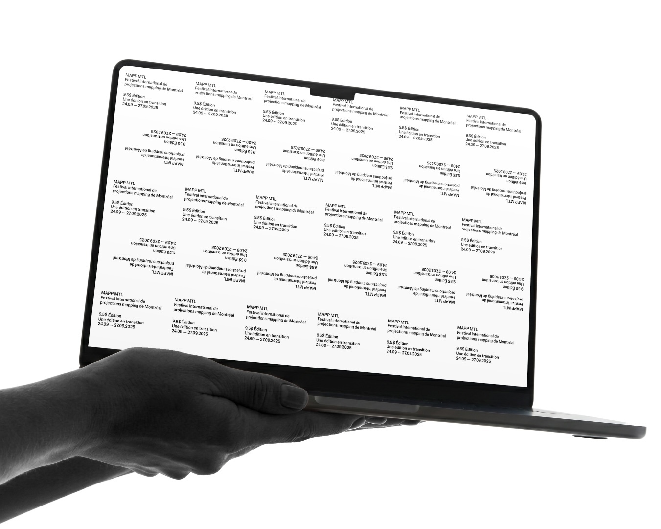
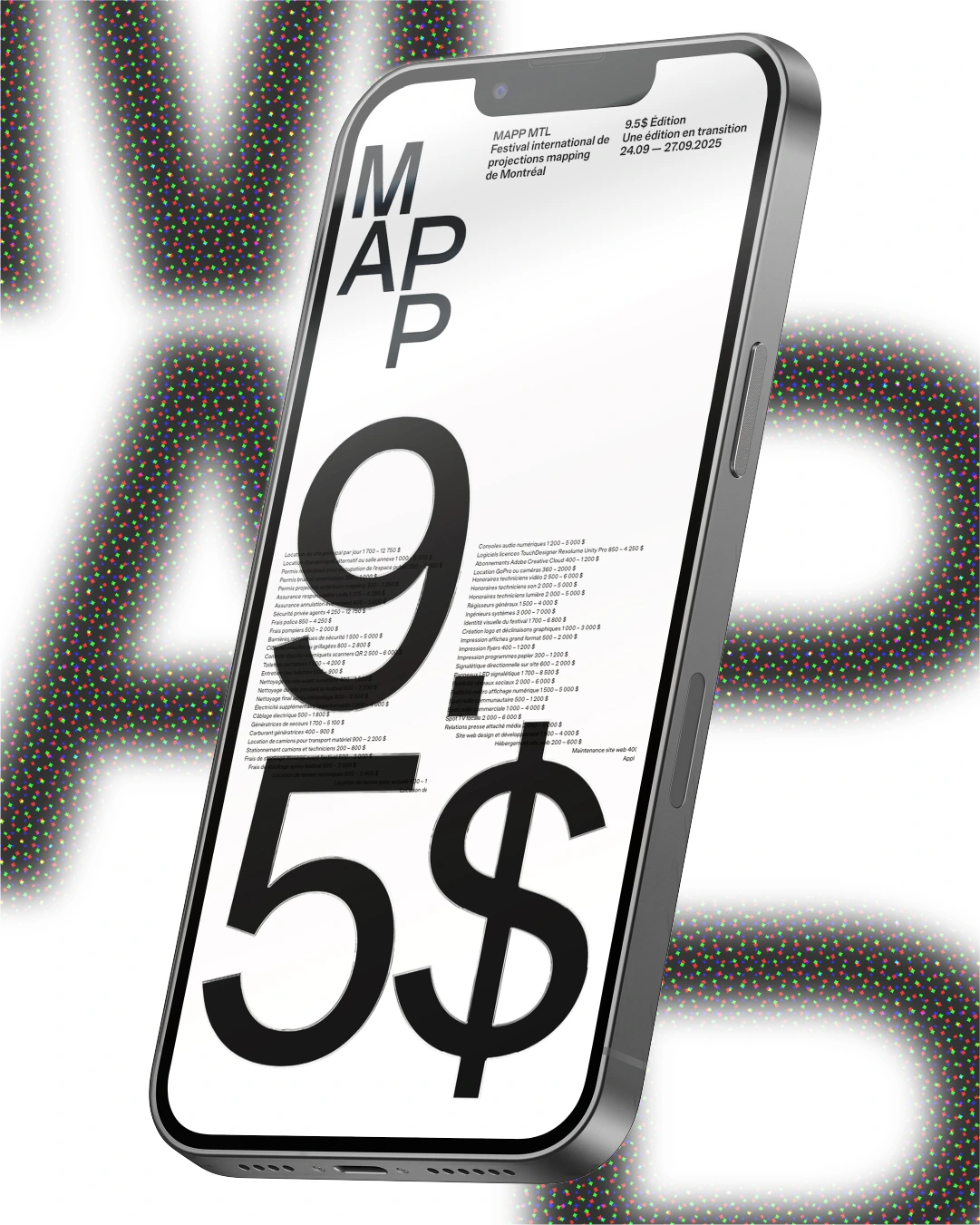
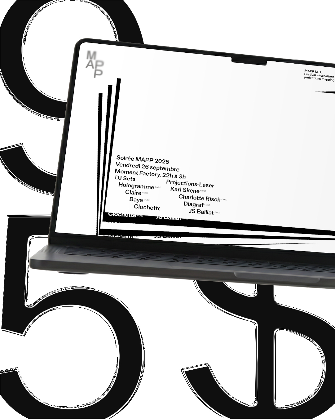
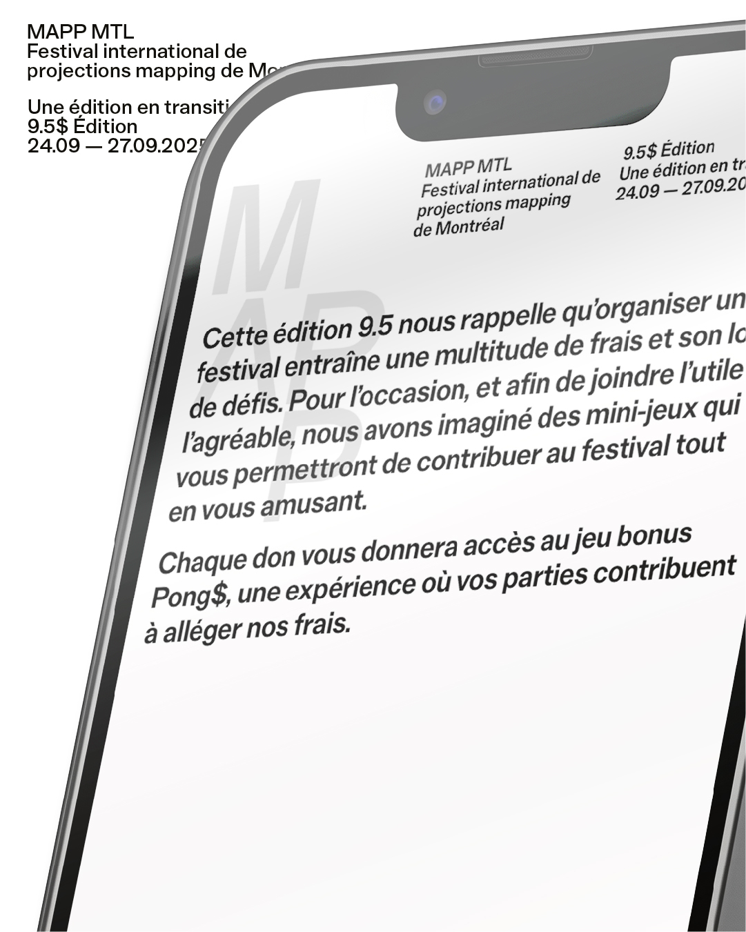
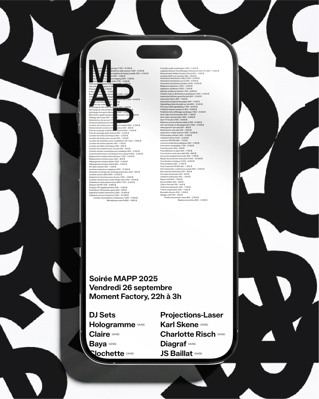
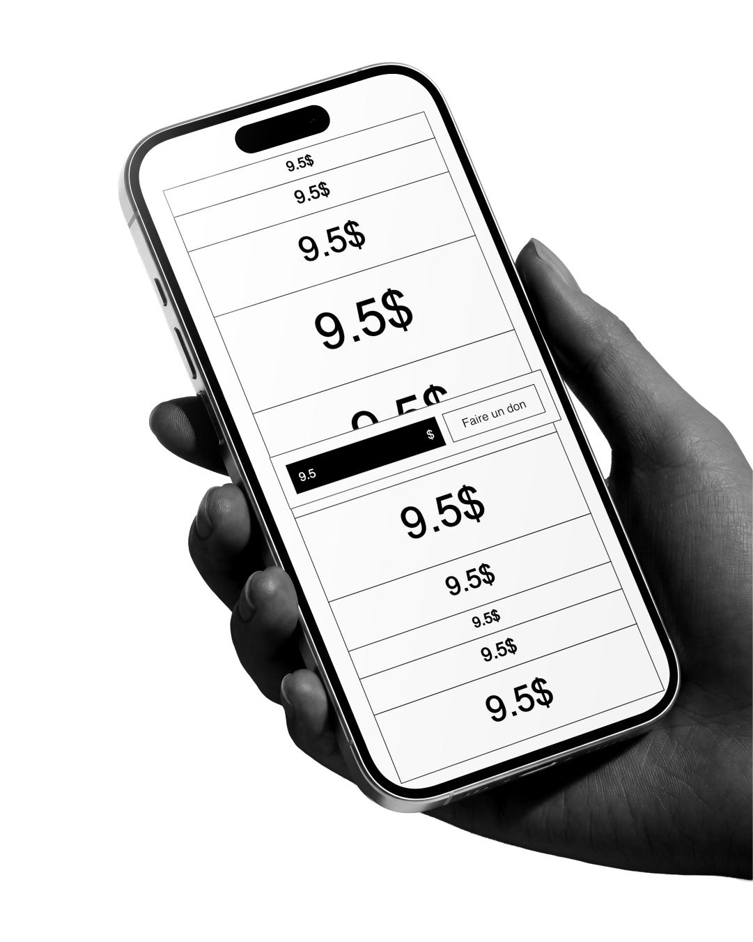
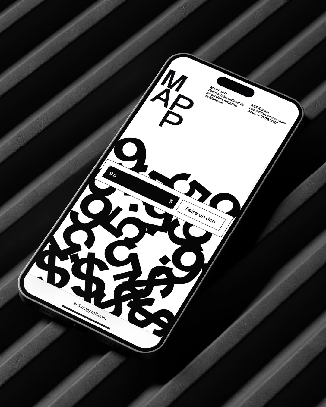
For the latest iteration of the MAPP MTL festival, Baillat Studio has crafted a brand identity that leans into a rigorous, monochromatic aesthetic, perfectly capturing the high-energy intersection of projection mapping and urban culture. By utilizing a stark, high-key palette and aggressive, sans-serif typography, the visual system prioritizes clarity and scale, ensuring that the digital event details remain the focal point across every touchpoint. The project channels a modern, graphic design-led sensibility, where bold text treatments are layered over abstract, repeating patterns to create a sense of structured movement. With UI illustration techniques and precise 3D render and CGI elements, the branding translates seamlessly from static print assets to dynamic mobile interfaces, reflecting the festival's commitment to cutting-edge digital experiences. The execution feels intentionally sparse yet impactful, creating a professional and cohesive presence that anchors the festival's diverse programming—from laser projections to DJ sets—within a unified aesthetic language. Through the collaborative efforts of Baillat Studio on design and motion, supported by Applied Archive Atelier on web development, the identity transforms technical event information into a high-contrast, immersive narrative. This identity avoids unnecessary clutter, instead relying on the raw power of typography and sharp visual hierarchies to engage audiences within the Festivals & Events space, signaling a bold transition for the 2025 edition.